Font Directory
Mina
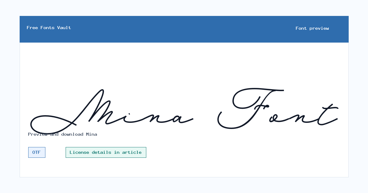
Mina includes 1 downloadable variant for live preview and testing.
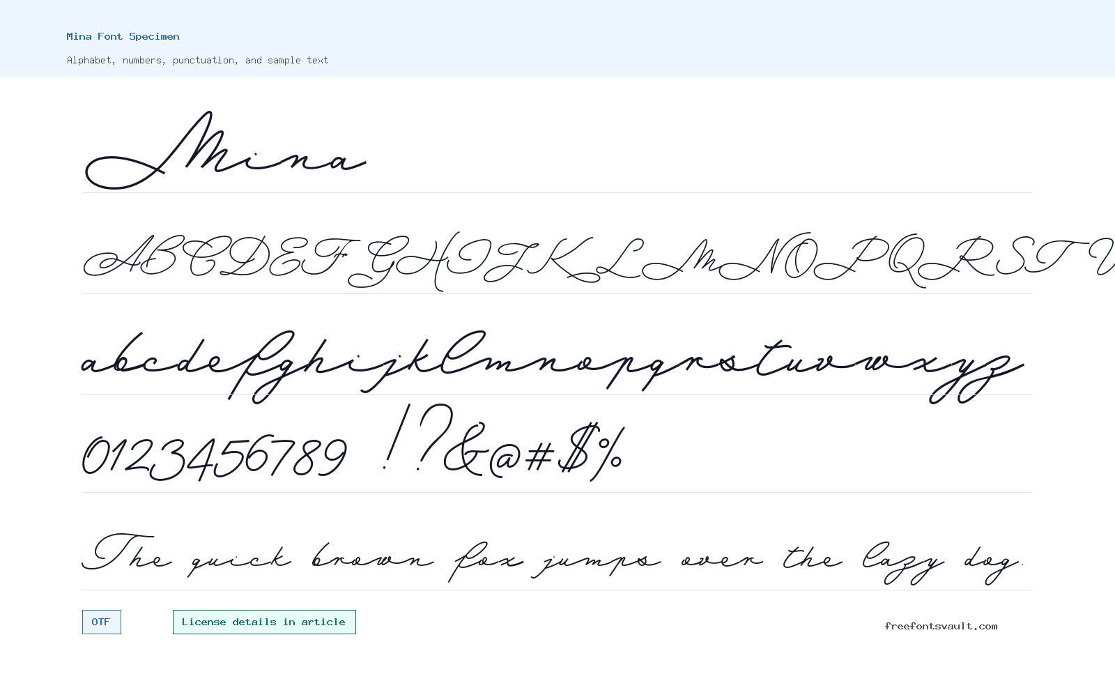
Font Specimen
Details
- Designer Giuseppe Salerno & Paco Gonzlez
- Foundry Resistenza
- License Open Font License
- License URL github.com/google/fonts/blob/main/ofl/mina/OFL.txt
- Format OTF
- Variants 1 file available
Mina is a modern sans-serif design with a clear, compact construction that can support interface labels, concise headings, and multilingual-looking visual systems. This page reviews the exact Mina file mapped by the catalog rather than making a broad claim about every possible style. Enter the words from your design and compare their width, punctuation, and visual weight before treating the preview as final artwork.
How Mina reads
The family has a straightforward sans-serif rhythm, but its personality comes from the relationship between rounded bowls, open counters, and sturdy verticals. That makes it useful for short messages that need to be clean without feeling anonymous. Inspect the way the capitals sit beside lower case and test an address, date, or number if the font will be used in a practical layout.
Mina can work for product cards, modern posters, navigation-adjacent headings, and support text around a stronger display face. Keep the hierarchy deliberate: a simple sans serif works best when line height, size, and contrast are doing the organizing. For a dense article, test a longer paragraph at normal reading size before choosing a weight.
Verified file details
- Family page: Mina.
- Included file: Mina-Medium.otf.
- Format and mapped style: OTF, normal 500.
- Local-file size: 99,952 bytes.
- File fingerprint: SHA-256 e3ce30f6b83ca79f47cb0d050c52682269821986096c1338767cbc86c230dbf5.
License and source record
The official Google Fonts project record identifies Mina as an OFL family. The primary links below support the recorded source and license, while the local checksum above identifies the actual file that this catalog page previews.
The links below are the source and license records used for this page review. They describe the recorded family context; the fingerprint above identifies the exact local file mapped to this page.
Preview before you decide
Try a button label, a two-line heading, and a number-heavy line. Then shrink the preview to the smallest real destination. The right treatment should stay calm and clear instead of becoming cramped.
Related tools
Try the same short phrase in the Font Generator, compare a heading and body choice in the Font Pairing Studio, or use the Font Identifier when you need to compare a reference image. Those tools help evaluate appearance; the linked source and license record remain the terms to review for a real project.
Questions about Mina
Is Mina useful for interface text?
It can work well for concise interface headings and labels when tested at the real UI size.
Can Mina support a display font?
Yes. Its straightforward sans-serif structure can provide a quiet companion to a more expressive display choice.
Browse More Fonts
Want to browse beyond this family? Return to All Fonts for the main directory.



