Font Directory
L
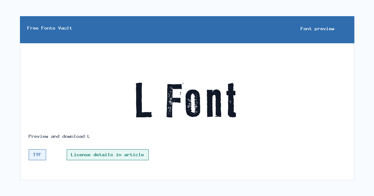
L includes 1 downloadable variant for live preview and testing.
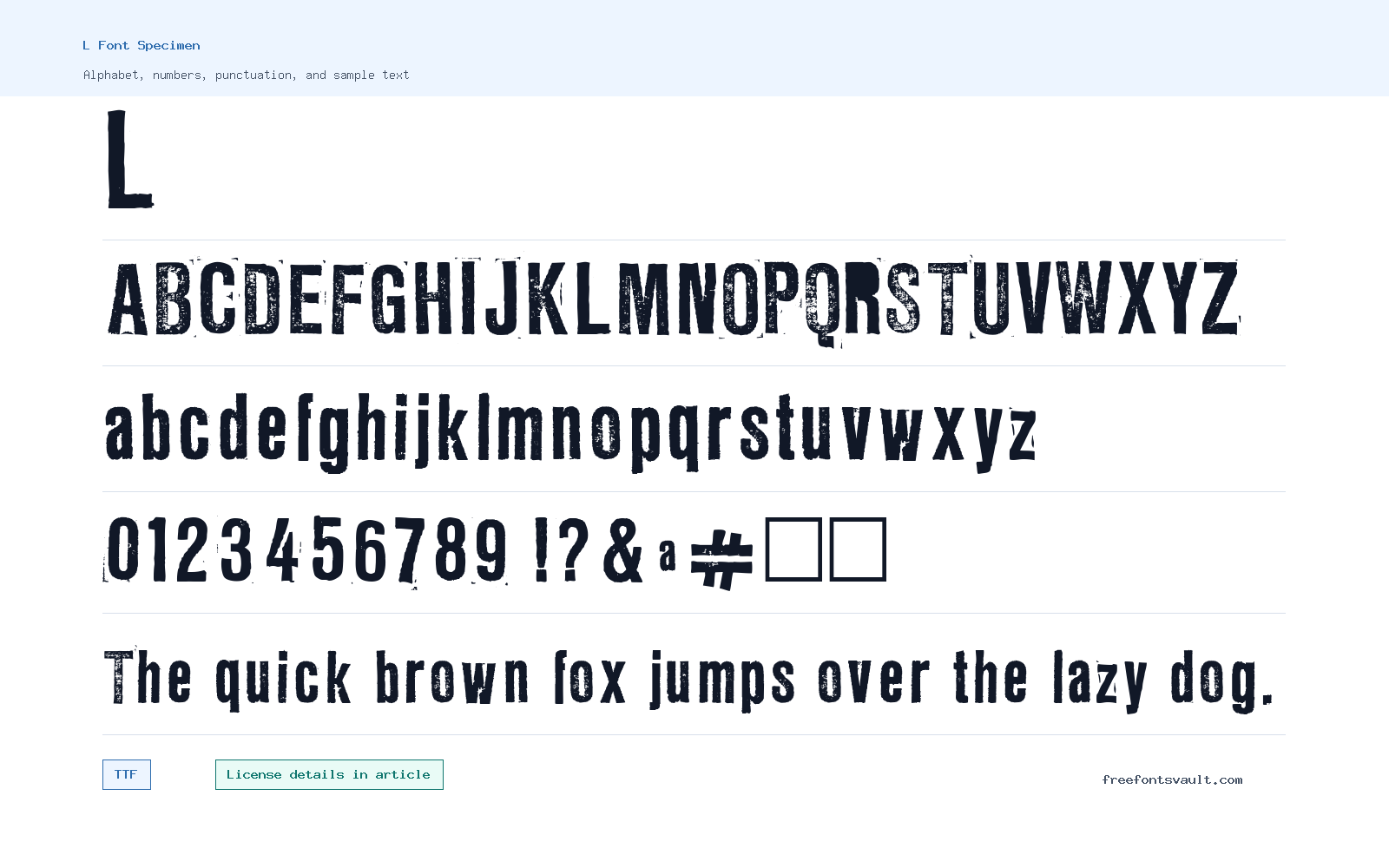
Font Specimen
Details
- Designer Markus Schreppel
- Format TTF
- Variants 1 file available
L font.
L is a simple single-style font download for quick testing, mockups, and short display experiments. The family name is minimal, so the preview is the best way to understand whether its letter shapes fit the tone of your project.
About L Font
The downloadable file is L-Regular.ttf, a TrueType font marked as a normal 400-weight style. Because only one style is present, you should not expect a matching bold, italic, or expanded family. That does not make it unusable; it simply means the design should rely on size, spacing, color, and layout for emphasis.
Use the preview with real text before installing it. Try names, initials, numbers, punctuation, and the exact words you plan to design. A one-style font can work well for a small headline, label, or personal mockup, but it needs a good companion typeface if the finished layout also contains paragraphs or smaller interface text.
Features
- TTF font file named L-Regular.ttf.
- Regular 400 weight with upright normal styling.
- Single-style family intended for straightforward preview and install testing.
- Works best for short phrases, labels, initials, and small display experiments.
Best Uses
- Short headings, initials, labels, and simple title tests.
- Personal mockups, quick typography comparisons, and font pairing experiments.
- Designs where a single regular style is enough.
- Pairing with a full-featured text family for long reading sections.
License Information
The license status is not confirmed for this download. Before using L in client work, paid products, logos, merchandise, apps, ads, templates, or webfont embedding, check the license file and make sure the intended use is allowed.
Designer and Foundry
The embedded credit appears to reference Markus Schreppel, but the stored text had a corrupted character. Treat the spelling as a cleanup note rather than a formal attribution until you confirm the preferred credit from the font package or designer record.
Usage Tips
Keep your first test practical: type the real word or name, then check spacing and readability at the size you plan to use. If you need emphasis, use hierarchy and contrast instead of forcing fake bold or italic styles. For a finished page or graphic, pair L with a neutral body font that handles longer text cleanly. A good practical test is to compare it beside two or three fonts with fuller families; if L still gives the clearest result for your short phrase, keep it as the accent and let another typeface handle the longer reading work.
FAQ
What format is L font?
The downloadable file is a TrueType font named L-Regular.ttf.
Does L include bold or italic styles?
Only a regular upright style is currently part of this family.
Can I use L commercially?
Commercial permission is not confirmed. Check the license terms before using it in paid, client, or public work.
Who is credited for L font?
The cleaned credit points to Markus Schreppel, but the original embedded text had a character issue, so verify the exact spelling before formal attribution.
What should I test before downloading?
Preview your exact words, numbers, punctuation, and small-size use cases. This is especially important because the family has only one style.
Browse More Fonts
Want to browse beyond this family? Return to All Fonts for the main directory.



