Font Directory
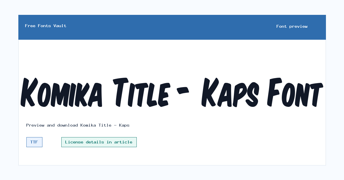
Komika Title - Kaps
Komika Title - Kaps includes 1 downloadable variant for live preview and testing.
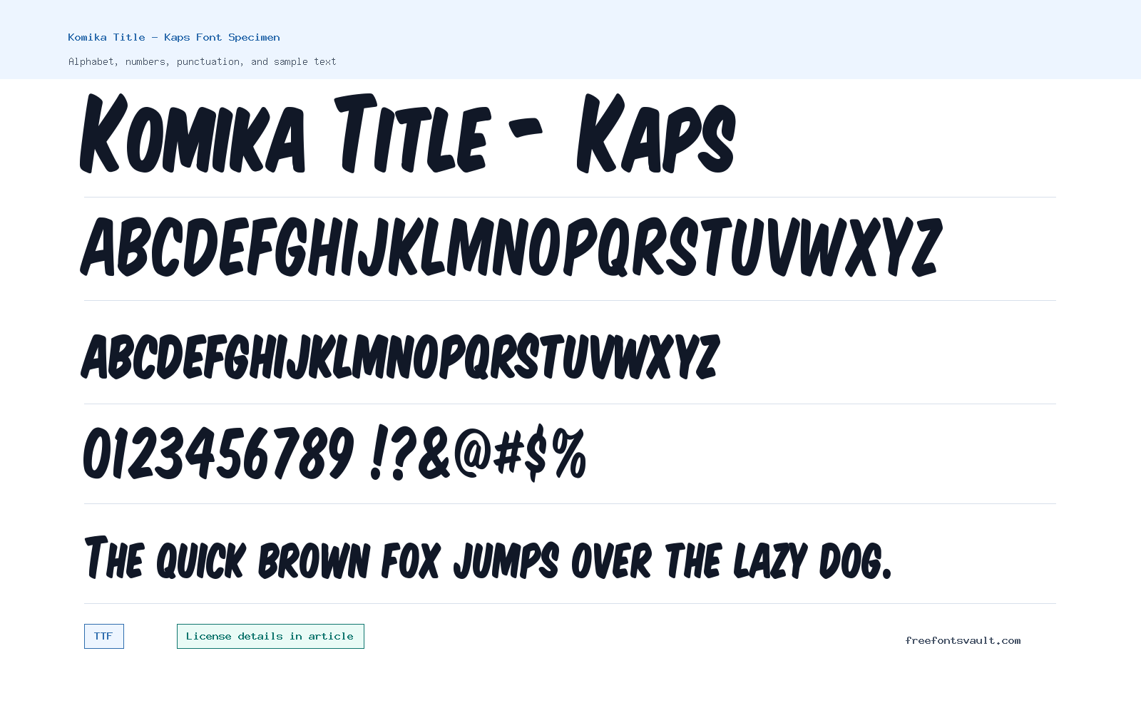
Font Specimen
Details
- Designer WolfBainX & Apostrophe
- Format TTF
- Variants 1 file available
Komika Title – Kaps font.
Komika Title – Kaps is a loud, playful title font for short text that needs instant personality. It works best when the words are treated like artwork: comic covers, sticker-style labels, event graphics, video thumbnails, and display headlines.
About Komika Title – Kaps
Komika Title – Kaps is listed as a regular TrueType font with normal style and 400 weight. The file name is KOMTITK_.ttf, so it should be easy to test in common desktop design apps, document tools, and font managers that accept TTF fonts. The typeface name makes its role clear: use it for title work, not quiet reading text.
The strongest use case is short, expressive lettering. Try it with uppercase words, compact titles, punchy labels, badges, cover mockups, and playful graphics where the font can carry the mood of the design. If a layout includes paragraphs, use Komika Title – Kaps for the headline and pair it with a calmer sans serif or serif for everything people need to read slowly.
Before choosing it for finished work, preview the exact phrase you plan to use. Comic-style display fonts can change character quickly when a word has many narrow letters, numbers, punctuation, or mixed-case combinations. Test spacing at the final size, then decide whether the title needs more tracking, a larger size, or a simpler companion font.
Features
- Regular TTF font file named KOMTITK_.ttf
- Normal style with a standard 400 weight
- Display-focused personality for high-impact title text
- Good fit for uppercase words, labels, covers, and playful graphics
- Single listed variant, simple to install and test
- Credited to WolfBainX and Apostrophe
Best Uses
- Comic-style headlines, title cards, and cover text
- Posters, stickers, badges, and social media images
- Game, video, or stream graphics with a playful tone
- Short phrases where legibility can be checked at a large size
- Accent typography paired with a simpler reading font
License Information
The license terms for Komika Title – Kaps are not confirmed. Do not assume commercial permission for client work, logos, merchandise, apps, ads, templates, or redistribution. Check the license file in the download or contact the listed creator before using it in paid or public projects.
Designer and Foundry
Komika Title – Kaps is credited to WolfBainX and Apostrophe. Keep that credit with your project notes if you need to track font origins, license files, or attribution requirements later.
Usage Tips
Use Komika Title – Kaps as a headline voice. Start with your real title, test it at the size it will appear, and check whether numbers, punctuation, and tight letter pairs stay clear. For longer copy, choose a more neutral companion font so the design keeps its energy without becoming tiring to read.
FAQ
Is Komika Title – Kaps free for commercial use?
Commercial permission is not confirmed. Review the license file or ask the creator before using it in client, paid, logo, merchandise, app, or advertising work.
What file format is included?
The listed file is a TrueType font, or TTF, named KOMTITK_.ttf.
Does Komika Title – Kaps include bold or italic styles?
Only one regular, normal-style variant is listed, so use size, spacing, color, or a separate companion font for hierarchy.
What is Komika Title – Kaps best used for?
It is strongest in short display settings such as comic-inspired titles, posters, badges, cover text, and graphic labels.
Should I use it for paragraphs?
It is better as an accent or headline font. For paragraphs and small captions, pair it with a simpler font built for comfortable reading.
Similar Fonts
Want to browse beyond this family? Return to All Fonts for the main directory.



