Font Directory
IT Valero Demo Ita
IT Valero Demo Ita includes 2 downloadable variants for live preview and testing.
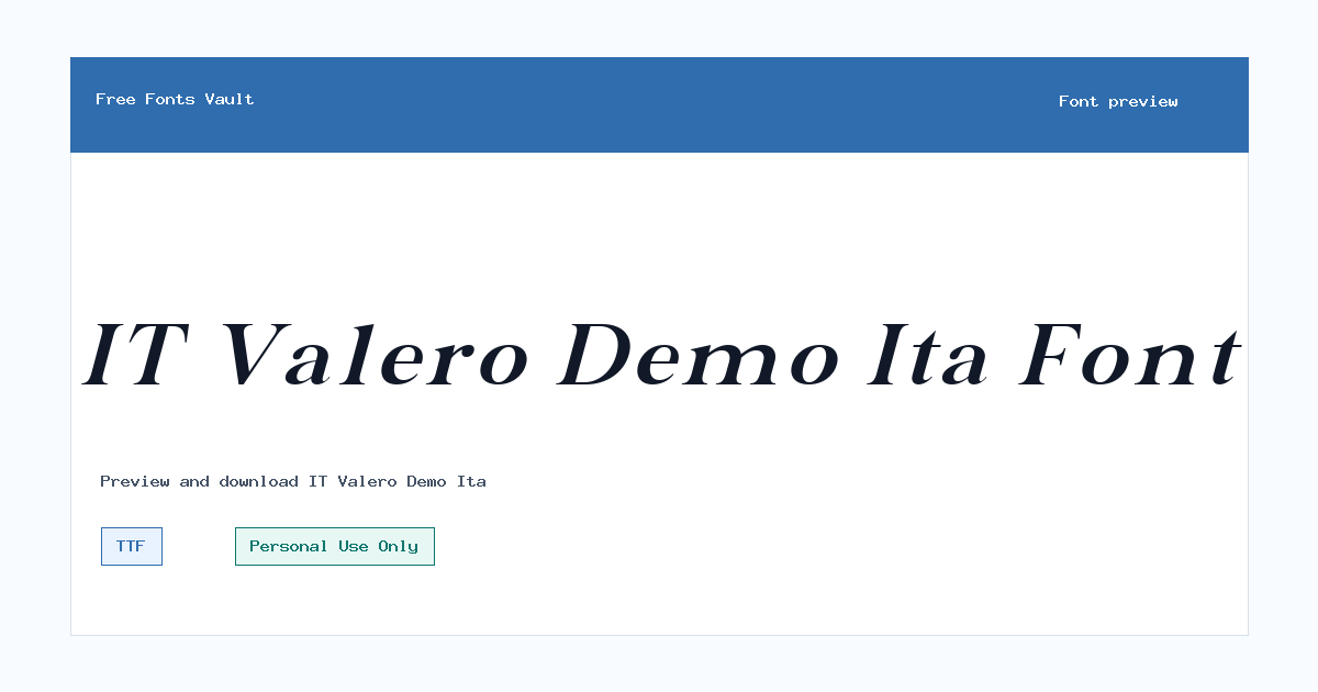
Styles in this family
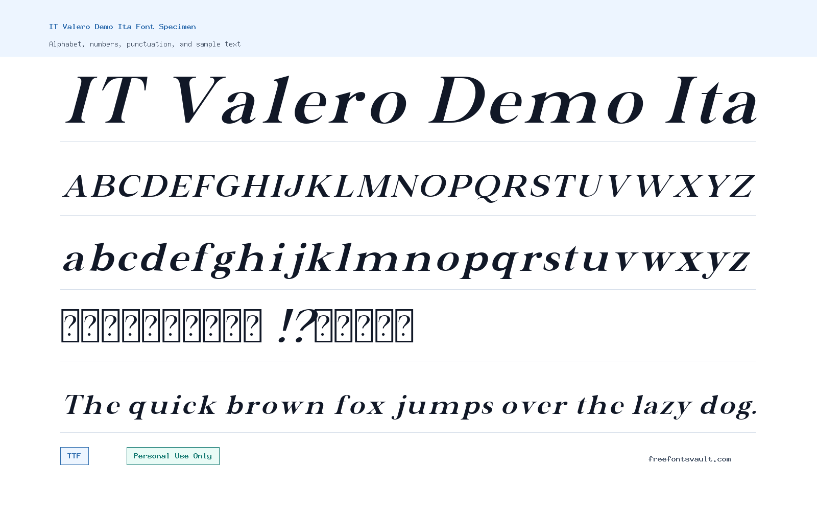
Font Specimen
Details
- Designer Indotype
- Foundry Indotype Foundry
- License Personal use only
- Format TTF
- Variants 2 files available
IT Valero Demo Ita font.
IT Valero Demo Ita is an italic serif demo font from Indotype Foundry, made for personal design testing and preview work. It has a refined serif look with a slanted rhythm, making it most useful for display text, stylish headings, and short lines where the italic character can stand out.
About IT Valero Demo Ita
IT Valero Demo Ita belongs to the IT Valero Demo font family and appears as an italic serif style rather than a plain upright text face. The font files on this page are TrueType files, with an italic regular weight and a bold italic weight. That gives visitors two practical options: a lighter italic for graceful titles and a stronger bold italic for more visible display use. The overall impression is classic and polished, but it should be judged in the live preview with your own words, because italic serifs can change character quickly depending on letter spacing, word length, and size.
Use IT Valero Demo Ita when you want a serif voice with movement: editorial-style headlines, quote graphics, invitation mockups, social post titles, poster lines, mood boards, and personal branding drafts. It can also help with logo exploration, especially for names, monograms, boutique concepts, and elegant wordmarks, but do not treat the demo license as permission for a finished commercial logo. For longer reading text, test carefully at small sizes. Italic serif forms often look beautiful in short lines, but they can become tiring in paragraphs if the spacing is tight or the contrast is high.
Designers working on web mockups can use this font to test hierarchy and mood before committing to a licensed family. Try the regular italic for secondary headings, pull quotes, or hero sublines, then compare the bold italic for a main title or poster headline. Keep the copy short and avoid using all caps for long phrases unless the preview shows enough breathing room. If the font feels too decorative for body copy, pair it with a clean sans serif or a calm readable serif for longer text. Let IT Valero Demo Ita handle emphasis while the companion font carries the practical reading load.
For poster and social graphics, give the italic shapes enough space. Increase tracking slightly if the letters feel crowded, and test the design at the real export size rather than only zoomed in. For logos and brand marks, check every character in the exact name you plan to use. Some italic letters may create beautiful movement, while others may need spacing adjustments. Also test punctuation, numbers, and accented characters if your project needs them, because demo fonts may not include the same character support as a full commercial family.
Features
- Italic serif demo style with a classic, elegant display feel
- Two TrueType font files: italic regular weight and bold italic weight
- Useful for short display text, quotes, headings, posters, and personal mockups
- Personal Use Only license, with commercial use requiring a separate license
- Works best when tested with real words, spacing, and final design sizes
Best Uses
- Personal editorial headlines and quote graphics
- Invitation drafts, mood boards, and elegant layout tests
- Poster titles, social media graphics, and short promotional mockups for personal projects
- Logo and wordmark exploration before purchasing the correct commercial license
- Web design mockups where an italic serif accent is needed
License Information
IT Valero Demo Ita is marked Personal Use Only. You can use it for personal experiments and non-commercial design practice, but commercial use is not allowed unless you obtain the proper license from the rights holder. Do not use the demo font in paid client work, advertising, product packaging, business branding, monetized videos, merchandise, or a final commercial logo without the correct license.
Designer and Foundry
The designer/foundry is listed as Indotype, also referred to as Indotype Foundry. The Indotype website is given as https://indotype.com/.
Usage Tips
Start by previewing your exact headline, name, or phrase in both italic weights. Use the regular italic for softer emphasis and the bold italic when the design needs more presence. Pair it with a simple sans serif for captions, body copy, navigation, and small web text. Before using it in any public or client-facing project, check the license and buy the right commercial version if the work has business value.
FAQ
Is IT Valero Demo Ita free for commercial use?
No. The license information marks it as Personal Use Only. Commercial work needs a separate license from the rights holder.
What font format is included?
The listed files are TrueType fonts, using the .ttf format.
What styles are included for this font page?
The page lists an italic regular weight and a bold italic weight.
Can I use IT Valero Demo Ita for a logo?
You can test it in personal logo concepts or mockups, but a finished logo for a business, client, product, or paid project needs the proper commercial license.
Is this font good for body text?
It is better suited to short display text. Italic serif fonts can be harder to read in long paragraphs, so use a more neutral companion font for body copy.
Who made IT Valero Demo Ita?
The font is credited to Indotype / Indotype Foundry.
What should I test before downloading?
Preview your own text, check spacing at the size you plan to use, compare regular italic and bold italic, and confirm that the characters you need are present.
Similar Fonts
Want to browse beyond this family? Return to All Fonts for the main directory.



