Font Directory
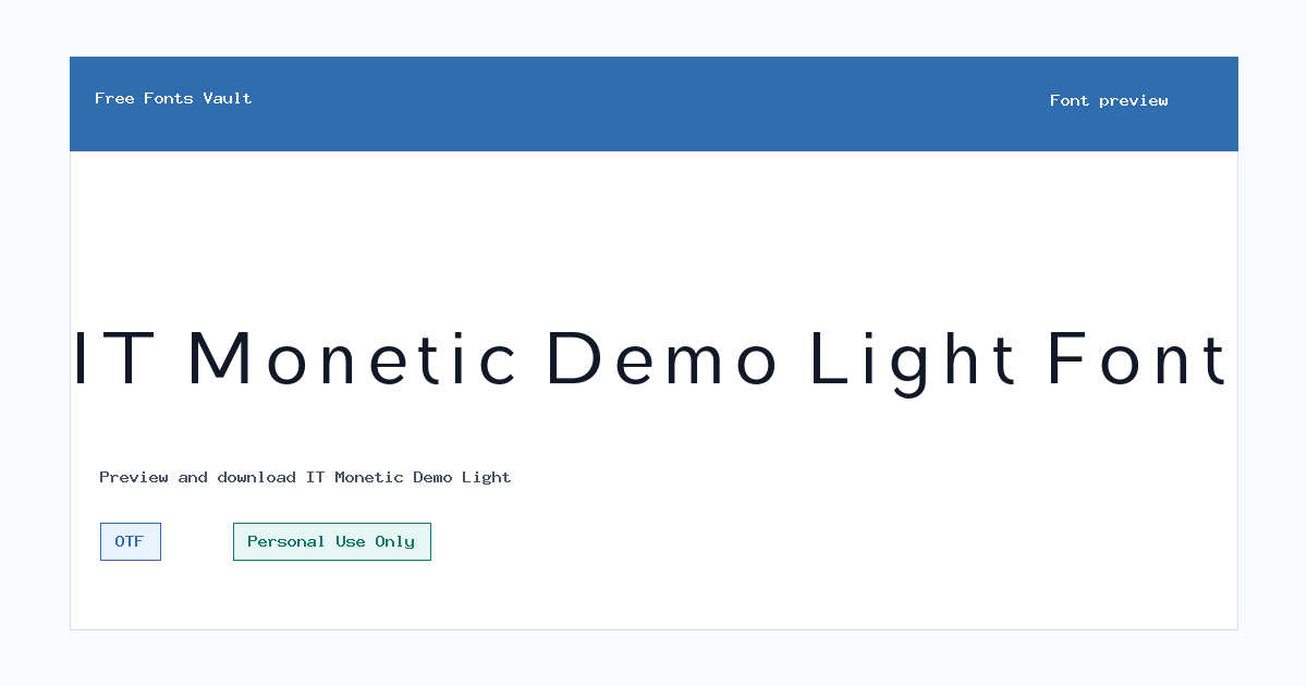
IT Monetic Demo Light
IT Monetic Demo Light includes 1 downloadable variant for live preview and testing.
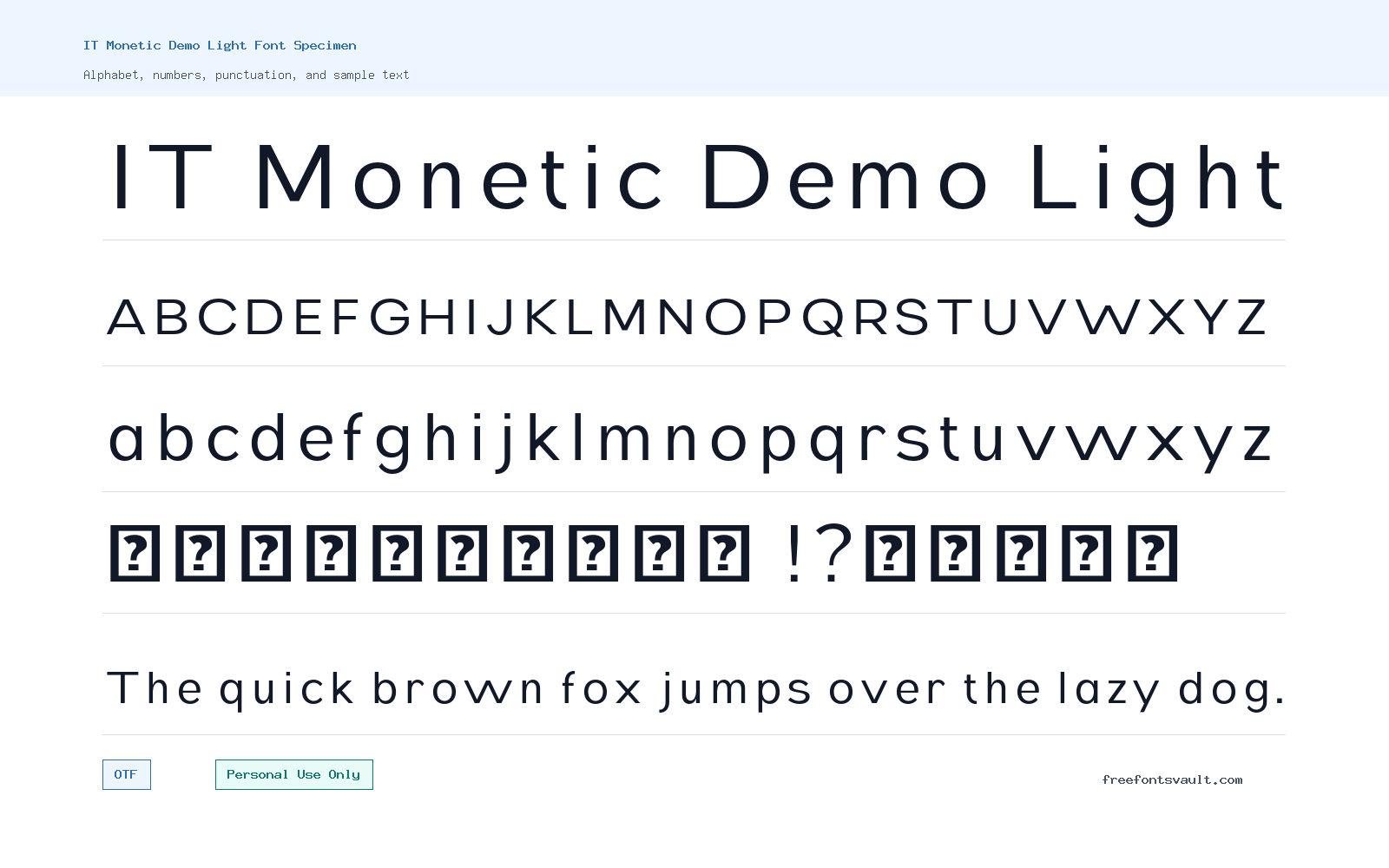
Font Specimen
Details
- Designer Indotype
- Foundry Indotype Foundry
- License Personal use only
- Format OTF
- Variants 1 file available
IT Monetic Demo Light font.
IT Monetic Demo Light is a light-weight sans serif font from Indotype Foundry. It is useful when you want a clean, airy text style for previews, personal design drafts, and simple display layouts.
About IT Monetic Demo Light
IT Monetic Demo Light has the restrained feel of a light sans serif: thin strokes, a normal upright style, and a softer presence than heavier headline fonts. Because this cut is marked as Light and carries a 300 weight value, it is best treated as a delicate option rather than a bold attention-grabber. It can work well for short titles, elegant labels, minimal poster text, web mockup headings, social graphics, and branding experiments where the design needs space and quiet structure.
For logo work, IT Monetic Demo Light can help you test a refined direction, especially for names, initials, packaging concepts, and clean identity sketches. Keep in mind that very light fonts often lose strength at small sizes or on busy backgrounds. If you use it in posters or digital mockups, give the letters enough contrast and spacing, then test the result in the actual size your audience will see. Pair it with a sturdier sans serif or a readable serif for body copy so the light style can stay focused on headings, captions, or accent text.
Features
- Light sans serif style with a normal upright appearance
- OTF font file format suitable for common desktop design apps
- 300 font weight for thin, refined display text
- Demo Light cut from the IT Monetic family name
- Best suited to short text where spacing and contrast can be controlled
Best Uses
- Personal design projects
- Logo concept drafts
- Minimal poster titles
- Web and app mockup headings
- Social media graphics
- Packaging or label concepts
- Typography previews and layout tests
License Information
The license is Personal Use Only. Use IT Monetic Demo Light for personal projects, practice work, and non-commercial previews unless you obtain the proper commercial license from the rights holder. Do not use it in client work, paid products, advertising, business branding, merchandise, or commercial web projects without confirming and purchasing the correct license.
Designer and Foundry
The designer is listed as Indotype, with Indotype Foundry named as the foundry. For licensing, full family options, and official details, check Indotype directly.
Usage Tips
Use IT Monetic Demo Light where a thin sans serif can stay readable: short headings, names, labels, menu text, and clean visual mockups. Avoid long paragraphs, tiny captions, low-contrast color combinations, and image-heavy backgrounds unless you increase size and spacing. For pairing, try a stronger neutral sans serif for body text, or a calm serif if you want more contrast between headings and reading copy.
FAQ
Is IT Monetic Demo Light free for commercial use?
No. The license information marks it as Personal Use Only. For commercial use, contact the designer or foundry and get the correct license first.
What kind of font is IT Monetic Demo Light?
It is a light sans serif font in a normal upright style. The available file is marked with a 300 weight, which is commonly used for thin or light typography.
Can I use IT Monetic Demo Light for a logo?
You can test it in personal logo concepts and drafts. For a real business logo, client identity, product mark, or paid branding project, confirm commercial licensing with Indotype first.
What file format is included?
The font file is in OTF format, which is widely supported by common design and desktop publishing applications.
Is this a good font for body text?
It is better for short text than long reading sections. Because it is a light-weight style, it may become hard to read in small sizes or low contrast settings.
What should I pair it with?
Pair it with a stronger sans serif for paragraphs, menus, or supporting text. If you want contrast, use a readable serif for body copy and keep IT Monetic Demo Light for headings or accents.
Family Styles
Want to browse beyond this family? Return to All Fonts for the main directory.



