Font Directory
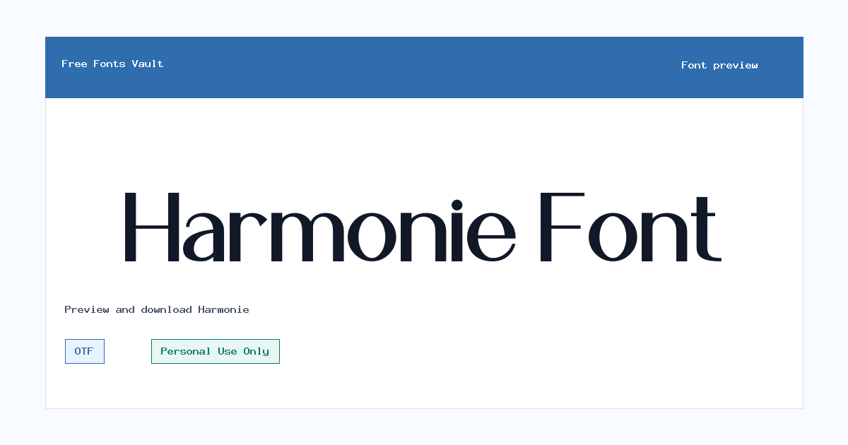
Harmonie
Harmonie includes 1 downloadable variant for live preview and testing.
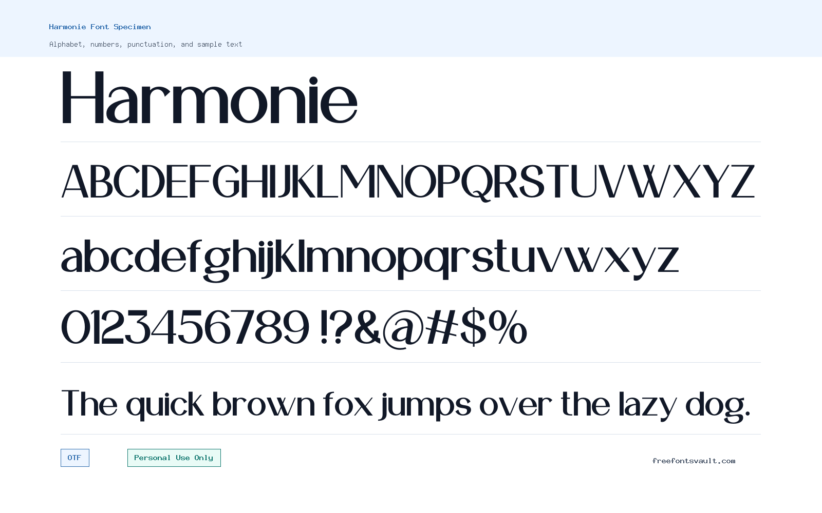
Font Specimen
Details
- Designer Annisa Febriani
- Foundry Masyafi Studio
- License Personal use only
- Format OTF
- Variants 1 file available
Harmonie font.
Harmonie is a sans serif font by Annisa Febriani of Masyafi Studio. It is offered in an OTF regular style and is licensed for personal use only, so it is best suited for non-commercial design testing, mockups, and personal creative work.
About Harmonie Font
Harmonie is a practical choice when you want to try a clean sans serif look without adding a complicated font family to your project. The available file is a regular-weight OTF, which makes it easy to test in common design apps for headings, short text blocks, social graphics, invitations, presentation mockups, and layout experiments. Because only one regular style is listed, it is better to treat Harmonie as a display or supporting typeface rather than a full branding system with multiple weights.
For visitors previewing the font, the most useful test is not just the alphabet. Try your real project words: a logo name, a poster headline, a menu title, a quote, or a short call-to-action. Look closely at letter spacing, repeated letters, punctuation, and mixed uppercase/lowercase combinations. Sans serif fonts can feel very different depending on the words used, so checking your own text before download will help you decide whether Harmonie fits the tone of your design.
Harmonie may be useful for personal logo concepts, mood boards, portfolio drafts, poster layouts, web mockups, and social media artwork where a straightforward sans serif is needed. It can also work as a starting point for comparing different font directions before choosing a final licensed typeface for a client or commercial release. If you are building a logo or brand identity, test the font at both large and small sizes. A style that looks clean in a big preview may need extra spacing adjustments in a compact logo, app header, or mobile layout.
Because the available style is regular weight, pair it with fonts that give your design enough contrast. For example, you can combine Harmonie with a serif for editorial-style headings, a softer script for personal invitations, or a heavier sans serif for stronger poster hierarchy. Avoid pairing it with another sans serif that looks too similar unless you are intentionally building a very minimal layout. When two fonts share the same role, the design can feel flat or unclear. A clear contrast in weight, width, or personality usually works better.
For web and interface mockups, use Harmonie carefully in body-size text until you have tested readability. Single-style fonts are often more comfortable in headings, labels, buttons, short descriptions, and hero sections than in long articles. If you plan to use it in a real website, also check browser rendering, line height, and spacing. The OTF format is useful for desktop design work, but web projects may require additional conversion or a properly licensed webfont package depending on your final use case.
The most important point is licensing. Harmonie is marked Personal Use Only. That means it should not be used in commercial work unless you obtain the correct permission or commercial license from the rights holder. Personal projects can include practice designs, school-style exercises, private mockups, or non-commercial artwork, but client projects, paid products, business branding, monetized content, merchandise, and advertising usually require commercial rights. When in doubt, contact the designer or foundry before using the font publicly.
Features
- Sans serif font family with a regular OTF style
- Suitable for testing clean headline, logo, poster, and layout concepts
- Single regular weight, best used where complex font hierarchy is not required
- Works well for personal mockups, draft branding ideas, and short text previews
- OTF format for desktop design apps and typography testing
Best Uses
- Personal logo drafts and name-based design experiments
- Poster headlines, quote graphics, and social media layouts
- Web mockups, landing page concepts, and button or label previews
- Mood boards, portfolio studies, and non-commercial presentation designs
- Pairing tests with serif, script, or heavier sans serif fonts
License Information
Harmonie is licensed for Personal Use Only. Do not use it for client work, business branding, paid products, advertising, merchandise, monetized content, or other commercial projects unless you obtain the proper commercial permission from the font owner.
Designer and Foundry
Harmonie is credited to designer Annisa Febriani and foundry Masyafi Studio.
Usage Tips
Preview your actual words before downloading, especially for logos, posters, and web mockups. Test uppercase, lowercase, numbers, punctuation, and spacing. Since only a regular style is listed, build hierarchy with size, spacing, color, or a contrasting companion font rather than relying on multiple weights.
FAQ
Is Harmonie free for commercial use?
No. Harmonie is marked Personal Use Only. You should not use it in commercial projects unless you get the correct commercial license or permission from the rights holder.
Who designed Harmonie?
Harmonie is credited to Annisa Febriani, with Masyafi Studio listed as the foundry.
What font format is included?
The listed font file is an OTF file in a regular style.
Can I use Harmonie for a logo?
You can test Harmonie in personal logo concepts and drafts. For a business, client, product, or public brand logo, check and obtain the correct commercial license first.
Is Harmonie good for posters?
Harmonie can be tested for personal poster designs, especially short headings or simple text layouts. Preview the exact title and adjust spacing if the design needs a more polished look.
Can I use Harmonie on a website?
You may test it in personal web mockups, but a live commercial website would require the proper license. Also check whether a webfont version or conversion is allowed under the license terms.
What should I pair with Harmonie?
Try pairing it with a serif for contrast, a script for softer personal designs, or a heavier sans serif for strong headings. Avoid using another font that looks too similar unless you want a very minimal result.
Is Harmonie suitable for long paragraphs?
Test it first before using it for long text. With only a regular style listed, it may be easier to use for headings, labels, short descriptions, and layout previews.
Similar Fonts
Want to browse beyond this family? Return to All Fonts for the main directory.



