Font Directory
Greenwich
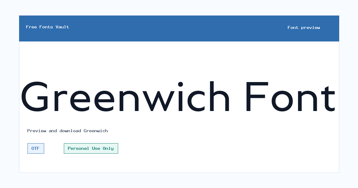
Greenwich includes 18 downloadable variants for live preview and testing.
Styles in this family
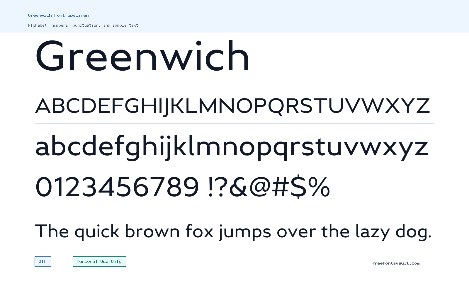
Font Specimen
Details
- Designer Andriy Konstantynov
- Foundry Mint Type
- License Personal use only
- Format OTF
- Variants 18 files available
Greenwich font.
Greenwich is a sans serif font family with a wide range of OTF styles, from Thin to Black, plus matching italic files. It gives visitors room to test light, regular, bold, and heavy text before choosing a style for a personal design project.
About Greenwich Font
Greenwich works best when you want a clean sans serif with enough weight options to build contrast. The lighter cuts can suit quiet headings, captions, or refined short text, while the Bold, ExtraBold, and Black styles are better for stronger titles and display use. Matching italic files make it easier to create emphasis without switching to another family.
Use the preview tool to test the exact words you plan to use, not just sample text. Try names, short headlines, menu labels, and any punctuation you need. Thin and ExtraLight styles may look elegant at large sizes but can lose clarity when used too small. Heavy weights should be checked for spacing in all caps, especially in logos, posters, thumbnails, and narrow layouts.
Features
- OTF font files with upright and italic styles
- Multiple weights including Thin, Light, Regular, Medium, Bold, ExtraBold, and Black
Best Uses
- Personal posters, headings, social graphics, and title treatments
- Testing a coordinated sans serif family with matching italic emphasis
License Information
The listed license is Personal Use Only. Do not use Greenwich in paid, client, brand, product, app, merchandise, advertising, or other commercial work unless you confirm and obtain the correct commercial license from the rights holder.
Designer and Foundry
Greenwich is credited to designer Andriy Konstantynov and the foundry Mint Type.
Usage Tips
Download and install the OTF files you need, then test the font in your design software at the final size. Use lighter weights for larger, spacious text and heavier weights for short display copy. For body text or long paragraphs, check readability carefully before committing. Also compare the upright and italic styles in the same layout, because italics can work well for accents, captions, or secondary lines but may feel busy when every word is slanted. If a design needs a calm editorial feel, leave more line spacing around the lighter weights.
FAQ
Is Greenwich free for commercial use?
No. The license information lists Greenwich as Personal Use Only, so commercial use needs separate permission or a commercial license.
What font formats are included?
The listed font files are in OTF format.
Does Greenwich include italic styles?
Yes. The family list includes italic files for several weights, including Regular Italic, Bold Italic, and Black Italic.
What should I test before downloading?
Preview your real text, check uppercase spacing, compare light and heavy weights, and make sure the style stays readable at the size you plan to use.
Similar Fonts
Want to browse beyond this family? Return to All Fonts for the main directory.



