Font Directory
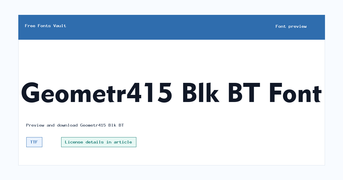
Geometr415 Blk BT
Geometr415 Blk BT includes 1 downloadable variant for live preview and testing.
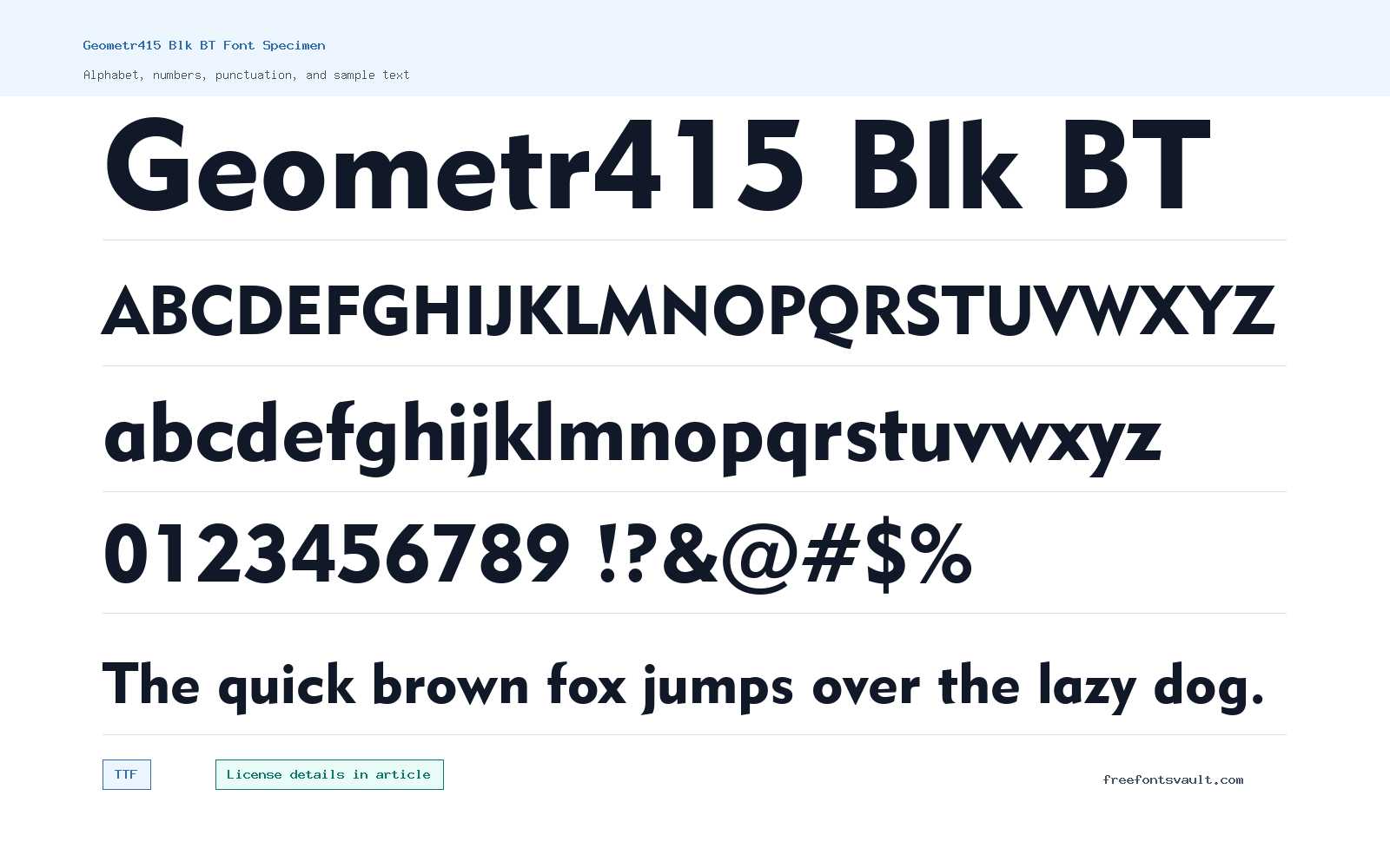
Font Specimen
Details
- Designer Bitstream Inc
- Format TTF
- Variants 1 file available
Geometr415 Blk BT font.
Geometr415 Blk BT is a very heavy geometric display font with a solid, block-like feel. It is best used when you need short text to look firm, direct, and easy to notice.
About Geometr415 Blk BT
Geometr415 Blk BT has a black-weight build, which means the letters carry a lot of visual weight. The shapes feel structured and compact, making the font useful for headlines, title graphics, poster text, labels, and other places where a strong display style is more important than long-form reading. Because the available font file is a TrueType font, it should work in most common design, office, and publishing apps that support TTF files.
Use the preview tool to test the exact words you plan to set before downloading. Heavy fonts can look powerful in a few words but may become crowded in long sentences, small sizes, or narrow layouts. Try uppercase and lowercase, check spacing between tight letter pairs, and preview the font on both light and dark backgrounds. For cleaner layouts, pair Geometr415 Blk BT with a simpler text font for body copy so the heavy style stays focused on the main message.
For dense black-weight lettering, spacing matters as much as the shape of the letters. If a word looks crowded, try slightly wider tracking, fewer words per line, or a larger layout area instead of forcing it into a small box.
For logo drafts or title lockups, preview the same word in both uppercase and lowercase and check whether the counters and joins stay clear. This is especially important for short names, initials, and compact product labels.
Features
- Black-weight geometric display style with a strong headline presence
- TrueType font file format for broad app compatibility
Best Uses
- Posters, banners, thumbnails, and bold title graphics
- Logos, labels, short headings, and display text that needs a firm block-style look
License Information
The license terms are not stated in the font information. Check the font package, download source, or rights holder information before using Geometr415 Blk BT in commercial work.
Designer and Foundry
The designer field names Bitstream Inc.
Usage Tips
Keep it for short, high-impact text. Increase letter spacing if the words feel too tight, and avoid using it for paragraphs or small interface text where the heavy strokes may reduce readability. Use strong contrast and plenty of surrounding space so the heavy strokes stay readable on banners, covers, and thumbnail graphics.
FAQ
What format is Geometr415 Blk BT?
The available file is a TTF font file.
Is Geometr415 Blk BT good for body text?
It is better for display use. The 900 weight is very heavy, so paragraphs and small text may feel dense or harder to read.
Can I use Geometr415 Blk BT for commercial projects?
The license is not stated in the font information. Confirm the license from the font package or rights holder before using it in any commercial project.
What should I test in the font preview?
Test your actual title or logo text, compare uppercase and lowercase, and check spacing at the size you plan to use.
Similar Fonts
Want to browse beyond this family? Return to All Fonts for the main directory.



