Font Directory
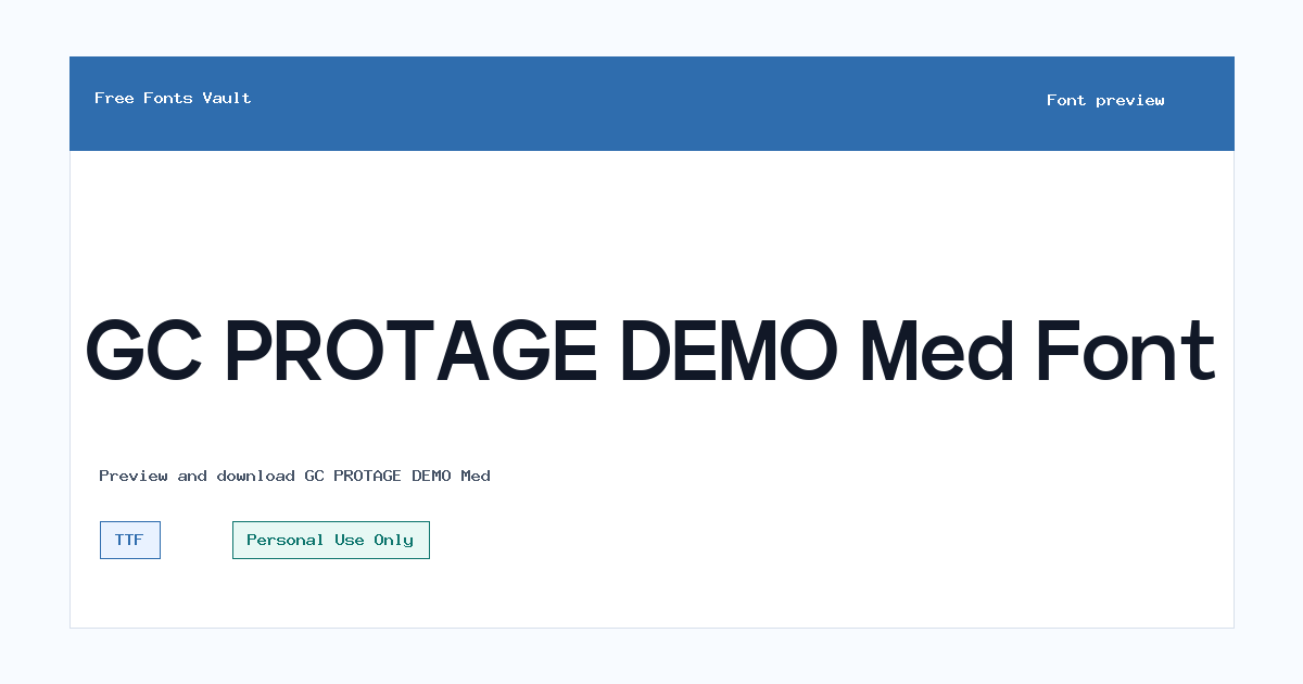
GC PROTAGE DEMO Med
GC PROTAGE DEMO Med includes 1 downloadable variant for live preview and testing.
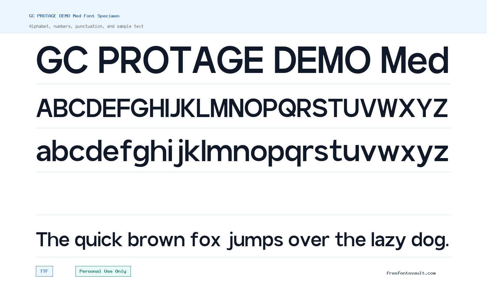
Font Specimen
Details
- Designer Dwi Indah Fadhilatul Amanah of Glyphonic
- Foundry Glyphonic
- License Personal use only
- Format TTF
- Variants 1 file available
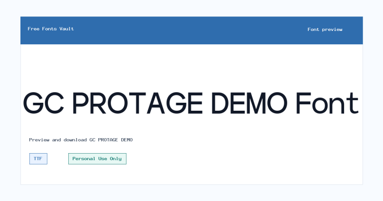
GC PROTAGE DEMO Med font.
GC PROTAGE DEMO Med is a medium-weight style from the GC Protage sans serif family. It gives designers a balanced option for testing clean headings, compact brand mockups, posters, and interface-style layouts without the heavier feel of a bold weight.
About GC PROTAGE DEMO Med
GC PROTAGE DEMO Med has the practical feel of a modern sans serif: simple letterforms, steady stroke weight, and enough presence to stand out in short lines of text. The “Med” weight is useful when regular feels too light but bold would look too forceful. In a font preview, try it with names, short titles, menu labels, product mockups, and social graphics to see how the spacing and letter shapes behave at different sizes.
Because this is a demo/personal-use font, it is best treated as a design-testing option rather than a finished commercial asset. Use it to explore whether the GC Protage look fits your project, compare it with lighter or heavier sans serif choices, and test how it pairs with a readable body font. For longer paragraphs, check comfort carefully: a medium sans serif can work for short descriptions, but it is usually strongest in headings, labels, navigation text, and display blocks where clarity and firmness matter.
Features
- Medium 500 weight for balanced emphasis without a heavy bold appearance
- TTF font format suitable for common desktop design and preview projects
- Normal style from the GC Protage sans serif family
- Good fit for short text tests such as headings, labels, posters, and mockups
Best Uses
- Logo drafts and brand concept previews
- Poster titles, social media graphics, and promotional layouts
- Website headers, navigation labels, and interface mockups
- Product packaging concepts and clean display typography tests
License Information
GC PROTAGE DEMO Med is marked as Personal Use Only. Use it for personal projects, previews, and testing unless you have a separate commercial license from the rights holder. Do not assume commercial use is allowed from the demo font alone.
Designer and Foundry
GC PROTAGE DEMO Med is credited to Dwi Indah Fadhilatul Amanah of Glyphonic, with Glyphonic listed as the foundry.
Usage Tips
Start by previewing the font in the exact words you plan to use, especially if your design depends on a brand name, title, or short phrase. Test it at both large and small sizes, then compare it with a simple serif or neutral sans serif for body text. Keep the medium weight for emphasis and structure, and avoid using it for long reading sections until you are sure the spacing and rhythm feel comfortable.
FAQ
Is GC PROTAGE DEMO Med free for commercial use?
No commercial-use permission is confirmed here. The font is marked Personal Use Only, so treat it as a personal/demo font unless you obtain a proper commercial license.
What kind of font is GC PROTAGE DEMO Med?
It is a medium-weight sans serif style from the GC Protage family. It is suited to clean short text, headings, labels, and design mockups.
What does the “Med” weight mean?
“Med” refers to a medium weight. It usually gives more visual strength than a regular weight while staying lighter and more restrained than bold.
Can I use GC PROTAGE DEMO Med for logos?
You can test it in logo drafts and personal concept work. For a real client, business, product, or public brand project, confirm and purchase the correct commercial license first.
What file format is included?
The listed font file is in TTF format, a common desktop font format used by many design and preview applications.
Is this font good for body text?
It may work for short descriptions, captions, or interface labels, but it is better to test readability before using it in long paragraphs. Medium sans serif weights often work best in headings and short blocks.
Similar Fonts


Want to browse beyond this family? Return to All Fonts for the main directory.



