Font Directory
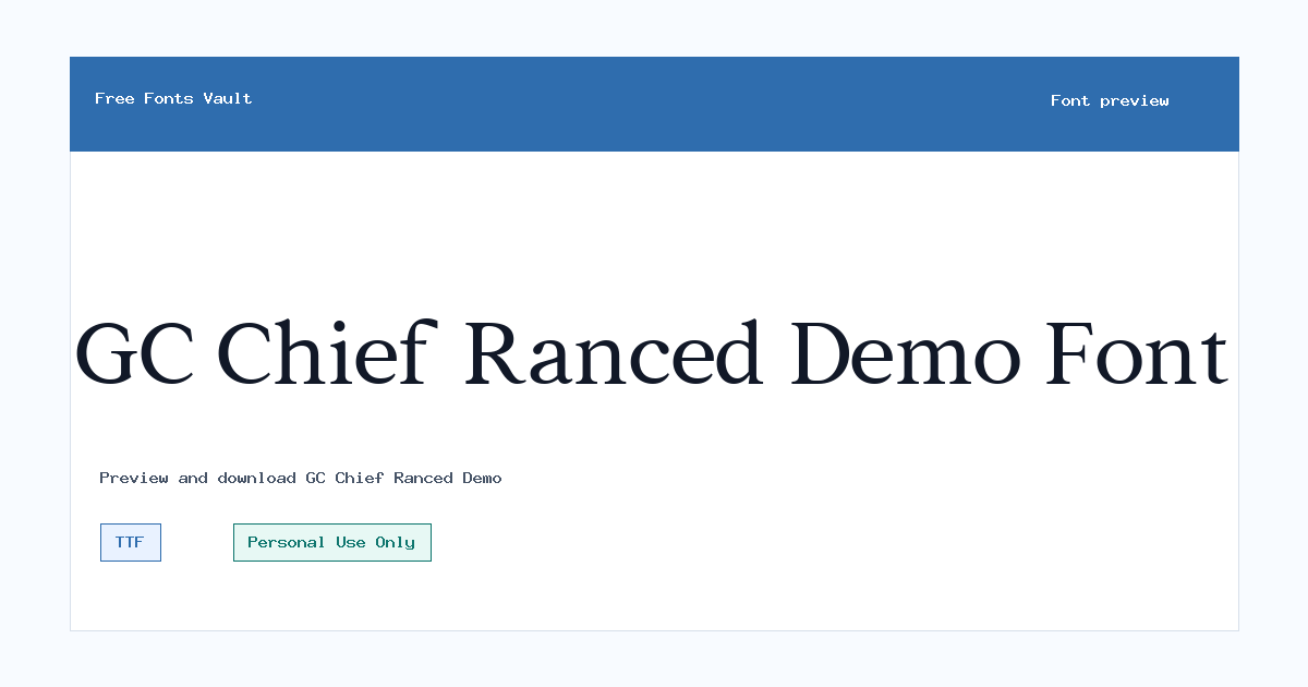
GC Chief Ranced Demo
GC Chief Ranced Demo includes 2 downloadable variants for live preview and testing.
Styles in this family
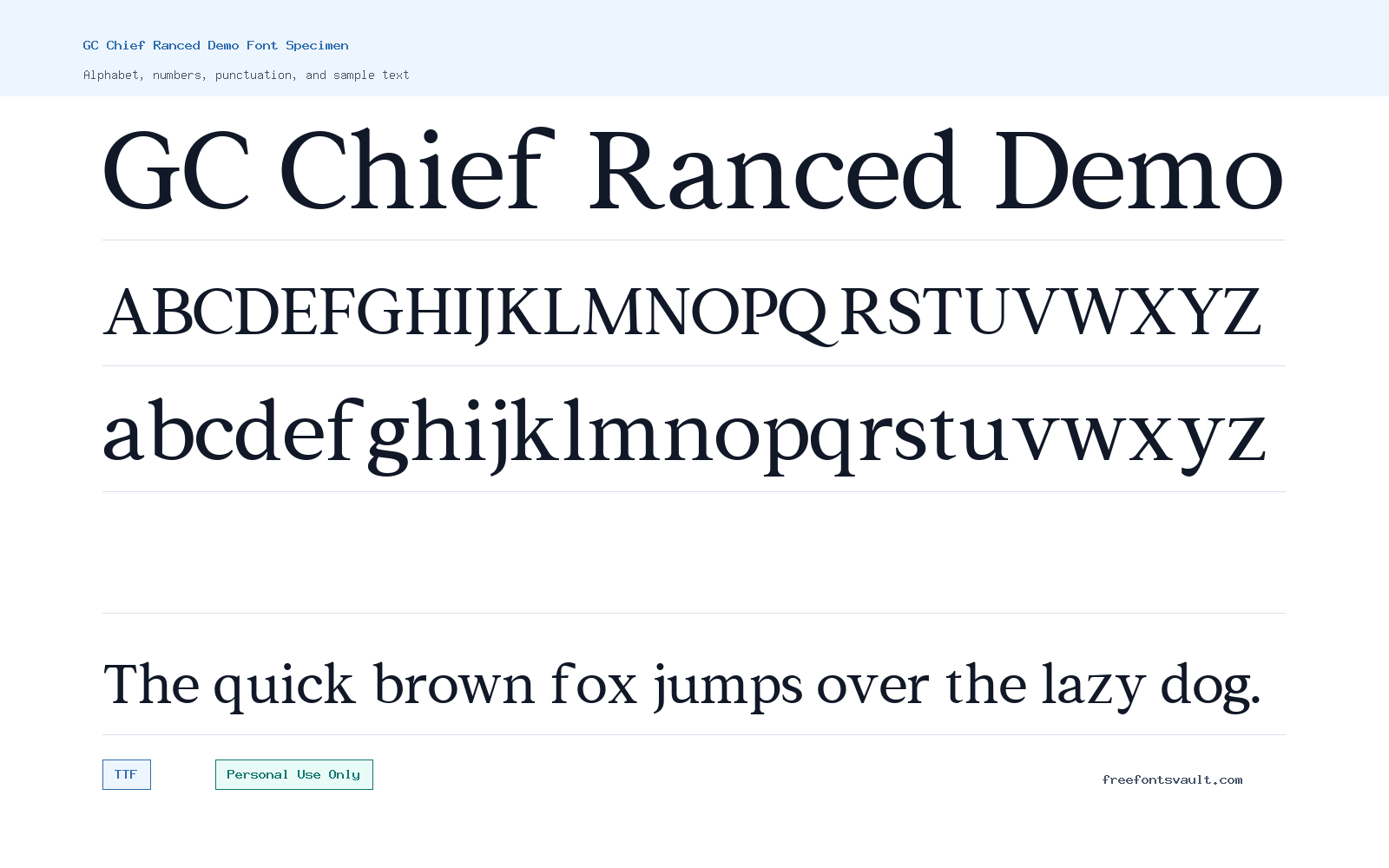
Font Specimen
Details
- Designer Abel Aurelia Thalitha of Glyphonic
- Foundry Glyphonic
- License Personal use only
- Format TTF
- Variants 2 files available
GC Chief Ranced Demo font.
GC Chief Ranced Demo is a serif display font family from Glyphonic, designed by Abel Aurelia Thalitha. It comes in regular and italic styles, making it useful for testing both upright headlines and more expressive slanted text in the same visual direction.
About GC Chief Ranced Demo
GC Chief Ranced Demo has the kind of serif personality that works best when the text is meant to be noticed. Rather than using it for long paragraphs, try it first in short lines: brand names, poster titles, packaging concepts, editorial headers, invitation headings, or social graphics. The regular style is the safer choice when you want a clear, stable title, while the italic style can add motion and a more crafted feel to selected words. Because this is a demo font, it is especially helpful for exploring mood, layout, and direction before deciding whether the typeface fits a larger project.
For logo work and identity mockups, keep the wording short and check every character you need before building a final design around it. Demo fonts sometimes have limited character sets or usage restrictions, so test uppercase, lowercase, numbers, punctuation, and any accented letters directly in the preview. For posters and web mockups, give the letters enough space and avoid shrinking them too far; decorative serif details can lose clarity at small sizes. If you pair GC Chief Ranced Demo with another typeface, use a plain sans serif or a quiet text serif for body copy so the display font can carry the visual focus without making the whole layout feel busy.
Features
- Serif display style suited to short, attention-focused text such as titles, names, and headings.
- Includes regular and italic TTF font files, both marked as normal weight 400.
Best Uses
- Logo drafts, wordmarks, packaging mockups, and brand presentation concepts.
- Posters, invitations, editorial headings, web hero mockups, and social media title graphics.
License Information
GC Chief Ranced Demo is marked as Personal Use Only. Use it for personal projects, previews, and non-commercial mockups unless you have a separate commercial license from the rights holder. Do not assume it is cleared for client work, merchandise, paid ads, business branding, apps, templates, or other commercial use.
Designer and Foundry
The designer is listed as Abel Aurelia Thalitha of Glyphonic, and the foundry is listed as Glyphonic.
Usage Tips
Start by previewing your exact wording in both the regular and italic styles. Use the regular style for the main title when readability matters most, and reserve the italic for emphasis, subtitles, initials, or a single highlighted word. For design mockups, pair it with a neutral sans serif for descriptions, buttons, captions, and other small text. If you plan to use the font beyond personal testing, confirm the license terms first.
FAQ
Is GC Chief Ranced Demo free for commercial use?
No. The license information marks GC Chief Ranced Demo as Personal Use Only. You should not use it in commercial projects unless you obtain a proper commercial license.
What font styles are included?
The family includes a regular TTF file and an italic TTF file. Both are listed with a normal 400 weight.
Can I use GC Chief Ranced Demo for a logo?
You can use it for personal logo experiments and mockups, but commercial logo use needs the right license. Also test all letters in the name before committing to the design.
Is this a good font for body text?
It is better treated as a display font for short text. For paragraphs, pair it with a simpler, more readable typeface.
What should I check before downloading or using it?
Preview your exact words, compare the regular and italic styles, check punctuation and numbers, and review the Personal Use Only license limit before using it in any public or paid project.
Similar Fonts
Want to browse beyond this family? Return to All Fonts for the main directory.



