Font Directory
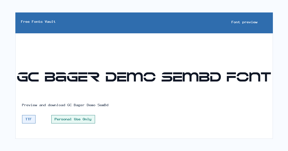
GC Bager Demo SemBd
GC Bager Demo SemBd includes 1 downloadable variant for live preview and testing.
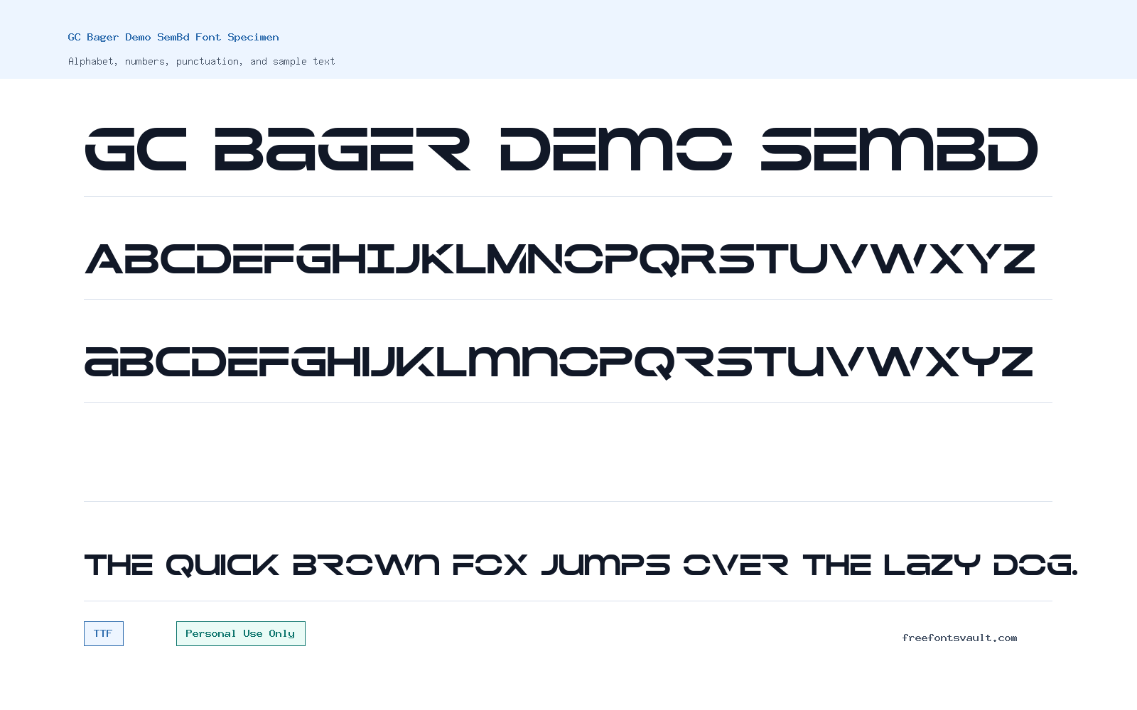
Font Specimen
Details
- Designer Laila Nuzul Maghfiroh of Glyphonic
- Foundry Glyphonic
- License Personal use only
- Format TTF
- Variants 1 file available
GC Bager Demo SemBd font.
GC Bager Demo SemBd is a bold display font with a sharp, futuristic look. Its wide shapes, sliced strokes, and squared curves make it better for short visual text than for long reading.
About GC Bager Demo SemBd
GC Bager Demo SemBd has a tech-style sans serif appearance built around heavy strokes and distinctive horizontal cuts. The letters feel wide, low, and mechanical, with rounded corners balanced by straight, angular details. In a wordmark or poster headline, the font quickly gives text a sci-fi, gaming, automotive, or modern product feel without needing extra decoration. The sample file is a TrueType font, so it should be easy to test in most design apps that support TTF files.
Use this font where the shape of the letters is part of the design. It works best for short names, bold headings, cover titles, YouTube thumbnails, apparel concepts, esports-style graphics, tech posters, and logo mockups. It is not a good choice for paragraphs, small captions, or text that needs to be read quickly at a small size. The cut-through construction can make some letters feel similar when they are tightly spaced, so test your exact wording in the preview before using it in a finished layout.
For logo work, GC Bager Demo SemBd can be a strong starting point when you want a compact futuristic mark. Try it in uppercase first, because the capitals carry the style clearly. Mixed case can also work, but the lowercase letters are stylized rather than quiet, so they still feel display-focused. If you plan to customize the letters for a logo, check spacing around letters such as A, G, R, B, X, and Y, because the strong geometry can create uneven gaps depending on the word.
For posters and web mockups, give the font enough room. Larger sizes help the sliced details stay clean, while extra tracking can make the word shape easier to read. A simple layout usually works better than a crowded one: use GC Bager Demo SemBd for the main title, then use a plain sans serif for supporting information. Avoid pairing it with another heavily stylized futuristic font unless you want an intentionally intense look. A neutral grotesk, geometric sans, or simple UI font will keep the design balanced.
The demo font file appears to have limited character support. Basic uppercase and lowercase Latin letters are present, but numbers and common punctuation were not found in the inspected character map. That means it may not work for dates, prices, usernames, handles, slogans with punctuation, or text that includes symbols. If your design needs digits, punctuation, accents, or multilingual text, test the exact characters first and consider checking the full family or a licensed version from the foundry.
Features
- Bold futuristic sans serif letterforms with horizontal sliced details
- Wide display shapes suited to short titles, logos, and poster text
- TrueType font format for broad design-app compatibility
- Best at large sizes where the cut letter details remain visible
- Limited demo character support, with basic letters but no detected numerals or common punctuation
Best Uses
- Technology logo concepts
- Gaming and esports graphics
- Poster headlines
- Album or cover title mockups
- YouTube thumbnails and social media titles
- Streetwear or apparel text layouts
- Futuristic web hero mockups
License Information
GC Bager Demo SemBd is marked as Personal Use Only. Use it for personal projects, previews, and non-commercial testing unless you have permission or a separate commercial license from the rights holder. Do not assume it is cleared for client work, products, advertising, merch, apps, logos for a business, or other commercial uses.
Designer and Foundry
The font is credited to Laila Nuzul Maghfiroh of Glyphonic, with Glyphonic listed as the foundry.
Usage Tips
Keep the font for short, high-impact text. Test the full word before committing to a design, especially if the text includes numbers, punctuation, or tight spacing. Pair it with a clean, readable sans serif for body copy, menus, descriptions, and smaller labels.
FAQ
Is GC Bager Demo SemBd free for commercial use?
No. The license information marks it as Personal Use Only. For commercial work, look for a proper commercial license from the designer or foundry.
What kind of font is GC Bager Demo SemBd?
It is a bold display sans serif with a futuristic, cut-stroke style. It is made for short visual text rather than long reading.
Can I use GC Bager Demo SemBd for a logo?
You can test it in personal logo concepts, but commercial logo use needs the correct license. Also check the exact word carefully, because the stylized shapes may need spacing adjustments.
Does the font include numbers and punctuation?
The inspected demo file showed basic uppercase and lowercase letters, but numbers and common punctuation were not detected. Test your exact text before using it in a design.
What should I pair with GC Bager Demo SemBd?
Pair it with a clean sans serif that stays readable. Let GC Bager Demo SemBd handle the main title, then use the simpler font for descriptions, buttons, credits, and body text.
Is this a good font for website body text?
No. Its heavy, sliced display style is better for hero headings, banners, and graphic titles. Use a more readable font for paragraphs and interface text.
Similar Fonts
Want to browse beyond this family? Return to All Fonts for the main directory.



