Font Directory
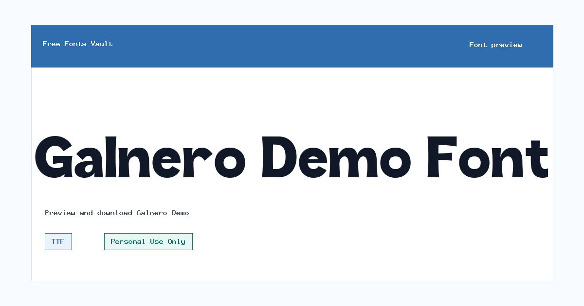
Galnero Demo
Galnero Demo includes 1 downloadable variant for live preview and testing.
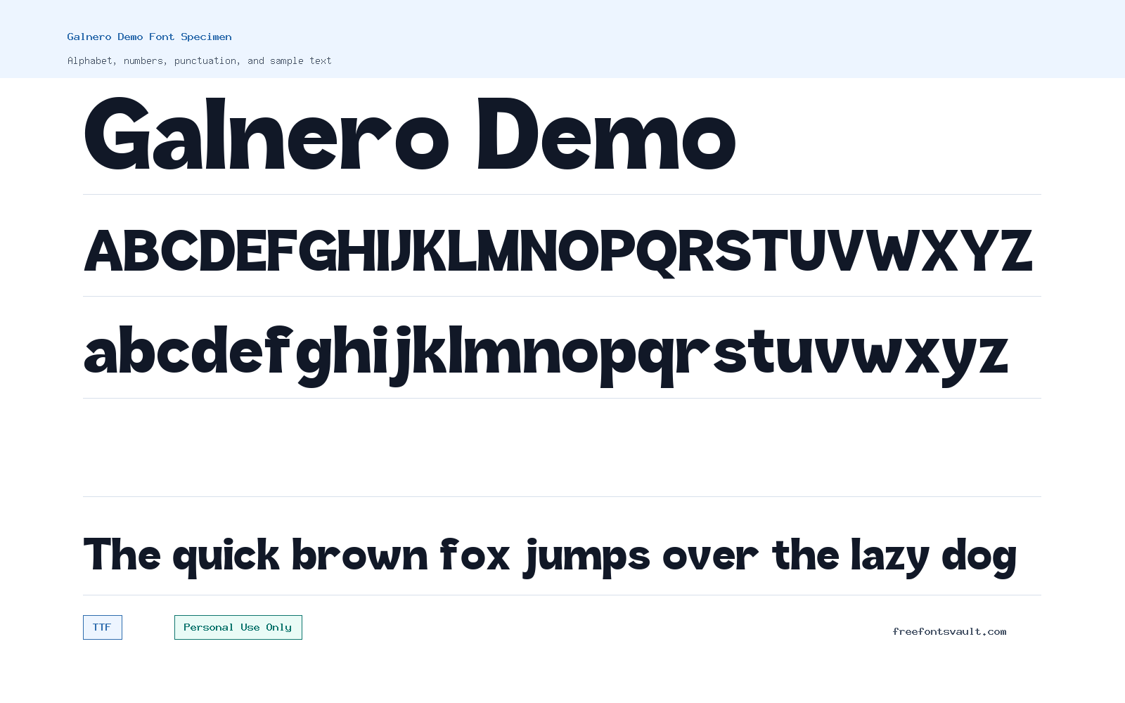
Font Specimen
Details
- Designer Ragamkata Studio
- License Personal use only
- Format TTF
- Variants 1 file available
Galnero Demo font.
Galnero Demo is a personal-use font from Ragamkata Studio with a clean display feel that suits short, confident text. Use the preview tool to test your own words before downloading, especially if you plan to use it for logos, posters, or social graphics.
About Galnero Demo
Galnero Demo comes as a regular TTF font with a normal style and 400 weight, making it easy to install and test in most design apps. The name suggests a demo cut, so the safest way to judge it is by typing the exact words you want to use and checking spacing, letter shapes, and how the font behaves at different sizes. It is a good candidate for short display settings where the font can be noticed without needing long paragraphs.
For design work, try Galnero Demo in headings, nameplates, poster titles, packaging mockups, logo drafts, YouTube thumbnails, and web hero concepts. Keep the text short at first: brand names, one-line slogans, menu headers, event titles, and bold callouts are better tests than full body copy. If you want to use it in a logo concept, check every letter in the brand name carefully. Some demo fonts look strong in a sample word but may need manual spacing adjustments when used in real names, initials, or all-caps layouts.
Because only the regular style is listed, build contrast with size, color, spacing, and layout rather than relying on multiple weights. For example, use Galnero Demo for the main headline and pair it with a quiet sans serif for descriptions, buttons, captions, and longer text. Avoid pairing it with another loud display font unless the design is intentionally experimental. A simple supporting typeface will help Galnero Demo stand out without making the page or poster feel crowded.
In web mockups, Galnero Demo can work well for visual direction and presentation screens, but test legibility on both desktop and mobile layouts. Display fonts often look best when given enough room, so add generous line height and avoid squeezing letters into narrow columns. If the design uses small labels, menus, or paragraph text, choose a more neutral font for those areas and keep Galnero Demo for the parts that need personality.
For posters and social posts, test a few treatments before choosing the final style. Try title case, uppercase, wider tracking, tight tracking, and centered layouts. Check how the font looks over images, gradients, and flat backgrounds. If the edges or details feel less clear at small sizes, increase the font size or simplify the message. A strong short title will usually work better than a long sentence.
Features
- Regular TTF font file for easy testing in common design and desktop apps.
- Normal style with 400 weight, suitable for headline trials, display text, and layout mockups.
- Useful for short-form design work where the main text needs a clear visual voice.
- Single-style family, so contrast should come from layout choices such as scale, spacing, and color.
Best Uses
- Logo drafts and brand-name tests
- Poster titles and event graphics
- Website hero headings and landing page mockups
- Social media graphics, thumbnails, and banners
- Packaging concepts and short product labels
- Mood boards and typography exploration
License Information
Galnero Demo is marked as Personal Use Only. Use it for personal projects, practice designs, private mockups, and non-commercial previews unless you obtain the correct commercial license from the rights holder. Do not assume it is cleared for client work, paid branding, merchandise, ads, apps, templates, or public commercial campaigns.
Designer and Foundry
The designer is listed as Ragamkata Studio. No foundry details or official designer link are provided in the available font information.
Usage Tips
Install the TTF file, type your own sample text, and inspect the letters you actually need. For logos and titles, adjust tracking by hand and compare uppercase, lowercase, and title-case versions. For longer layouts, pair Galnero Demo with a plain sans serif or readable serif so paragraphs, menus, and captions stay easy to read. If the project is commercial, confirm the licensing terms before using the font in final artwork.
FAQ
Is Galnero Demo free for commercial use?
No. The license information marks Galnero Demo as Personal Use Only. For commercial projects, you should get the proper license from the font owner or designer.
Who designed Galnero Demo?
Galnero Demo is credited to Ragamkata Studio.
What format is the Galnero Demo font file?
The listed font file is a TTF file, which is widely supported by desktop design software and many operating systems.
What kind of projects is Galnero Demo good for?
It is best tested in short display uses such as logo drafts, poster titles, web mockups, social graphics, thumbnails, and packaging concepts.
Can I use Galnero Demo for body text?
It is better to test it as a headline or display font first. For paragraphs, captions, and interface text, pair it with a more neutral and highly readable font.
Does Galnero Demo include multiple weights?
Only a regular 400-weight style is listed, so you should create hierarchy with size, spacing, color, and layout instead of relying on extra font weights.
Similar Fonts
Want to browse beyond this family? Return to All Fonts for the main directory.



