Font Directory
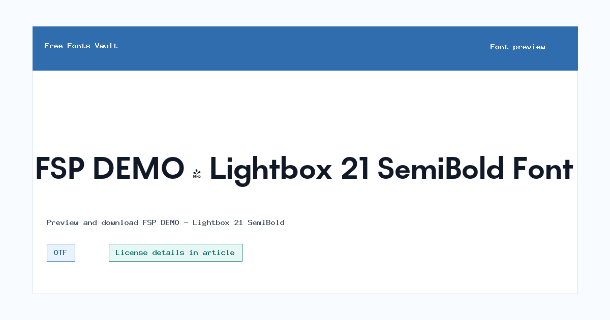
FSP DEMO - Lightbox 21 SemiBold
FSP DEMO - Lightbox 21 SemiBold includes 1 downloadable variant for live preview and testing.
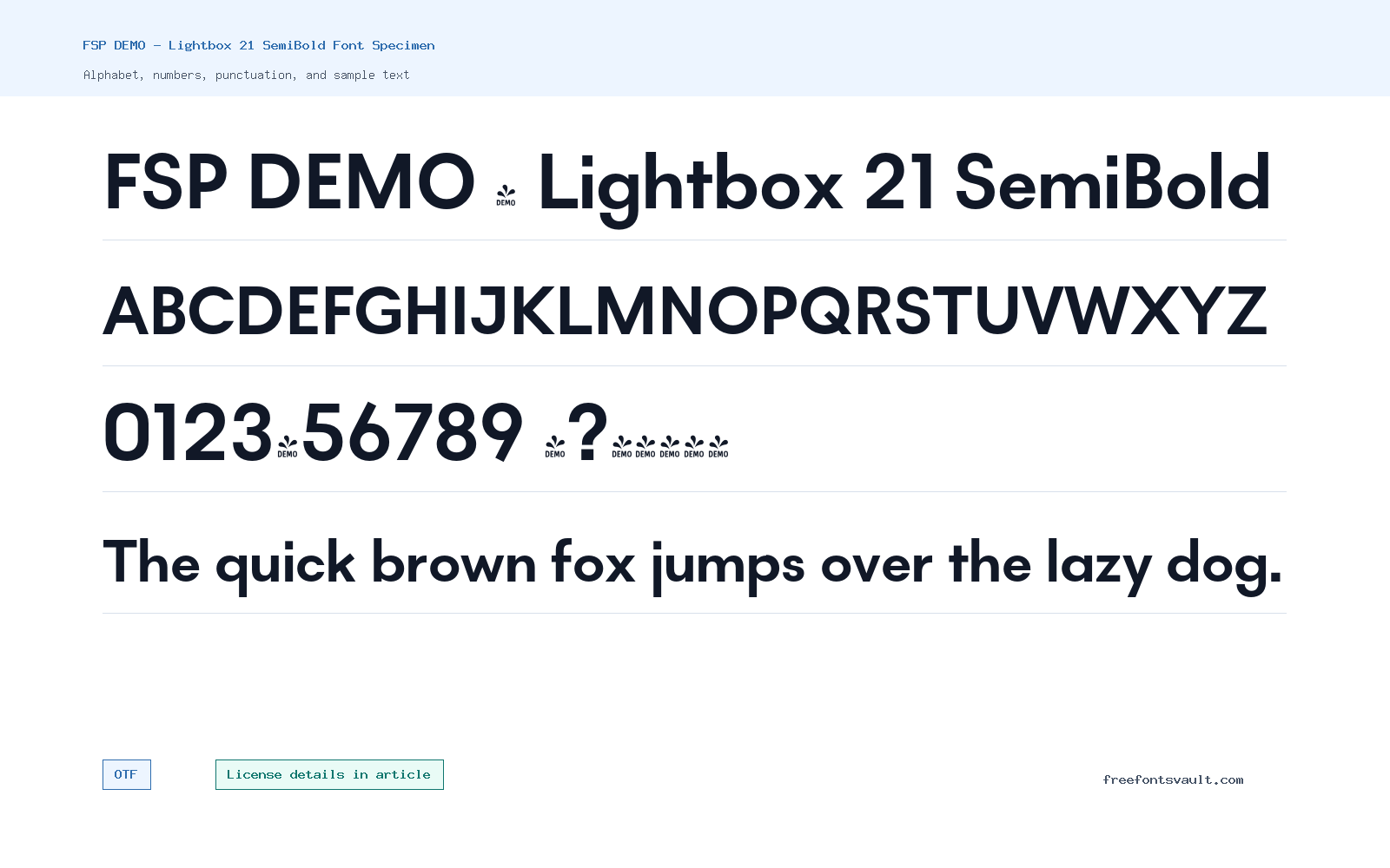
Font Specimen
Details
- Designer Ben Jones
- Foundry Protimient
- License URL www.protimient.com
- Format OTF
- Variants 1 file available
FSP DEMO – Lightbox 21 SemiBold font.
FSP DEMO – Lightbox 21 SemiBold is a 700-weight OTF font credited to Ben Jones and Protimient. It gives text a firm, confident weight without needing a full extra-bold treatment.
About FSP DEMO – Lightbox 21 SemiBold Font
Lightbox 21 SemiBold is a practical choice when a layout needs more presence than a regular weight can give. The stored font data lists a normal style, 700 weight, and OTF format, so it is best tested as a heading, label, button, or short display face. It can help section titles, interface labels, poster lines, and thumbnail text feel clearer and more deliberate.
The name includes FSP DEMO, so license care matters. Demo fonts are often distributed for testing, previewing, or limited personal evaluation, while commercial usage may require a separate purchase or permission. Before using this font in client work, advertising, packaging, apps, merchandise, or a public brand system, check the terms from Protimient or the designer.
Use the preview with your real words before downloading. Semi-bold fonts can look polished in short lines but heavy in paragraphs, especially if spacing is tight. Try title case, all caps, numbers, and punctuation, then compare it against the final background color. If it feels too dense, increase letter spacing slightly or reserve it for headings while a lighter companion font carries body copy.
For best results, compare Lightbox 21 SemiBold against the surrounding typography instead of judging it alone. It can bring useful emphasis to a headline or button, but a full page of 700-weight text may feel heavy. Keep hierarchy simple: one strong line for attention, then a calmer font for the reading work.
Features
- OpenType OTF font file
- 700-weight semi-bold style with normal style metadata
- Credited to Ben Jones and Protimient
- Useful for headings, labels, buttons, and short graphic text
Best Uses
- Section headings, title cards, and poster text
- Buttons, labels, navigation accents, and UI emphasis
- Thumbnail text, short promotional graphics, and clean display layouts
- Projects where a firm weight is needed without an overly heavy look
License Information
The font has a Protimient license URL listed, but the exact usage terms are not shown on this page. Because the file name includes DEMO, confirm the license before commercial use, redistribution, branding, paid client work, or product packaging.
Designer and Foundry
FSP DEMO – Lightbox 21 SemiBold is credited to designer Ben Jones and foundry Protimient.
Usage Tips
Start with headings and short labels. Test all-caps settings carefully, keep line lengths modest, and pair it with a lighter readable font for paragraphs or longer explanations.
FAQ
What format is FSP DEMO – Lightbox 21 SemiBold?
The listed download is an OTF font file.
What weight is this font?
The stored font data lists it as 700 weight, commonly used for bold or semi-bold emphasis depending on the family.
Who made FSP DEMO – Lightbox 21 SemiBold?
The font is credited to Ben Jones, with Protimient listed as the foundry.
Can I use it commercially?
Confirm the Protimient terms first. The DEMO naming means it should not be treated as automatically cleared for commercial use.
What is it best for?
It is best for headings, labels, buttons, thumbnails, and short display text that needs a stronger weight.
Family Styles
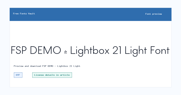
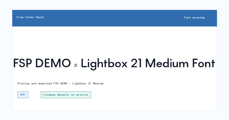
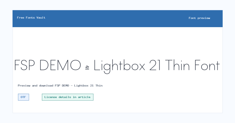
Want to browse beyond this family? Return to All Fonts for the main directory.



