Font Directory
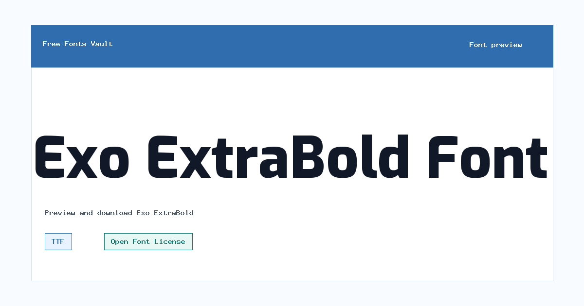
Exo ExtraBold
Exo ExtraBold includes 1 downloadable variant for live preview and testing.
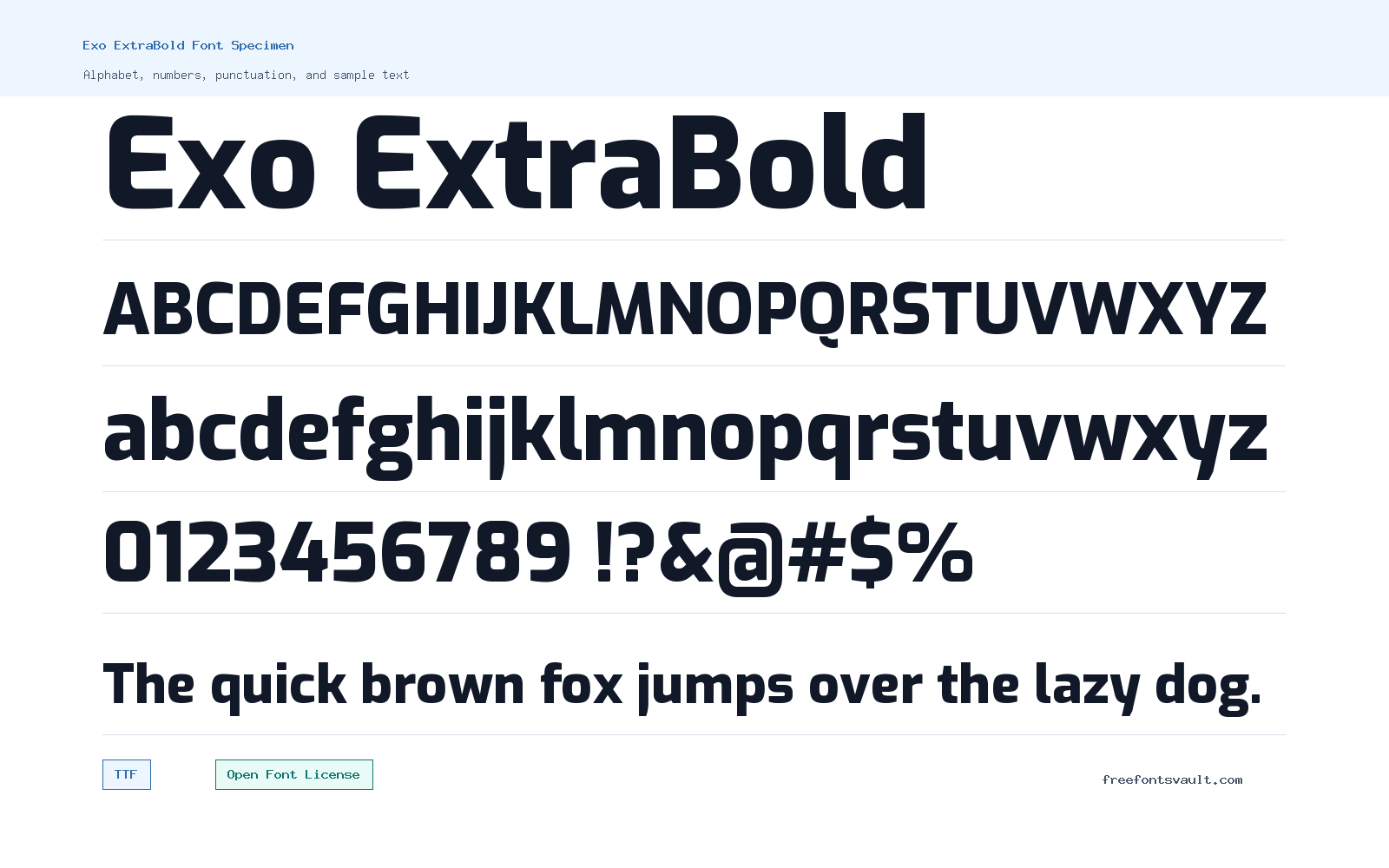
Font Specimen
Details
- Designer Natanael Gama
- Foundry Natanael Gama
- License Open Font License
- License URL scripts.sil.org/OFL
- Format TTF
- Variants 1 file available
Exo ExtraBold font.
Exo ExtraBold is a strong 700-weight style for readers who need a heavier version of the Exo family for titles, display text, and short emphasis.
About Exo ExtraBold
Exo ExtraBold uses a normal style with a bold 700 weight, so it is better suited to short, high-impact text than long paragraphs. Use it where the words need to stand out quickly: headers, poster lines, buttons, banners, section titles, and preview text that needs a firm visual presence.
The download is supplied as a TTF file, which is a common desktop font format and works well for testing in design apps and many system font managers. In the preview, try uppercase words, short headlines, numbers, and mixed-case phrases. ExtraBold weights can become dense at small sizes, so check spacing and readability before using it for captions or body copy.
Features
- ExtraBold 700 weight for strong headline and display use
- TTF font file in normal style
Best Uses
- Website headings, hero text, and section titles
- Posters, social graphics, labels, buttons, and short display copy
License Information
Exo ExtraBold is licensed under the SIL Open Font License, Version 1.1. Check the OFL terms if you plan to modify, bundle, redistribute, or embed the font in a product.
Designer and Foundry
Exo ExtraBold is credited to Natanael Gama, with Natanael Gama also listed as the foundry.
Usage Tips
Use Exo ExtraBold for short text where weight and contrast matter. For longer reading, pair it with a lighter or regular text face and test the spacing at the exact size you plan to use. Exo ExtraBold is most useful when the heading needs real weight. Try it for title cards, technology-style banners, section headers, and short product or project names where a strong sans serif can carry the layout. Keep long reading text in a lighter or more neutral companion style so the heavy weight stays useful as emphasis. If you set it in all caps, compare the result at mobile size and leave enough spacing around the line. For web or app mockups, check how the heavier strokes behave in buttons, navigation labels, and narrow columns. If the words feel cramped, reduce the weight for secondary labels and keep Exo ExtraBold for one clear focal point. This keeps the design bold without making every line compete for attention.
FAQ
What file format is Exo ExtraBold?
The downloadable font file is in TTF format.
What weight is Exo ExtraBold?
The font is listed with a 700 weight, which is commonly used for bold or heavy display text.
Can I use Exo ExtraBold in commercial work?
The font is licensed under the SIL Open Font License 1.1. Review the OFL terms for the exact rules on use, modification, embedding, and redistribution.
Is Exo ExtraBold good for body text?
It is better for headings and short emphasis. For long paragraphs, test a lighter companion style or another readable text font.
Who designed Exo ExtraBold?
The font is credited to Natanael Gama.
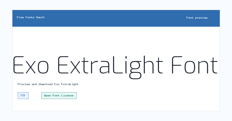
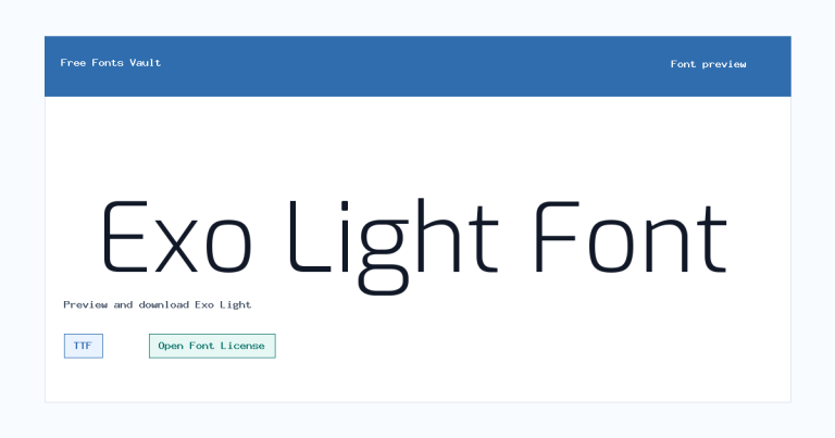
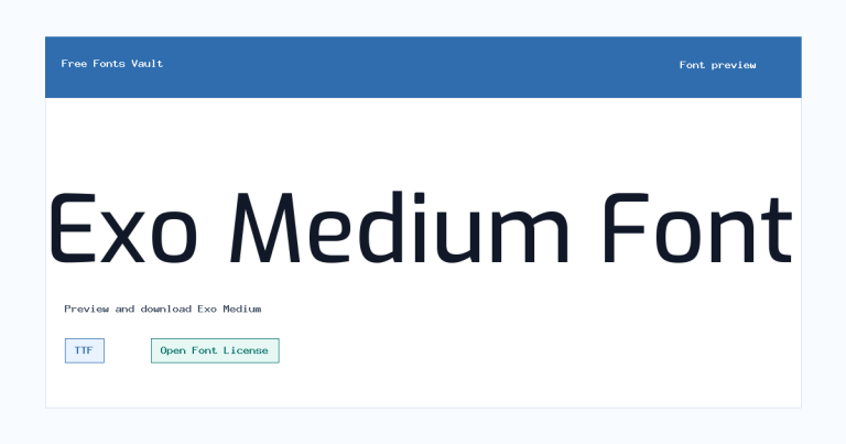
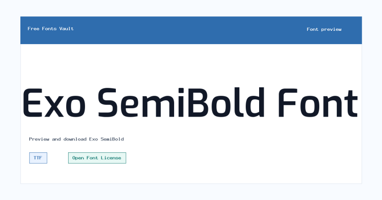
Family Styles
Want to browse beyond this family? Return to All Fonts for the main directory.



