Font Directory
Edition
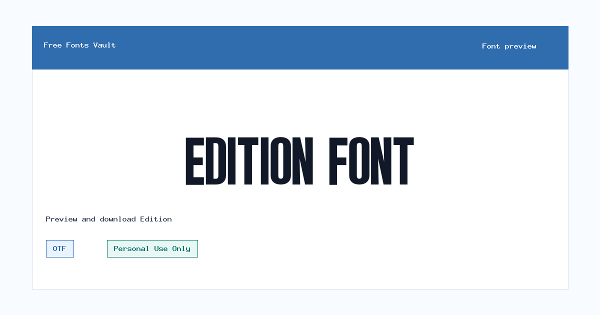
Edition includes 1 downloadable variant for live preview and testing.
Font Specimen
Details
- Designer Nurinto
- Foundry Funtype Co.
- License Personal use only
- Format OTF
- Variants 1 file available
Edition font.
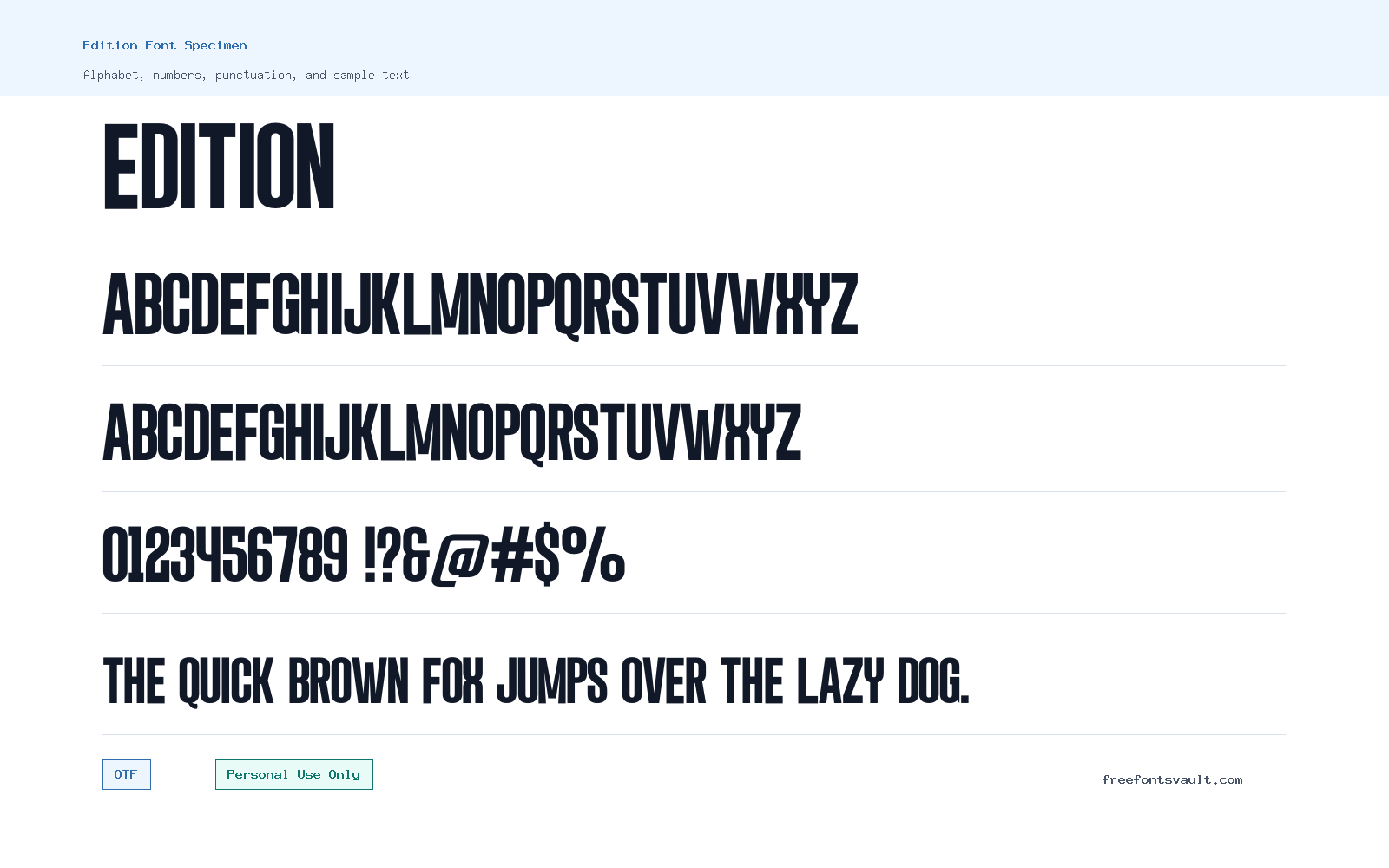
Edition is a bold condensed sans serif font with a tall, narrow build and strong all-caps impact. It suits short display text where you want a compact headline, poster title, logo draft, or web mockup to feel firm and direct.
About Edition Font
Edition has a heavy upright style with tight proportions, straight sides, and a clean sans serif structure. The regular font file reads like a display face rather than a body-text typeface: letters are narrow, dark, and closely packed, giving words a strong vertical rhythm. Its uppercase forms are especially useful for titles, banners, labels, thumbnails, and short promotional lines. The lowercase set follows the same condensed feel, so it still works best in short phrases rather than long paragraphs.
Use Edition when space is limited but the design still needs weight. It can help a poster title fit into a narrow column, give a logo concept a bold blocky tone, or make a hero heading stand out in a web mockup. Because the shapes are dense, test it at the exact size you plan to use. Add tracking for all-caps text, avoid very small sizes, and pair it with a calmer, wider font for descriptions, menus, or article copy.
Features
- Condensed sans serif letterforms with a bold display feel
- Regular OTF font file with upright, non-italic styling
- Strong uppercase presence for headlines and title graphics
- Compact spacing that helps short words fit into tight layouts
- Best suited to display use rather than long reading text
Best Uses
- Poster headlines and event title layouts
- Logo concepts, badge designs, and wordmarks for personal projects
- YouTube thumbnails, social graphics, and bold quote cards
- Hero headings and landing-page mockups
- Packaging mockups, labels, and short brand-style treatments
- Sports, streetwear, music, gaming, or editorial-style title experiments
License Information
Edition is marked as Personal Use Only. Use it for personal previews, mockups, practice designs, and non-commercial experiments. Do not use it in paid client work, commercial logos, merchandise, advertising, apps, templates, or business branding unless you obtain the proper license from the rights holder.
Designer and Foundry
Edition is credited to designer Nurinto and foundry Funtype Co. The font data identifies the family as Edition Regular.
Usage Tips
For the cleanest result, use Edition in short text blocks. Try uppercase titles first, then adjust letter spacing if the word feels too tight. It can look powerful in black and white, high-contrast poster designs, and compact logo drafts. For web layouts, use it for headings only and choose a readable companion font for paragraphs. A neutral sans serif, geometric sans, or simple humanist sans can balance Edition’s narrow, heavy shape. Avoid pairing it with another very condensed display font unless you want a deliberately intense look.
FAQ
Is Edition free for commercial use?
No. The license is Personal Use Only, so commercial use needs a separate license or permission from the rights holder.
What kind of font is Edition?
Edition is a condensed sans serif display font. It has tall, narrow, bold letters made for short, eye-catching text.
Who designed Edition?
Edition is credited to Nurinto, with Funtype Co. listed as the foundry.
What file format does the download use?
The listed font file is in OTF format, which is commonly supported by design apps and modern operating systems.
Can I use Edition for a logo?
You can test it in personal logo concepts and mockups. For a real business logo, client logo, product mark, or monetized project, check and purchase the correct license first.
Is Edition good for paragraphs?
Not really. Its condensed, heavy style is better for headlines, titles, labels, and short phrases. Use a more open text font for paragraphs.
How should I pair Edition with another font?
Pair it with a simpler, more readable sans serif for body text. Keep Edition for the main title so the layout has contrast without becoming crowded.
Similar Fonts
Want to browse beyond this family? Return to All Fonts for the main directory.



