Font Directory
Baflion Sans Black
Baflion Sans Black includes 1 downloadable variant for live preview and testing.
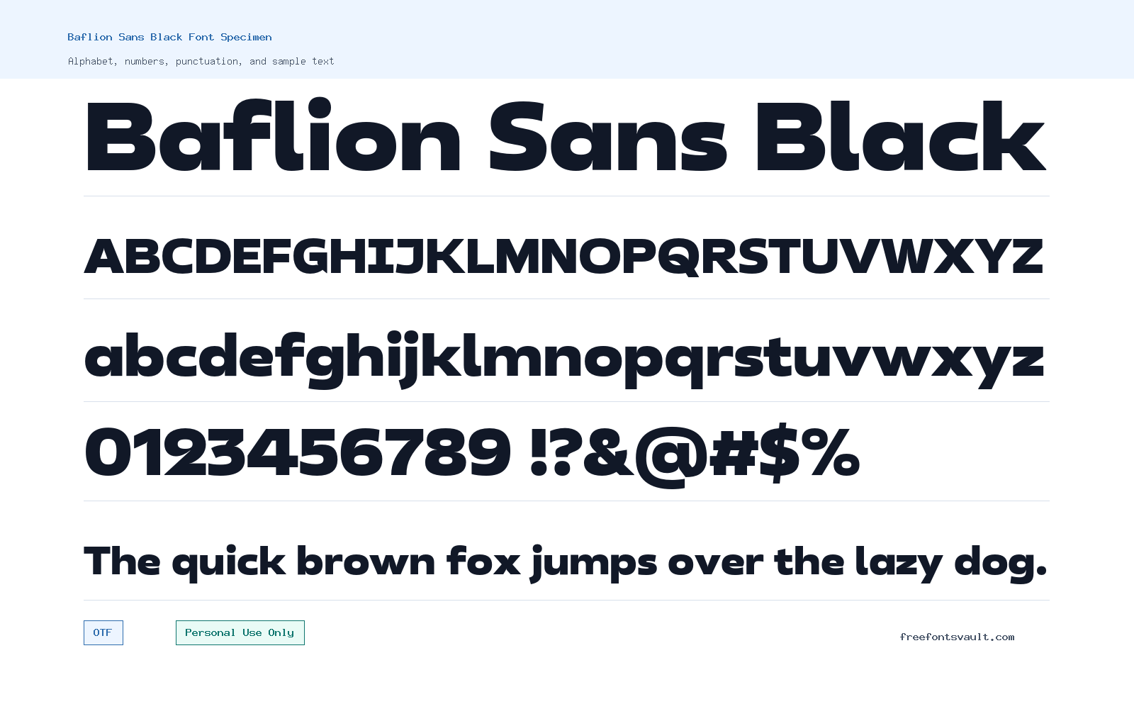
Font Specimen
Details
- Designer Sarwo Edi
- Foundry Oktnum Type Foundry
- License Personal use only
- Downloads 1
- Format OTF
- Variants 1 file available
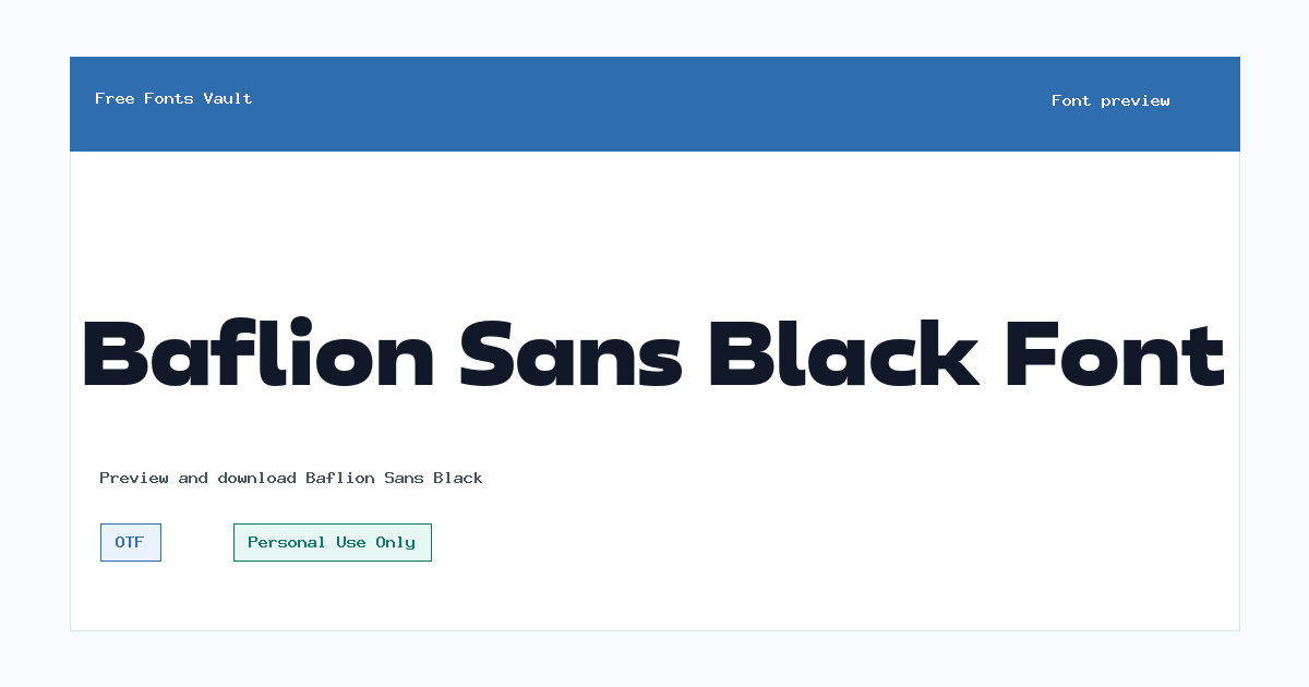
Baflion Sans Black font.
Baflion Sans Black is a heavy sans serif font made for strong display text. Its black weight gives short words, titles, and branding mockups a firm, confident look without needing extra decoration.
About Baflion Sans Black
Baflion Sans Black is best approached as a headline and display font rather than a long-reading text face. The available style is a normal upright OTF font with a 900 weight, so it is built around impact, density, and clear block-like presence. That makes it useful when a design needs one strong line to stand out: a poster title, a logo concept, a packaging label, a YouTube thumbnail, a social graphic, or a bold website hero headline. Because it is a sans serif in a black weight, the main strength is direct visual force. It should work especially well in short phrases where the letters have enough room to breathe.
When testing Baflion Sans Black in the preview box, try real words from your project instead of only the sample alphabet. Heavy fonts can change character quickly depending on spacing, word length, and letter combinations. Start with logo names, product names, event titles, or two-to-five-word headlines. Then check the result at both large and small sizes. If the text feels too tight, increase letter spacing slightly. If the font feels too loud beside other design elements, use it for the main word only and pair it with a quieter regular-weight sans serif for supporting details. For web mockups, it can be a good choice for large hero text or navigation concepts, but it should be tested carefully before using it in paragraphs or small interface labels.
For logo work, Baflion Sans Black can help create a simple, weighty wordmark direction. Keep the layout clean and avoid adding too many shadows, outlines, or effects until the letter shapes have been tested on their own. For posters and social posts, give the text generous margins so the black weight does not crowd the design. For packaging or label concepts, compare the font against the final product size; a style that looks sharp on a large screen may need more spacing when printed smaller. If you use it in a brand concept, check whether the license allows the final commercial purpose before delivering it to a client.
Font pairing is easiest when Baflion Sans Black carries the main message and another simpler typeface handles the rest. Try pairing it with a neutral sans serif in regular or medium weight for subtitles, dates, captions, and body copy. Avoid pairing it with another very heavy display font unless the design is intentionally loud, because two strong voices can compete. A light serif can also work for contrast in editorial layouts, but keep the hierarchy clear: Baflion Sans Black for the punch, the companion font for reading comfort.
The download file is in OTF format, which is commonly supported by design apps and operating systems. After installing it, test it in the software you plan to use, especially if your project needs exporting to print, PDF, or web assets. If you are preparing a website, remember that an OTF desktop font is not the same as a ready-made webfont package. You may need proper webfont conversion and licensing permission before using it on a live commercial site.
Features
- Black-weight sans serif style suited to large display text and bold headings
- Normal upright OTF font file with a listed 900 weight
- Practical for short names, posters, thumbnails, packaging concepts, and logo mockups
- Works best when paired with a simpler text font for captions and longer reading
Best Uses
- Logo and wordmark concept previews
- Poster titles and event graphics
- Website hero headline mockups
- Social media graphics and thumbnails
- Packaging, label, and merchandise concept designs
- Bold typography experiments where short text needs high impact
License Information
Baflion Sans Black is marked as Personal Use Only. Use it for personal projects, practice designs, previews, and non-commercial mockups unless you have a separate license that permits commercial use. Do not assume it is free for client work, paid products, business branding, merchandise, advertising, apps, or live commercial websites.
Designer and Foundry
Baflion Sans Black is credited to Sarwo Edi, with Oktnum Type Foundry listed as the foundry.
Usage Tips
Use Baflion Sans Black at large sizes, keep lines short, and check spacing before exporting final artwork. It is a strong display choice, so let it handle the main title while a calmer companion font carries supporting text. For web or commercial projects, confirm the license terms first.
FAQ
Is Baflion Sans Black free for commercial use?
No commercial-use permission is shown. The license is marked Personal Use Only, so treat it as non-commercial unless you obtain a separate commercial license.
What kind of font is Baflion Sans Black?
It is a heavy sans serif display font. The listed weight is 900, which makes it better for strong headlines and short text than for long paragraphs.
What file format is included?
The available font file is an OTF file.
Can I use Baflion Sans Black for a logo?
You can test it in personal logo concepts and mockups. For a real business logo, client project, or brand identity, confirm and obtain the correct commercial license first.
Is this font good for body text?
It is not the best choice for long body text because the black weight is very strong. Use it for titles, names, and short display lines, then pair it with a lighter, more readable font.
How should I pair Baflion Sans Black?
Pair it with a clean regular-weight sans serif for modern layouts, or with a light serif if you want more contrast. Keep the companion font simple so the headline remains the focus.
Similar Fonts
Want to browse beyond this family? Return to All Fonts for the main directory.



