Font Directory
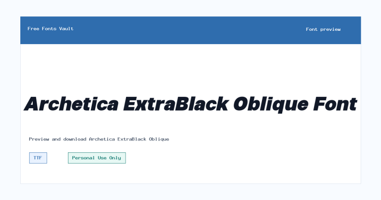
Archetica ExtraBold Oblique
Archetica ExtraBold Oblique includes 2 downloadable variants for live preview and testing.
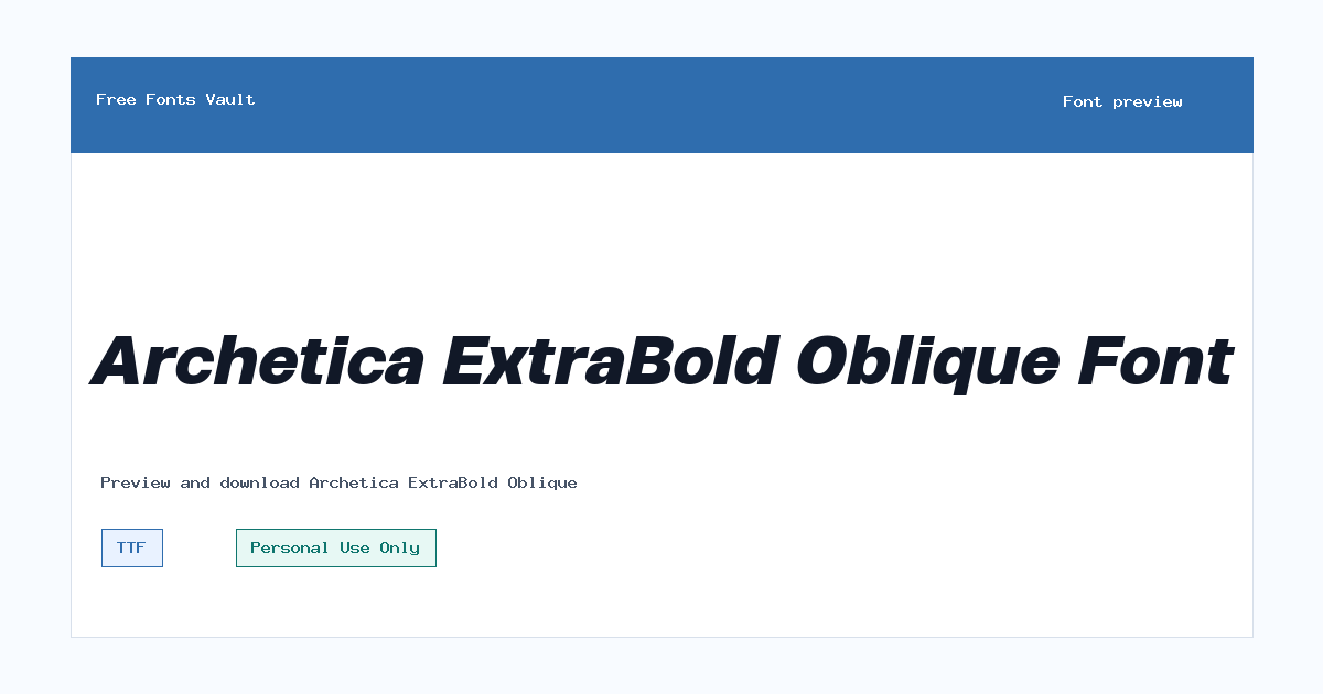
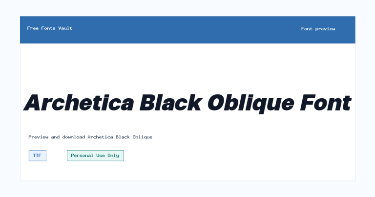
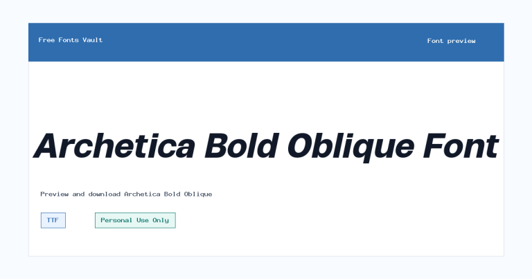
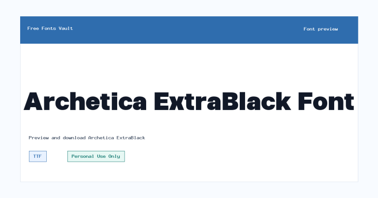
Styles in this family
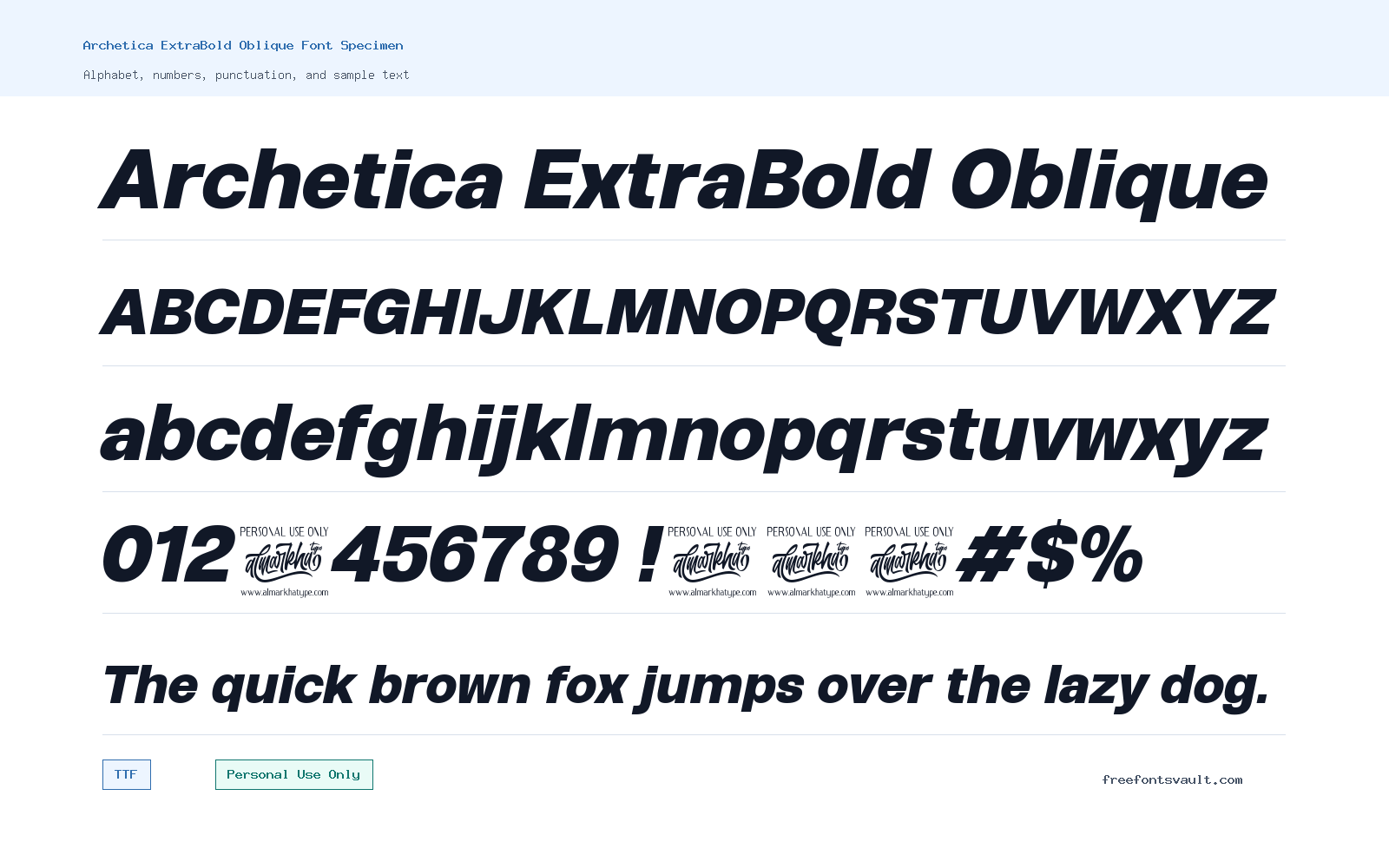
Font Specimen
Details
- Designer Ridwan Fadilah & Malik Wisnu
- Foundry Almarkhatype
- License Personal use only
- License URL almarkhatype.com
- Format TTF, OTF
- Variants 2 files available
Archetica ExtraBold Oblique font.
Archetica ExtraBold Oblique is a heavy italic font style with a forward-leaning, assertive look. It is best approached as a display choice for short text, titles, posters, logo drafts, and visual mockups where you want weight and movement in the same line.
About Archetica ExtraBold Oblique
Archetica ExtraBold Oblique uses a strong extra-bold weight with an italic style, giving words a dense shape and a clear sense of direction. That combination can work well when a design needs emphasis without relying on decorative effects. In a headline, the weight helps the text hold attention, while the oblique angle adds energy and speed. Because the style is both bold and slanted, it is most useful in controlled amounts: brand marks, short poster titles, section headers, packaging concepts, social graphics, apparel text, and web hero mockups.
For visitors testing the font, start with the exact words you plan to use rather than a generic sample. Extra-bold italic fonts can change the rhythm of a phrase quickly, especially when letters sit close together. Check uppercase and lowercase versions, test numbers if your design needs them, and look carefully at spacing in pairs such as AV, To, Wo, and Yo. If the preview feels too dense in a long sentence, reduce the length, add tracking, or reserve the font for the main word only. It can pair with a plain sans serif for body text, navigation, captions, or supporting information, allowing Archetica ExtraBold Oblique to stay focused on impact rather than readability-heavy paragraphs.
Features
- Extra-bold weight with an italic/oblique style for strong, forward-leaning display text.
- Available in both TTF and OTF font formats for flexible testing in common design apps.
- Useful for short, high-emphasis typography such as titles, logo concepts, posters, and web mockups.
- Best used at medium to large sizes where the heavy shapes and slant have enough room to read clearly.
- Personal Use Only licensing is indicated, so commercial projects need separate permission or confirmation.
Best Uses
- Poster headlines and event graphics that need a bold, energetic title.
- Logo drafts, wordmarks, and branding mockups where a heavy italic style fits the concept.
- Web hero sections, landing page mockups, and promotional banners.
- Sports, gaming, apparel, music, or product concept visuals that need strong short-form type.
- Social media graphics, thumbnails, and quote cards with minimal supporting text.
- Packaging or label concepts where one main word needs to stand out.
License Information
The license information for Archetica ExtraBold Oblique indicates Personal Use Only. Use it for personal previews, practice designs, and non-commercial testing unless you have permission for broader use. For client work, paid products, advertising, logos used by a business, merchandise, apps, websites, or any other commercial project, check the license terms through Almarkhatype before using the font.
Designer and Foundry
Archetica ExtraBold Oblique is credited to Ridwan Fadilah & Malik Wisnu, with Almarkhatype listed as the foundry. The related designer/foundry link points to almarkhatype.com.
Usage Tips
Use Archetica ExtraBold Oblique where the type needs to act as a visual feature, not as quiet reading text. It should perform best in short phrases, bold labels, names, slogans, and title treatments. For logo work, test the mark at several sizes, including small favicon-like uses and large poster-scale uses, because heavy italic forms can feel different across sizes. For web mockups, consider using it as a heading image or carefully loaded font only after confirming the license allows your intended use. Pair it with a neutral upright sans serif so menus, paragraphs, and fine print remain easy to read. Avoid setting long paragraphs, dense captions, or small mobile text in this style, because the extra-bold weight and slant may reduce comfort over longer reading.
FAQ
Is Archetica ExtraBold Oblique free for commercial use?
No commercial-use permission is confirmed. The license information indicates Personal Use Only, so commercial projects need separate permission or a suitable license from Almarkhatype.
What kind of font is Archetica ExtraBold Oblique?
It is an extra-bold italic/oblique style font. That makes it better for display typography such as titles, posters, logo concepts, and promotional graphics than for long body text.
Who designed Archetica ExtraBold Oblique?
The font is credited to Ridwan Fadilah & Malik Wisnu, with Almarkhatype listed as the foundry.
What font formats are available?
Archetica ExtraBold Oblique is available in TTF and OTF formats. Both are common desktop font formats used in many design and layout applications.
Can I use this font in a logo?
You can test it in personal logo concepts, but a real business logo or client project may count as commercial use. Confirm the license with Almarkhatype before using it in any public or commercial identity.
What should I pair with Archetica ExtraBold Oblique?
Pair it with a simple upright sans serif for paragraphs, menus, captions, and supporting text. Keeping the companion font neutral helps the bold italic headline stand out without making the whole design feel crowded.
Is it good for website body text?
It is not the best choice for long website body text. Use it for headings, hero words, banners, or short calls to action, then choose a more readable upright font for longer reading.
Family Styles
Want to browse beyond this family? Return to All Fonts for the main directory.



