Font Directory
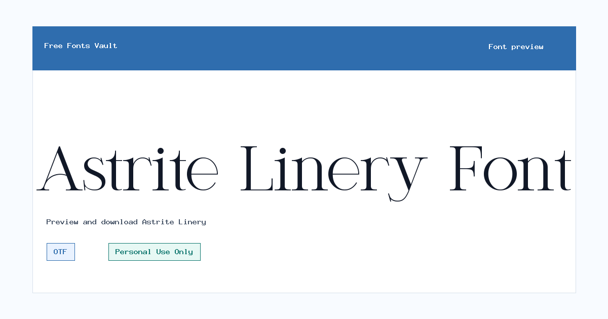
Astrite Linery
Astrite Linery includes 1 downloadable variant for live preview and testing.
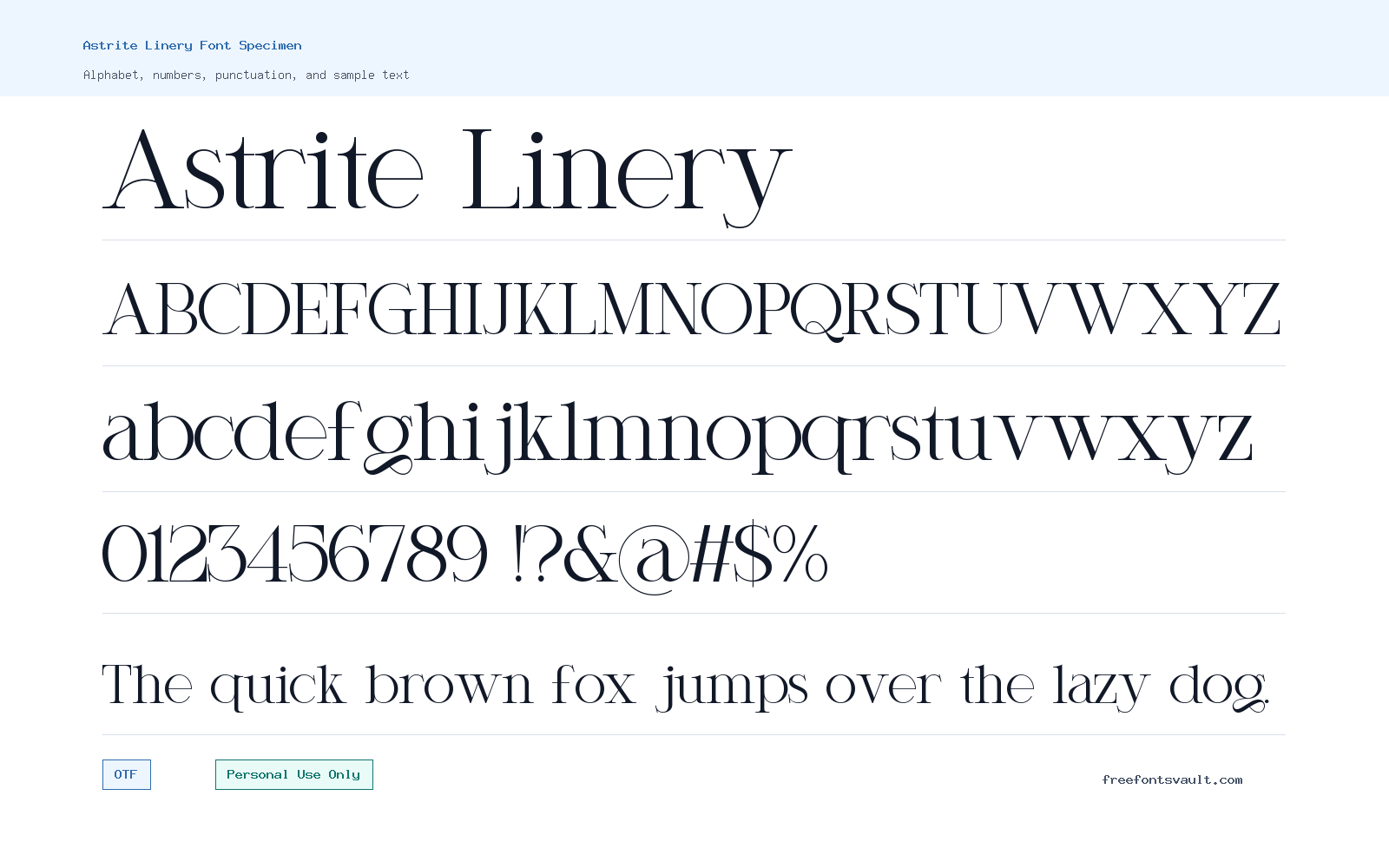
Font Specimen
Details
- Designer ErmediaStudio
- License Personal use only
- Downloads 1
- Format OTF
- Variants 1 file available
Astrite Linery font.
Astrite Linery is a regular serif font from ErmediaStudio with an OTF font file for personal projects. It is best approached as a display-friendly typeface: test it with your own words, check spacing at different sizes, and keep the Personal Use Only license in mind before using it beyond private work.
About Astrite Linery
Astrite Linery works well when you need a serif look for short, styled text rather than long blocks of reading. The font file identifies the family as Astrite Linery, with a Regular style and 400 weight, so the download is straightforward if you only need one main style. Because there are no bold, italic, or extra weights listed for this family, plan your design around the regular cut instead of relying on a full type system. Use the preview box to try names, headings, initials, invitations, quote lines, or a few words from your actual design before downloading.
For best results, start with display sizes. Serif fonts can look elegant in titles, but the real test is how they handle your exact text. Try uppercase and lowercase letters, numbers, punctuation, and any special characters you expect to use. The font includes basic Latin letters, digits, and common punctuation in the file, which makes it suitable for many simple English-language layouts. If you are preparing a logo draft, product mockup, social graphic, or client-facing concept, check the license first; the listed license is Personal Use Only, so commercial use should not be assumed. Pair Astrite Linery with a quiet sans serif for body text if you want the serif style to stand out without making the whole layout feel busy.
Features
- Regular OTF font file with normal style and 400 weight
- Includes uppercase letters, lowercase letters, numbers, and common punctuation
Best Uses
- Personal invitation drafts, quote graphics, and decorative headings
- Short titles, name-based designs, mood boards, and non-commercial previews
License Information
Astrite Linery is listed as Personal Use Only. Use it for personal testing and non-commercial projects unless you obtain separate permission or a commercial license from the rights holder.
Designer and Foundry
The designer information names ErmediaStudio. No separate foundry name or designer website is listed in the font page facts.
Usage Tips
Use Astrite Linery for short text first, then check readability before using it in paragraphs. Since only one regular style is listed, create contrast with size, spacing, color, or a paired sans serif rather than expecting bold or italic variants.
FAQ
Is Astrite Linery free for commercial use?
No commercial-use permission is listed. The license note says Personal Use Only, so do not use it in paid work, branding, products, ads, or client projects unless you confirm and obtain the proper license.
What file format is included?
The listed font file is an OTF file. OTF fonts are commonly used on desktop design apps and can also be used in web projects when the license allows that use.
Does Astrite Linery include bold or italic styles?
Only a regular, normal-style 400 weight variant is listed. If you need bold or italic emphasis, pair it with another font or adjust your layout instead of expecting extra styles in this download.
What should I test in the preview before downloading?
Try your real headline, a name, numbers, punctuation, and a few short phrases. Also test both uppercase and lowercase text, because decorative serif fonts can feel very different depending on capitalization.
Is Astrite Linery good for body text?
Use caution with long paragraphs. It is better suited to short display text, headings, and personal design previews. For longer reading, pair it with a simple text font.
Similar Fonts
Want to browse beyond this family? Return to All Fonts for the main directory.



