Font Directory
TRT Burn
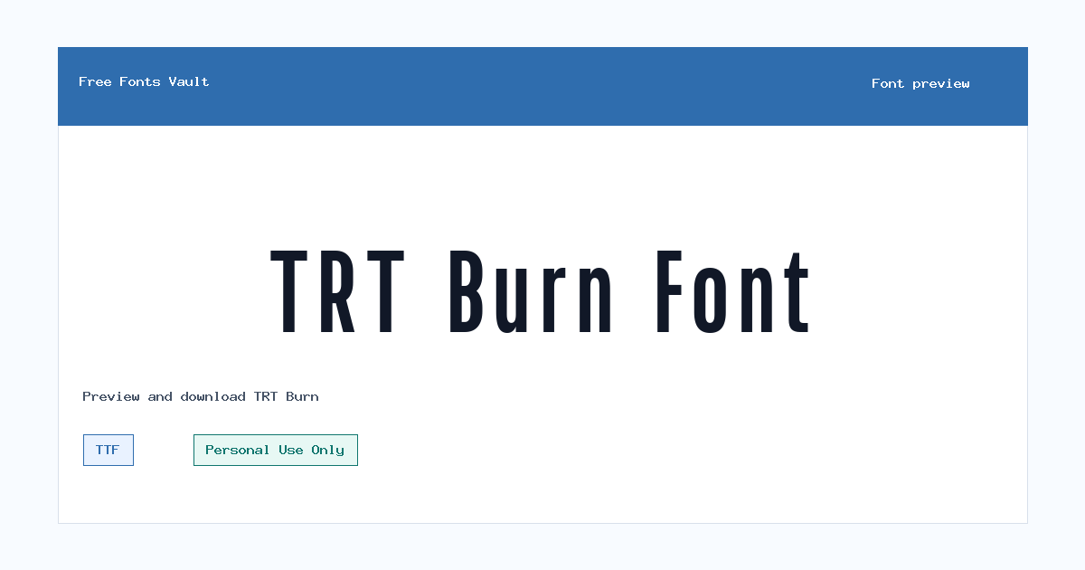
TRT Burn includes 2 downloadable variants for live preview and testing.
Styles in this family
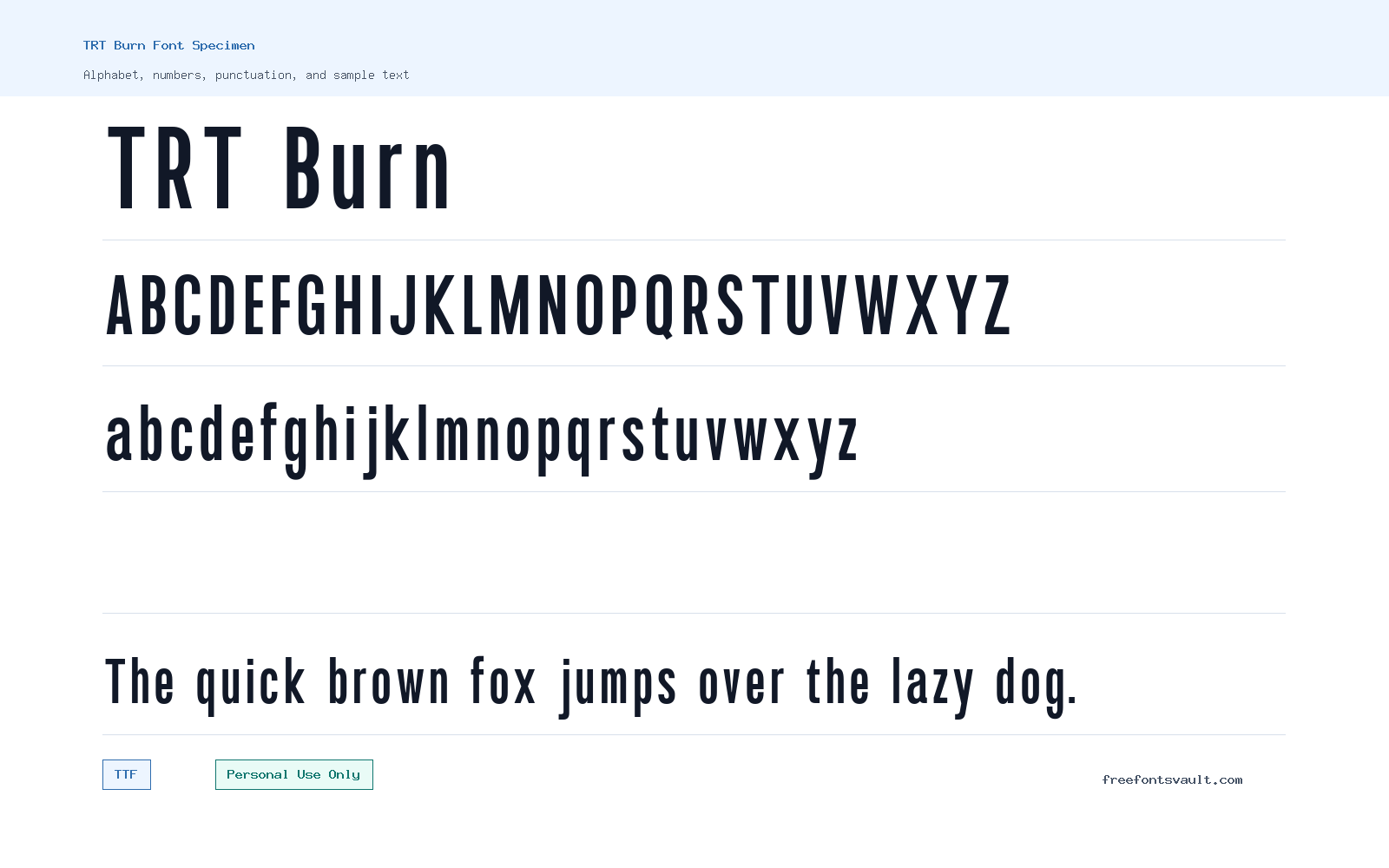
Font Specimen
Details
- Designer Zainaldi Ibrahim of Truetype
- Foundry Truetype
- License Personal use only
- Format TTF
- Variants 2 files available
TRT Burn font.
TRT Burn is a sans serif display font with a strong, compact feel that works best when the words need to stand out quickly. It comes in regular and bold TTF styles, making it useful for testing heavier headlines, poster text, logo sketches, and visual branding ideas before choosing a final type system.
About TRT Burn Font
TRT Burn has the kind of direct, attention-focused look that suits short text more than long reading. The available styles cover a regular weight and a bold weight, so you can try a lighter display setting or push the same design into a heavier headline. Because the font is offered as demo TTF files, it is a practical choice for previewing ideas in design software, mockups, and personal projects. It is not a font to judge only from the alphabet grid; type a few real words into the preview and look at how the spacing, letter shapes, and weight feel in the exact phrase you plan to use.
For design work, TRT Burn is most useful in places where the text is short and visual impact matters: poster titles, social graphics, YouTube thumbnails, album-style layouts, sports or streetwear-inspired concepts, game mockups, event flyers, and logo drafts. The bold style can carry a title on its own, while the regular style may be better for supporting words, smaller labels, or secondary lines. If you are testing it for logo work, try the brand name in all caps, title case, and lowercase if supported by your design needs. Also check letters that often affect logo balance, such as A, R, T, S, O, and any repeated characters in the name.
TRT Burn should be treated as a display face rather than a body-text font. Long paragraphs, dense menus, and small mobile text may become tiring if the shapes are too forceful at small sizes. A safer approach is to use TRT Burn for the main wordmark or headline, then pair it with a plain sans serif for descriptions, navigation, captions, and longer copy. This keeps the page or poster readable while still giving the main message a stronger voice.
When pairing TRT Burn, avoid combining it with another highly decorative font in the same layout. Two loud typefaces can compete and make the design feel unfocused. Use TRT Burn as the visual lead, then choose a neutral companion font with simple letterforms and comfortable spacing. For web mockups, it can work well in hero sections, promotional banners, and campaign visuals, but test the font size carefully. A headline that looks sharp on desktop may need extra spacing or a simpler layout on mobile.
Before using TRT Burn in any finished project, pay close attention to the license. The license information for this font says Personal Use Only. That means it is suitable for personal previews, non-commercial experiments, and private design tests, but it should not be used in client work, products, monetized graphics, business branding, paid ads, or other commercial projects unless you obtain the correct commercial license from the rights holder. If your project will be public, paid, sponsored, or connected to a business, confirm the license terms first.
Features
- Sans serif display style suited to short, high-impact text
- Regular and bold TTF font files for testing different headline weights
- Useful for personal design mockups, poster titles, logo drafts, and social graphics
- Best used at medium to large sizes where the shapes can be clearly seen
- Works more safely with a neutral sans serif companion font for body text
Best Uses
- Poster headlines and event flyer titles
- Logo concepts and wordmark drafts
- YouTube thumbnails, social media graphics, and promotional images
- Streetwear, sports, game, or music-themed personal mockups
- Hero sections and banner text in web design previews
- Short labels, badges, and bold display typography experiments
License Information
TRT Burn is marked as Personal Use Only. Use it for personal previews, practice layouts, and non-commercial experiments. Do not use it for client projects, business branding, paid products, monetized content, advertising, or commercial publishing unless you secure the proper commercial license from the font owner.
Designer and Foundry
TRT Burn is credited to Zainaldi Ibrahim of Truetype. No official designer URL is listed here, so verify the source directly if you need licensing, attribution, or commercial-use details.
Usage Tips
Use TRT Burn for short text first: names, headlines, poster titles, and logo drafts. Test both regular and bold styles in the preview, then check spacing at the size you plan to use. For readable layouts, pair it with a clean sans serif for paragraphs, captions, and interface text.
FAQ
Is TRT Burn free for commercial use?
No. The license information says Personal Use Only. For commercial use, get the correct license from the rights holder before using it in public or paid work.
What file format is included?
The available font files are in TTF format, with regular and bold styles listed.
Is TRT Burn good for logos?
It can be useful for personal logo drafts and wordmark experiments because it has a display-focused look. For a real business logo or client project, confirm commercial licensing first.
Can I use TRT Burn on a website?
You can test it in personal web mockups, but the Personal Use Only license means you should not use it on a commercial or public business website without proper permission.
What kind of designs suit TRT Burn best?
It is best for short, bold text such as posters, social graphics, thumbnails, banners, and display titles. It is less suitable for long paragraphs or small body text.
Which style should I try first?
Try the bold style for main headlines and the regular style for secondary words or less forceful display text. Preview both with your actual wording before choosing.
What should I pair TRT Burn with?
Pair it with a simple sans serif font for body copy, captions, menus, and supporting information. Avoid using another decorative display font beside it unless the design is intentionally experimental.
Family Styles
Want to browse beyond this family? Return to All Fonts for the main directory.



