Font Directory
TRT Aigo Mono Light
TRT Aigo Mono Light includes 1 downloadable variant for live preview and testing.
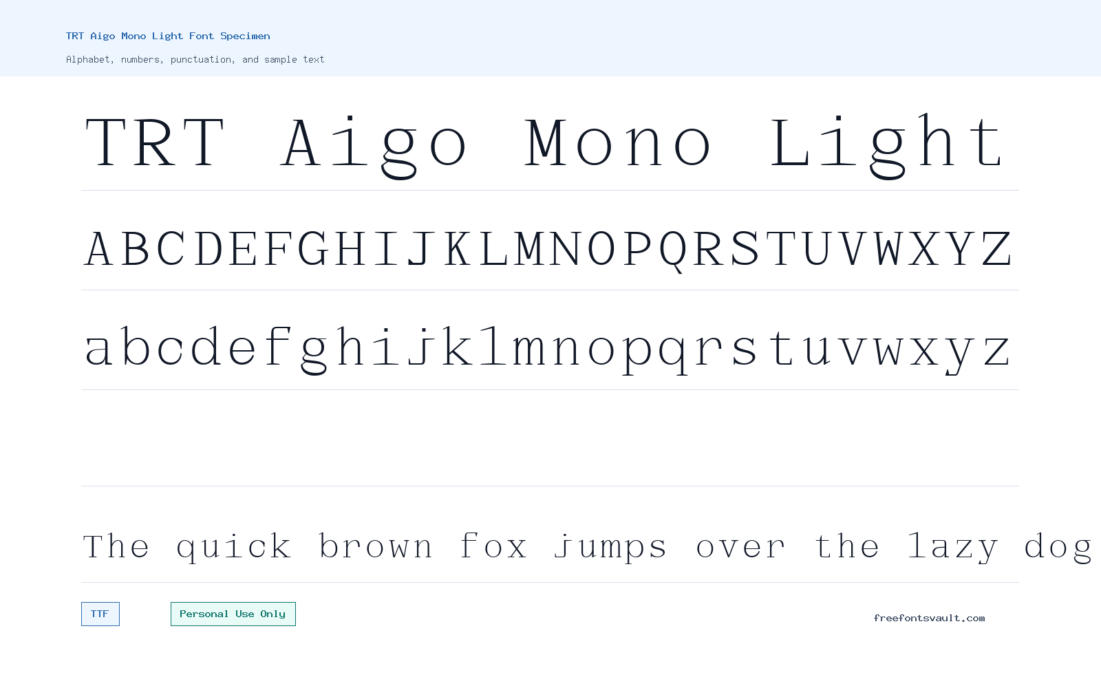
Font Specimen
Details
- Designer Achmad Akbar Afiansyah of Truetype
- Foundry Truetype
- License Personal use only
- Format TTF
- Variants 1 file available
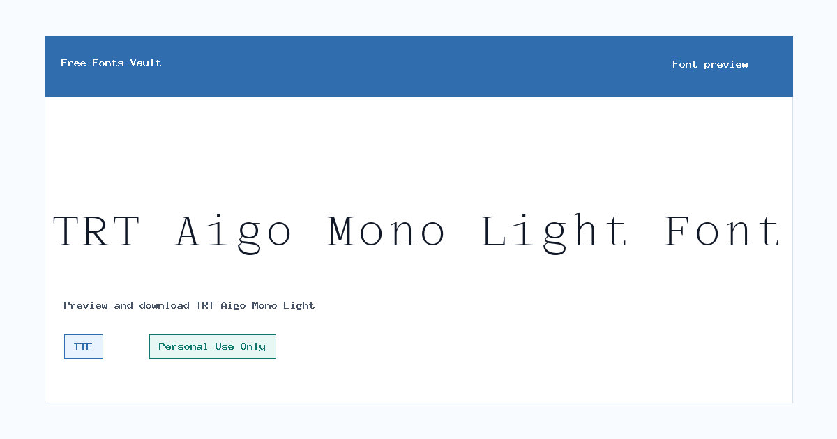
TRT Aigo Mono Light font.
TRT Aigo Mono Light is a light-weight font from the TRT Aigo Mono family, offered as a TTF file for personal-use projects. Its name points to a mono-style design, so it is best approached as a clean, structured display option for testing headings, labels, layout ideas, and visual identity drafts.
About TRT Aigo Mono Light
TRT Aigo Mono Light gives designers a lighter typographic option when a project needs a neat, measured look without heavy visual weight. Because the available style is marked as Light with a 300 weight, it is most useful in places where the text has enough space to breathe. Try it in large preview sizes first: poster titles, logo drafts, editorial headers, packaging mockups, quote cards, portfolio covers, and simple social graphics. Thin or light fonts can lose impact when they are used too small, so short text is the safest starting point. If you are testing it for a brand concept, check uppercase words, numbers, punctuation, and spacing before making final design decisions.
The mono-style naming makes TRT Aigo Mono Light especially interesting for layouts that need a tidy rhythm. It may suit technology-inspired graphics, modern stationery drafts, clean product labels, menu concepts, event posters, or web mockups where a calm geometric feel is useful. For logo work, keep the wordmark short and test it in black, white, and one-color versions. For posters, give the letters room and avoid placing the Light weight over busy images unless you add contrast behind the text. For web mockups, use it as a heading or accent font rather than a long body-text choice until you have tested readability across screen sizes. A light monospaced style can look elegant in a hero section, navigation concept, caption system, or code-inspired layout, but it still needs strong contrast and careful sizing.
Pairing TRT Aigo Mono Light works best when the second typeface has a different job. A neutral sans serif can handle paragraphs while TRT Aigo Mono Light is used for titles, labels, buttons, dates, or section markers. A readable serif can also balance it in editorial layouts, especially when the mono-style text is reserved for headlines or pull quotes. Avoid pairing it with another thin display font unless the design has a very minimal layout, because two delicate fonts can make the hierarchy unclear. If the preview tool allows custom text, test the exact words you plan to use, including repeated letters and mixed-case names. Letter spacing may need small adjustments for logos and posters, especially with short all-caps words.
Features
- Light 300 weight for clean, airy headline and display testing
- TTF font format for common desktop design projects
- Mono-style family naming that suits structured typographic layouts
- Useful for short text, labels, poster titles, logo drafts, and web mockups
- Best tested at larger sizes where the lighter stroke can remain clear
Best Uses
- Logo concepts and wordmark drafts
- Poster titles and event graphics
- Clean web mockup headings
- Editorial section labels and pull quotes
- Packaging, stationery, and product label concepts
- Social media graphics with short, high-contrast text
License Information
TRT Aigo Mono Light is marked as Personal Use Only. Use it for personal projects, previews, practice layouts, and non-commercial design tests unless you have permission or a separate license for commercial work. Do not assume it is cleared for client work, paid branding, merchandise, apps, advertising, or business use without checking the license terms from the rights holder.
Designer and Foundry
The designer is listed as Achmad Akbar Afiansyah of Truetype, with Truetype also listed as the foundry.
Usage Tips
Start by previewing your own text at the size you plan to use. For logos, test short names in uppercase, lowercase, and mixed case. For posters, use strong contrast and generous spacing so the Light weight stays readable. For web mockups, try it in headings, navigation, small labels, or hero text, then pair it with a more readable body font for paragraphs. If you plan to use the font in a commercial design, resolve the Personal Use Only license first.
FAQ
Is TRT Aigo Mono Light free for commercial use?
No commercial-use permission is stated. The license is marked Personal Use Only, so treat it as personal-use unless you obtain a proper commercial license or written permission.
What file format is TRT Aigo Mono Light?
The available font file is in TTF format, which is commonly supported by desktop operating systems and design software.
What weight is this version?
This version is marked as Light with a 300 font weight.
Can I use TRT Aigo Mono Light for a logo?
You can test it for personal logo concepts and mockups, but commercial logo use needs the correct license. For visual quality, test the exact wordmark at different sizes and check spacing carefully.
Is TRT Aigo Mono Light good for body text?
It is better to test it first as a display or accent font. A Light weight can become hard to read in long paragraphs or small sizes, so pair it with a clearer text font for body copy.
What should I pair it with?
Pair it with a readable neutral sans serif for clean digital layouts, or with a simple serif for editorial contrast. Keep TRT Aigo Mono Light for headings, labels, or short emphasis text.
Family Styles
Want to browse beyond this family? Return to All Fonts for the main directory.



