Font Directory
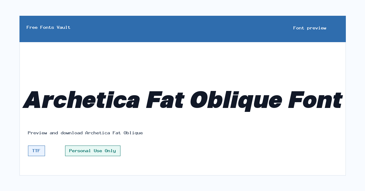
Archetica Fat Oblique
Archetica Fat Oblique includes 2 downloadable variants for live preview and testing.
Styles in this family
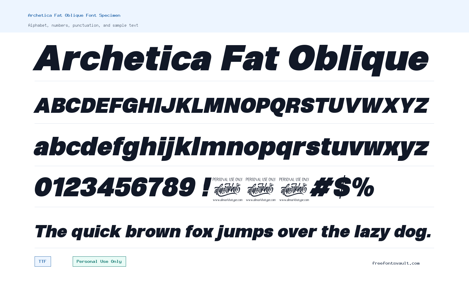
Font Specimen
Details
- Designer Ridwan Fadilah & Malik Wisnu
- Foundry Almarkhatype
- License Personal use only
- License URL almarkhatype.com
- Format TTF, OTF
- Variants 2 files available
Archetica Fat Oblique font.
Archetica Fat Oblique is a slanted display font with a heavy presence, made for short pieces of text that need to look bold, modern, and energetic.
About Archetica Fat Oblique
Archetica Fat Oblique works best when it is treated as a display face rather than a long-reading text font. The “Fat” part of the name points to its broad, weighty look, while “Oblique” signals the angled style. That combination gives the font a forward-moving feel that can suit posters, title graphics, thumbnails, social media headers, packaging mockups, and bold wordmarks. Because the available style is italic/oblique, it naturally adds motion and emphasis even before color, spacing, or effects are added.
For design work, start by testing the font in short words, names, and headline-length phrases. Heavy oblique fonts can look strong in logos and poster titles, but they may lose clarity when used for small labels or long paragraphs. Use the preview tool to check uppercase and lowercase forms, spacing between letters, and how the slant behaves in the exact wording you plan to use. If a word feels too tight, try increasing letter spacing slightly. If the design feels too loud, pair Archetica Fat Oblique with a calmer sans serif for body copy, captions, and supporting details.
The font is available in both TTF and OTF formats. TTF is widely supported and often easy to use across common desktop apps, while OTF is also a standard font format used in many design projects. If one format does not load correctly in your software, try the other. For web mockups, use the font in image-based drafts or local prototypes unless you have confirmed the license allows the exact kind of web use you need. The style is useful for testing hero sections, banner typography, gaming-style title blocks, music artwork, and bold branding concepts where the main word or phrase needs visual impact.
Because the license is marked Personal Use Only, treat Archetica Fat Oblique as a personal-project font unless you obtain permission or a commercial license from the rights holder. That means it is suitable for practice work, private mockups, school-style experiments, or non-commercial personal graphics, but not automatically safe for client logos, paid advertising, product packaging, monetized content, merchandise, or public brand use. If you want to use it in a logo, poster campaign, website, app, or product connected to a business, check the license terms with Almarkhatype first.
Features
- Heavy oblique display style for bold short text and headline treatments
- Available as both TTF and OTF font files
- Italic style with a forward-leaning feel suited to energetic compositions
- Best used at larger sizes where the weight and slant remain clear
- Personal Use Only license status that needs care for commercial projects
Best Uses
- Poster titles and event graphics
- Logo concepts and wordmark experiments
- YouTube thumbnails and social media headers
- Web hero mockups and landing-page title tests
- Album art, gaming graphics, and bold personal design projects
- Short packaging or label mockups for non-commercial presentation
License Information
Archetica Fat Oblique is marked as Personal Use Only. Do not assume it is free for commercial use. For client work, business branding, products, paid campaigns, merchandise, monetized media, or website deployment, confirm the commercial licensing options with Almarkhatype.
Designer and Foundry
The listed designers are Ridwan Fadilah and Malik Wisnu, with Almarkhatype listed as the foundry. The designer/foundry website is almarkhatype.com.
Usage Tips
Use Archetica Fat Oblique for short, high-impact text rather than paragraphs. Test the exact words you plan to use, especially if the design is for a logo or poster, because heavy oblique letters can create tight spacing in some letter combinations. Pair it with a neutral sans serif for descriptions, navigation, captions, and longer reading sections. Keep contrast high, avoid very small sizes, and confirm the license before using it in any commercial or public-facing project.
FAQ
Is Archetica Fat Oblique free for commercial use?
No commercial-use permission is stated in the available license information. The license is marked Personal Use Only, so you should contact Almarkhatype or check their current license terms before using it for business, client, product, or monetized work.
What kind of font is Archetica Fat Oblique?
It is a heavy oblique display font. It is better for titles, logos, posters, and short attention-grabbing text than for long paragraphs.
Can I use Archetica Fat Oblique for a logo?
You can test it in personal logo concepts, but a real brand, client logo, or commercial identity usually needs a commercial license. Confirm permission first.
Which file format should I download, TTF or OTF?
Both are common font formats. TTF is broadly supported in many apps, while OTF is also widely used in design software. If one format causes issues, install or test the other.
Is Archetica Fat Oblique good for body text?
It is not the best choice for long reading. The heavy weight and oblique style are more useful for display typography, short phrases, and large-size designs.
What fonts pair well with Archetica Fat Oblique?
Pair it with a clean, simple sans serif for body copy and smaller text. A quieter companion font helps the heavy oblique title stand out without making the whole design feel crowded.
Family Styles
Want to browse beyond this family? Return to All Fonts for the main directory.



