Font Directory
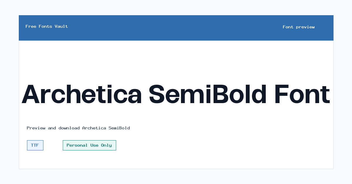
Archetica SemiBold
Archetica SemiBold includes 2 downloadable variants for live preview and testing.
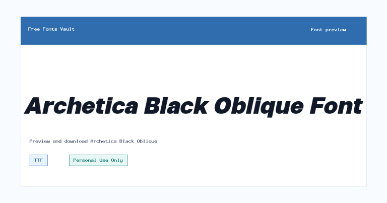
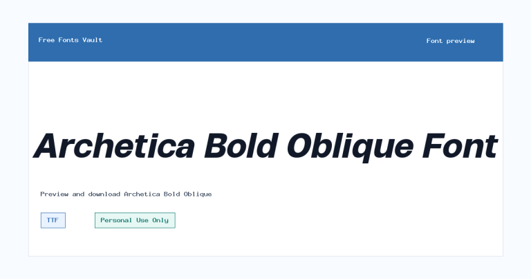
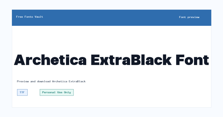
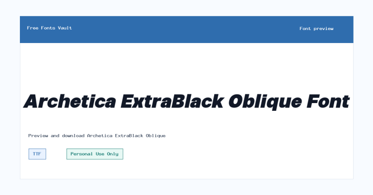
Styles in this family
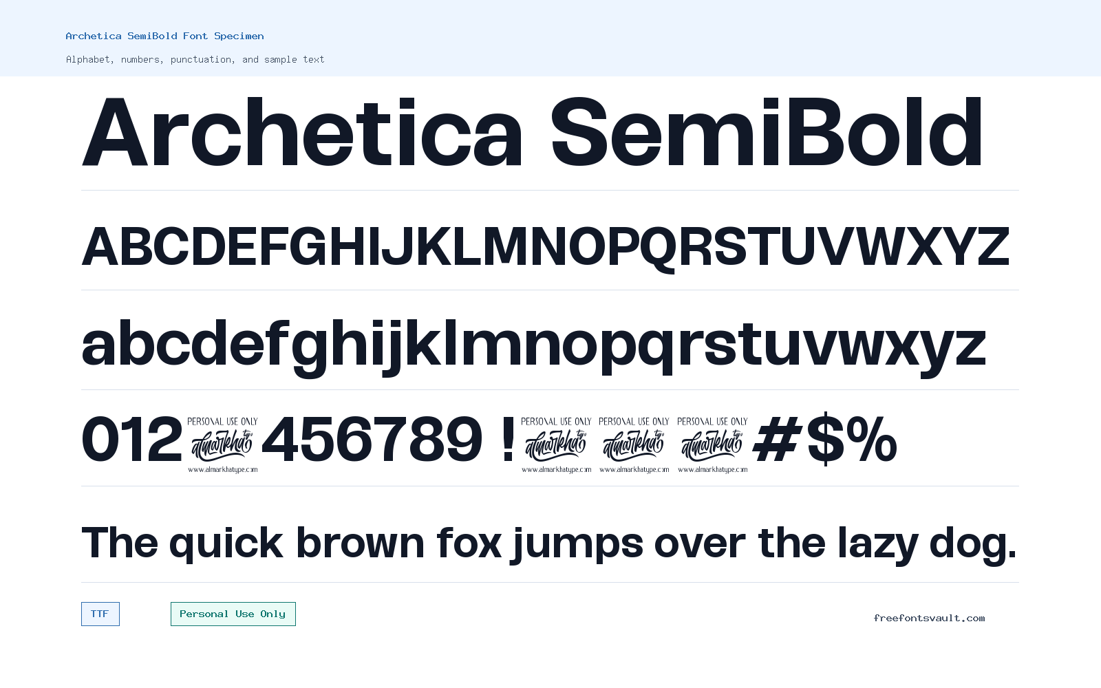
Font Specimen
Details
- Designer Ridwan Fadilah & Malik Wisnu
- Foundry Almarkhatype
- License Personal use only
- License URL almarkhatype.com
- Format TTF, OTF
- Variants 2 files available
Archetica SemiBold font.
Archetica SemiBold is a strong mid-to-heavy cut from the Archetica sans serif family. It has a clean geometric look, enough weight for headlines, and a practical tone for design tests where you need modern letters without extra decoration.
About Archetica SemiBold
Archetica SemiBold works best when you want a sans serif that feels structured but not overly stiff. The letterforms are built around a modern geometric style, so the font suits layouts that need clear shapes, steady rhythm, and a polished headline presence. In the SemiBold weight, it is heavier than a regular text face but not as forceful as a full bold, making it useful for titles, section headers, navigation labels, brand boards, social graphics, and short blocks of emphasis.
Use the preview tool to test the exact words you plan to design with, especially if you are checking a logo, poster headline, packaging mockup, or website hero line. SemiBold weights often look confident at larger sizes, but spacing can change the feel quickly: tight tracking may make a logo feel compact and technical, while a little extra letter spacing can make the same font feel calmer and more editorial. For longer paragraphs, consider using Archetica SemiBold only for headings and pairing it with a lighter sans serif or a readable serif for body text.
The download options include both TTF and OTF formats for the Archetica SemiBold style. TTF is widely supported across common desktop and web design projects, while OTF is often preferred in professional design apps. If both formats work in your software, try the OTF first for layout work and keep the TTF as a reliable fallback for apps or systems that handle TrueType more smoothly.
For logo exploration, Archetica SemiBold can be a useful starting point when the brand direction needs clean, modern, and simple lettering. Test uppercase and title case versions, then check how the shapes hold up at small sizes such as a favicon, app icon label, social profile image, or mobile header. For posters and thumbnails, the SemiBold weight gives enough presence for a main line without immediately feeling too heavy. If the design needs strong contrast, pair it with a thin serif, a restrained mono font, or a much lighter sans serif rather than another similar geometric face.
For web mockups, Archetica SemiBold is most practical in headings, buttons, cards, feature labels, and navigation elements. Keep body copy in a more text-focused weight or font, and watch line height when using all caps. If your design includes multilingual text, test the required characters in the preview before committing, especially for accented Latin words, punctuation-heavy copy, or Cyrillic text. The wider Archetica family is reported with broad Latin and Cyrillic coverage, but each project should still be checked with the exact strings you need.
Features
- SemiBold sans serif weight with a clean geometric character
- Available as both TTF and OTF font files
- Useful for headlines, logo drafts, posters, buttons, and short display text
- Personal Use Only license, so commercial projects need separate permission or licensing
- Part of the Archetica family, which is described by font listings as a geometric sans serif family
Best Uses
- Modern poster headlines
- Logo concepts and brand mockups
- Website hero text and UI headings
- Social media graphics and thumbnails
- Packaging drafts and presentation layouts
- Short editorial titles or section labels
License Information
Archetica SemiBold is listed as Personal Use Only. You can use it for personal previews, practice designs, and non-commercial experiments, but do not use it for client work, paid products, advertising, merchandise, business branding, apps, websites, or other commercial projects unless you have the proper license from the rights holder.
Designer and Foundry
Archetica SemiBold is credited to Ridwan Fadilah & Malik Wisnu, with Almarkhatype listed as the foundry.
Usage Tips
Try Archetica SemiBold first in short text: logos, headings, poster lines, navigation labels, and call-to-action buttons. For body copy, use a lighter companion font or another readable text face. Check spacing, punctuation, numbers, and any accented or non-Latin characters in the preview before using it in a finished design.
FAQ
Is Archetica SemiBold free for commercial use?
No. The license information lists Archetica SemiBold as Personal Use Only. For commercial work, get a commercial license or written permission from the font owner.
What file formats are included?
Archetica SemiBold is available in TTF and OTF formats. Both are common font formats used in design software and desktop systems.
What kind of font is Archetica SemiBold?
It is a SemiBold style from a geometric sans serif family. The look is clean, modern, and practical for display text.
Can I use Archetica SemiBold for a logo?
You can test it in personal logo concepts, but a real business, client, or product logo would count as commercial use. Make sure you have the correct license first.
Is Archetica SemiBold good for body text?
It is better for headings and short emphasis. For long reading, pair it with a lighter text font and keep Archetica SemiBold for titles, labels, or callouts.
Which format should I install, TTF or OTF?
Most users can install either. OTF is often convenient for design applications, while TTF is broadly supported across many systems and apps.
Does Archetica support accented characters?
Font listings for the Archetica family report broad Latin coverage, but you should test your exact words in the preview to make sure every character appears correctly.
Family Styles
Want to browse beyond this family? Return to All Fonts for the main directory.



