Font Directory
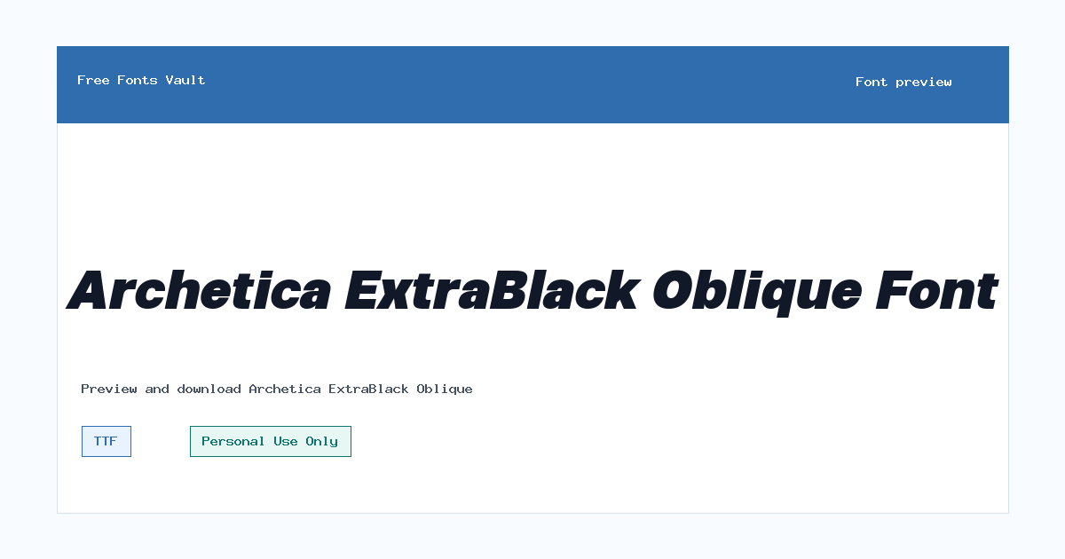
Archetica ExtraBlack Oblique
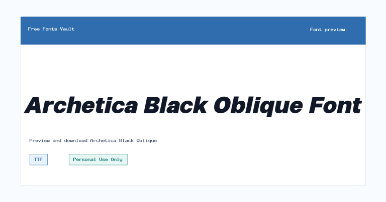
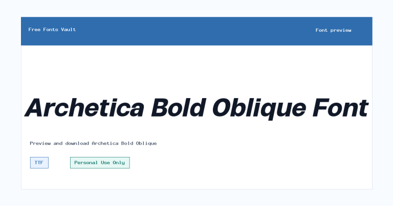
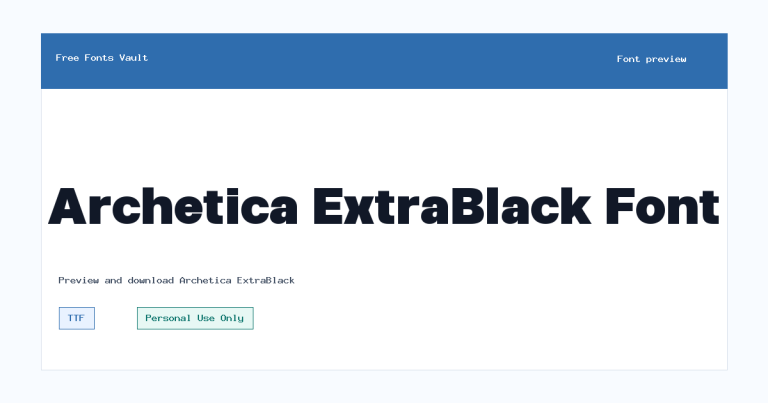
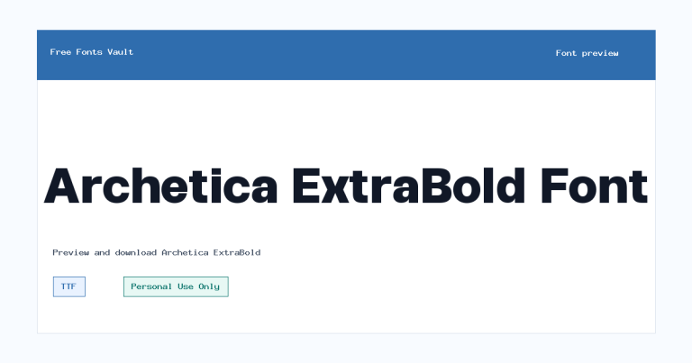
Archetica ExtraBlack Oblique includes 2 downloadable variants for live preview and testing.
Styles in this family
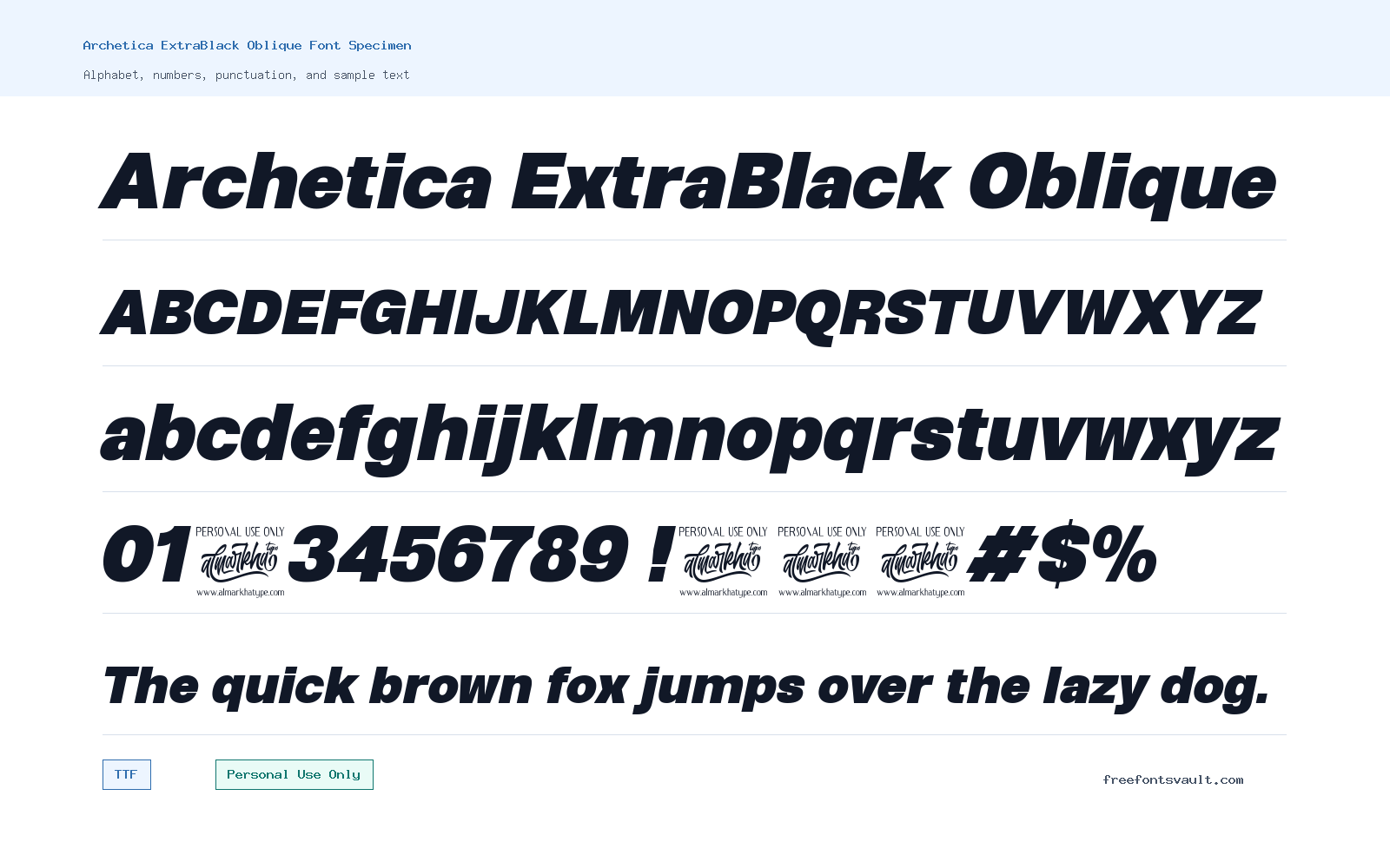
Font Specimen
Details
- Designer Ridwan Fadilah & Malik Wisnu
- Foundry Almarkhatype
- License Personal use only
- License URL almarkhatype.com
- Format TTF, OTF
- Variants 2 files available
Archetica ExtraBlack Oblique font.
Archetica ExtraBlack Oblique is a very heavy slanted sans serif font designed for bold display work. Its ExtraBlack weight gives words a strong visual block, while the oblique angle adds movement, making it useful when a design needs impact without adding too much decoration.
About Archetica ExtraBlack Oblique
Archetica ExtraBlack Oblique works best when it is treated as a display face rather than a long-reading text font. The 900 weight is built for large, confident words: short headlines, poster titles, logo sketches, album-style covers, packaging concepts, and social graphics. The oblique style gives the letters a forward lean, so the font can feel more active than a straight upright sans serif. That makes it a good option for designs that need a sense of speed, pressure, or emphasis, especially when the wording is short and the layout has enough space around it.
Because this is a very dark weight, spacing and size matter. In a preview, test it with the exact word or phrase you plan to use, not only with sample alphabet text. Heavy oblique letters can close up quickly, especially in all caps or in tight logo arrangements. Try increasing letter spacing slightly for uppercase titles, and avoid using it for small paragraphs, captions, navigation menus, or dense UI text. For web mockups, it can work well as a hero headline or campaign wordmark, but it should usually be paired with a lighter, simpler sans serif for body copy. A neutral regular-weight font will keep the page readable while letting Archetica ExtraBlack Oblique handle the main visual punch.
For logo work, this font is better suited to early concepts, personal projects, and mockups unless you have the correct commercial permission. The heavy slant can make a name look energetic, but it is still important to check the letter shapes in context. Look at repeated vertical strokes, narrow letters, punctuation, and numbers before finalizing a layout. If the design uses a very small icon, thin outline, or complex background, the ExtraBlack weight may need more breathing room to stay clear.
For posters and promotional graphics, use contrast to your advantage. Archetica ExtraBlack Oblique can hold a large headline at the top of a composition, sit across an image, or anchor a bold typographic layout. Keep supporting text smaller and quieter. Avoid stacking too many heavy fonts together, because the page can become crowded fast. If you want a cleaner result, pair it with a plain sans serif in regular or medium weight. If you want more contrast, pair it with a readable serif for short secondary lines, but keep the serif restrained so the headline remains the focus.
Features
- ExtraBlack 900 weight for strong display headlines and compact title settings
- Oblique italic style that adds a forward-leaning, energetic look
- Sans serif structure that keeps the design cleaner than decorative display fonts
- Available in both TTF and OTF formats for common desktop design projects
- Best suited to short words, titles, posters, logo mockups, and web hero text
Best Uses
- Poster titles and event graphics
- Logo drafts and personal branding experiments
- Bold website hero headlines in mockups
- Social media banners and promotional images
- Packaging concepts that need a heavy sans serif title
- Sports, tech, music, or action-themed personal designs where a slanted heavy type style fits
License Information
The listed license is Personal Use Only. Use Archetica ExtraBlack Oblique for personal projects unless you have a separate commercial license from the designer or foundry. Do not assume it is cleared for client work, paid branding, merchandise, advertising, apps, templates, or business websites without checking the license terms first.
Designer and Foundry
Archetica ExtraBlack Oblique is credited to Ridwan Fadilah & Malik Wisnu, with Almarkhatype listed as the foundry. The designer/foundry link points to almarkhatype.com.
Usage Tips
Use this font large, with short text and generous spacing. It is not a practical choice for long paragraphs or small interface labels. For a balanced design, pair it with a readable neutral sans serif for body text, captions, and menus. When using it in logos or web mockups, test uppercase, lowercase, numbers, and punctuation before exporting final artwork.
FAQ
Is Archetica ExtraBlack Oblique free for commercial use?
No. The license information says Personal Use Only. For commercial work, contact the designer or foundry and confirm the correct license before using it.
What kind of font is Archetica ExtraBlack Oblique?
It is a heavy oblique sans serif display font. The 900 weight makes it very bold, and the slanted style gives headlines a more active look.
Can I use Archetica ExtraBlack Oblique for a logo?
You can test it in personal logo concepts, but commercial logo use needs proper licensing. Also check spacing carefully, because the heavy oblique letters can feel tight in compact wordmarks.
Is this font good for body text?
It is not ideal for body text. The ExtraBlack weight is better for short headlines, titles, posters, and display settings.
Which file formats are available?
The font is listed in TTF and OTF formats, which are commonly used in desktop design apps and font managers.
What should I pair with Archetica ExtraBlack Oblique?
Pair it with a simple regular-weight sans serif for a clean layout. If you want more contrast, use a readable serif for short supporting lines, but keep the main headline in Archetica.
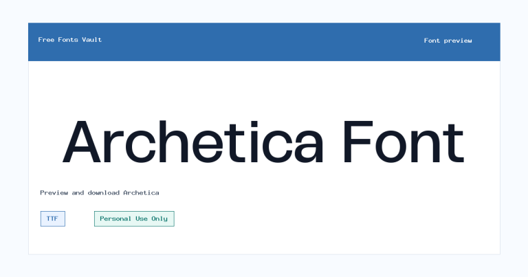
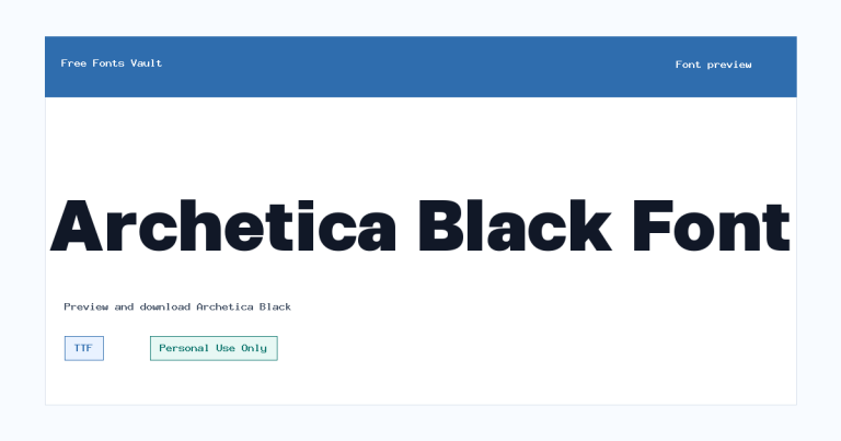
Family Styles
Want to browse beyond this family? Return to All Fonts for the main directory.



