Font Directory
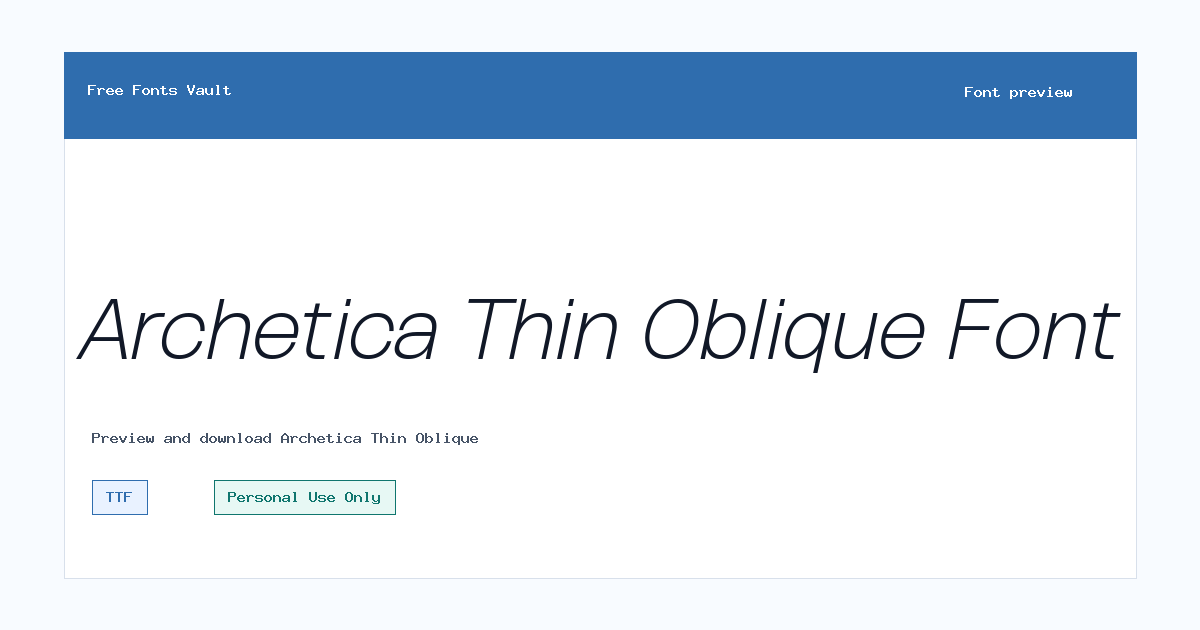
Archetica Thin Oblique
Archetica Thin Oblique includes 2 downloadable variants for live preview and testing.
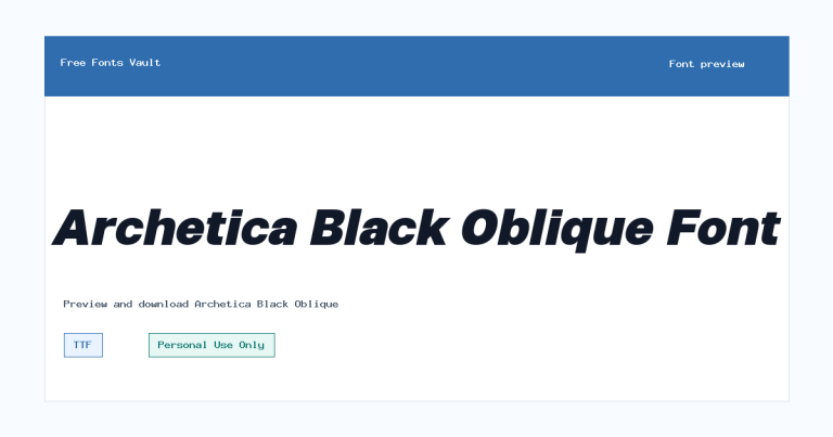
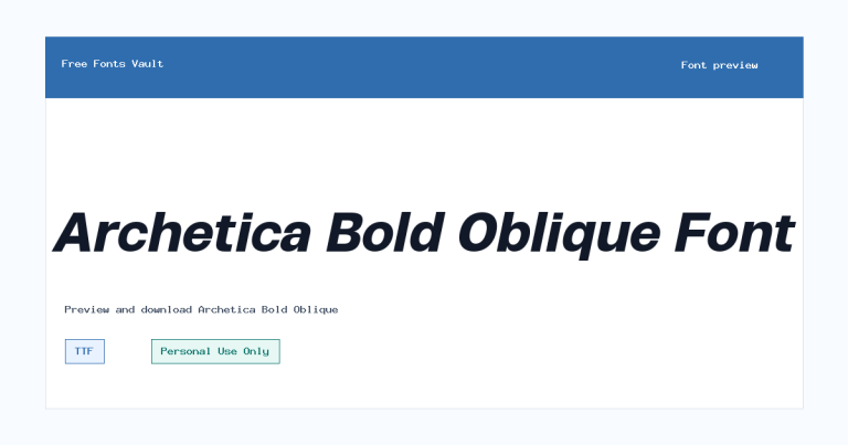
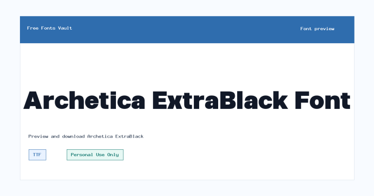
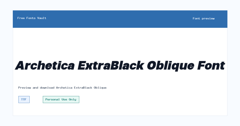
Styles in this family
Font Specimen
Details
- Designer Ridwan Fadilah & Malik Wisnu
- Foundry Almarkhatype
- License Personal use only
- License URL almarkhatype.com
- Downloads 1
- Format TTF, OTF
- Variants 2 files available
Archetica Thin Oblique font.
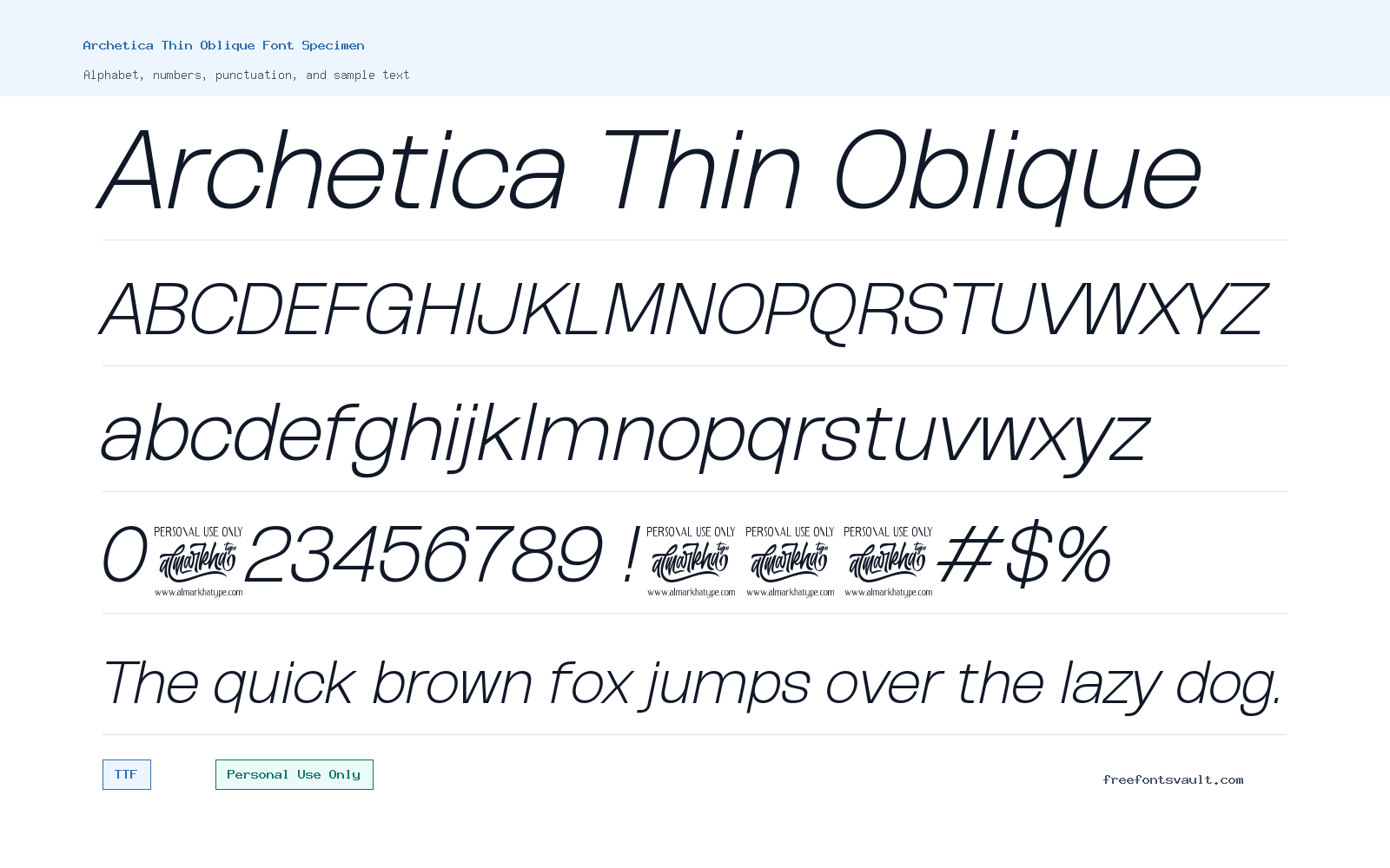
Archetica Thin Oblique is a very light italic sans serif style with a clean, slanted look. It works best when you need a refined line of text rather than a heavy display face, making it useful for elegant headings, soft branding drafts, and layout previews.
About Archetica Thin Oblique
Archetica Thin Oblique has a thin weight and an oblique style, so its main character comes from restraint. The letters are likely to feel airy in use because the font weight is 100, while the italic styling adds forward movement without making the design feel loud. That combination can be useful for short phrases, fashion-style titles, minimal poster text, portfolio headings, editorial mockups, and logo concepts where the type should feel light and controlled. It is not the kind of font to use when you need maximum impact at a distance or strong contrast on a busy background. Thin italic type usually needs breathing room, clean spacing, and enough size to keep the strokes visible.
For designers testing this font, start with short words, names, and two- to five-word headlines in the preview tool. Try it in uppercase, lowercase, and mixed case, then check whether the thin strokes remain clear at the size you plan to use. Archetica Thin Oblique may suit logo sketches, social graphics, invitation-style layouts, poster subtitles, website hero lines, and web mockups where the typography should feel modern and quiet. Use caution with body text, long paragraphs, small captions, and low-resolution images because very light oblique fonts can lose clarity when reduced. If you are pairing it with another typeface, choose something simpler and more readable for the supporting text, such as a regular-weight sans serif for paragraphs or a neutral serif for contrast. Let Archetica Thin Oblique carry the stylish accent while the paired font does the practical reading work.
Features
- Thin 100-weight sans serif style with an oblique/italic appearance
- Available in both TTF and OTF formats for flexible desktop design use
- Best suited to short display text, refined headings, and clean visual mockups
- Light stroke weight that benefits from generous spacing and larger sizes
- Personal-use license category, so commercial work needs separate permission or verification
Best Uses
- Logo drafts and wordmark concepts for personal projects
- Minimal posters, fashion-style layouts, and editorial titles
- Website hero text, landing page mockups, and portfolio headings
- Invitation designs, social media graphics, and elegant short quotes
- Pairing with a regular-weight sans serif for readable supporting copy
License Information
Archetica Thin Oblique is marked as Personal Use Only. Use it for personal design tests, previews, and non-commercial projects unless you have permission or a suitable commercial license from the rights holder. Do not treat it as free for client work, paid products, brand identities, merchandise, advertising, or commercial web use without checking the license terms first.
Designer and Foundry
The designer information for Archetica Thin Oblique is listed as Ridwan Fadilah & Malik Wisnu, with Almarkhatype named as the foundry. The related designer/foundry URL is https://almarkhatype.com.
Usage Tips
Use Archetica Thin Oblique at larger sizes, especially for headings and logo-style text. Thin italic fonts can look elegant, but they can also become hard to read when placed over photos, gradients, or textured backgrounds. For posters and social graphics, test it on both light and dark backgrounds before exporting. For web mockups, use it as an accent face rather than the main reading font. If you plan to use it in a real website, check loading, rendering, and licensing carefully, and keep a fallback font ready. For pairing, try a regular or medium-weight sans serif for menus and paragraphs, or use a calm serif when you want a more editorial contrast. Avoid pairing it with another very thin decorative font, because the layout may become fragile and difficult to scan.
FAQ
Is Archetica Thin Oblique free for commercial use?
No commercial-use permission is stated here. The license is marked Personal Use Only, so use it for personal projects unless you obtain the correct commercial license or written permission.
What kind of font is Archetica Thin Oblique?
It is a thin oblique sans serif font. The available style is italic with a 100 font weight, which makes it better for light display text than dense reading copy.
What formats are available?
Archetica Thin Oblique is available in TTF and OTF formats. Both are common desktop font formats used in design software and font managers.
Can I use Archetica Thin Oblique for a logo?
You can test it in personal logo concepts and mockups, but a real client logo, business identity, product, or paid brand project would need proper commercial licensing.
Is this font good for body text?
It is better for short display text. Because it is very light and oblique, long paragraphs or small captions may become harder to read.
What fonts pair well with Archetica Thin Oblique?
Pair it with a clean regular-weight sans serif for body text, navigation, and labels. If you want contrast, a simple serif can also work, as long as the layout stays readable.
Family Styles
Want to browse beyond this family? Return to All Fonts for the main directory.



