Font Directory
Koltav
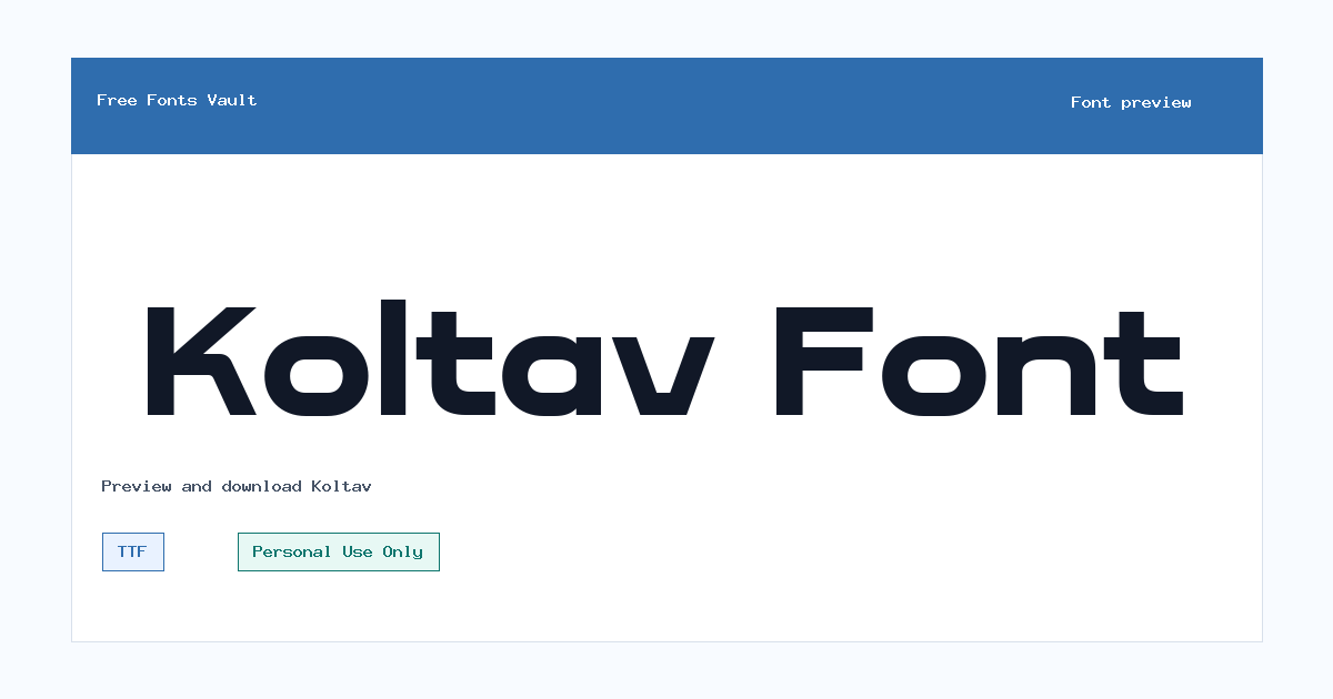
Koltav includes 1 downloadable variant for live preview and testing.
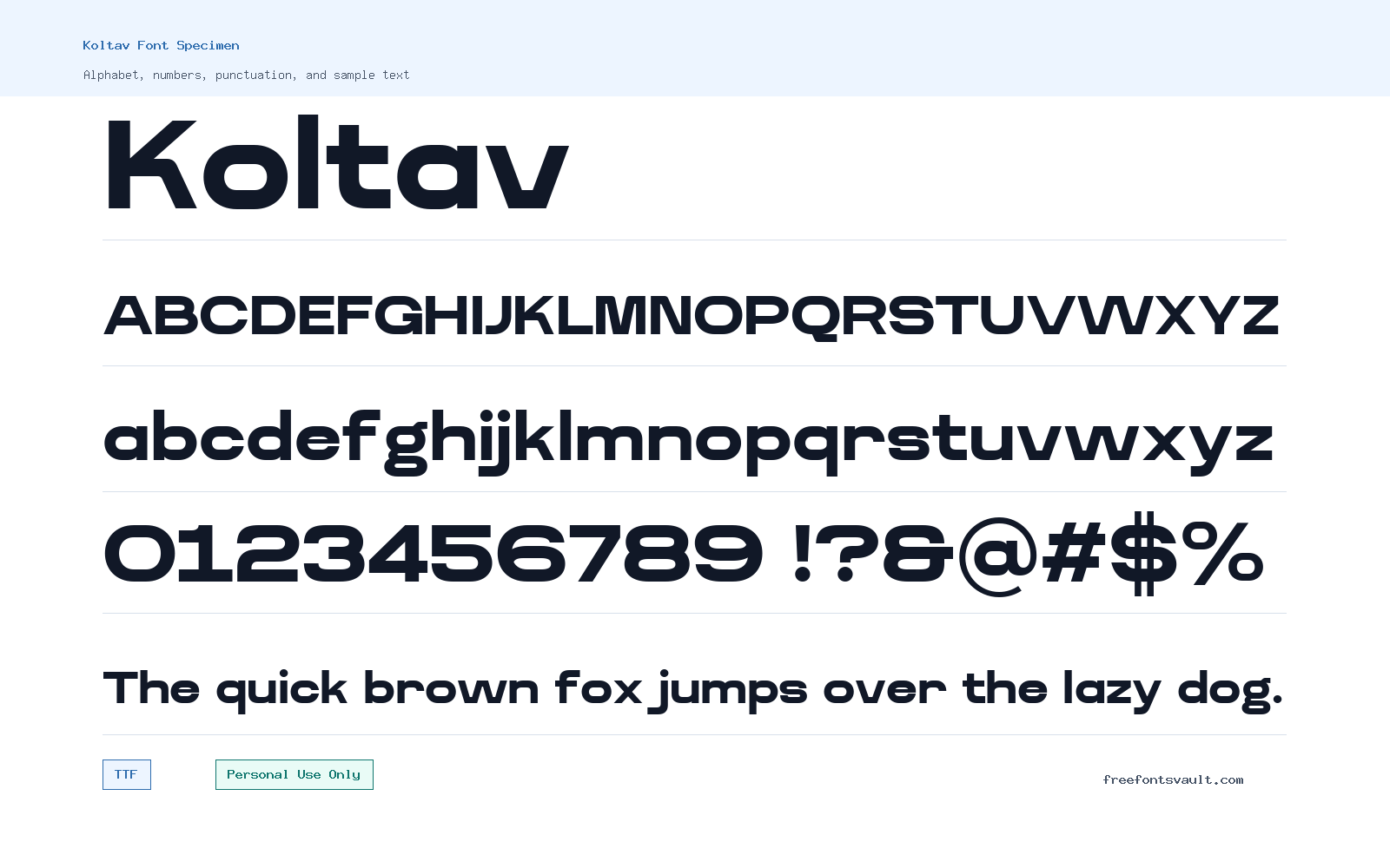
Font Specimen
Details
- Designer Ragamkata Studio
- License Personal use only
- Format TTF
- Variants 1 file available
Koltav font.
Koltav is a sans serif font from Ragamkata Studio, offered in a Regular TTF style for personal-use design projects. It is a practical choice to test when you need clear lettering for titles, logo drafts, posters, social graphics, or presentation mockups.
About Koltav Font
Koltav is best approached as a clean sans serif display and layout font rather than a font with a documented long backstory. The confirmed file is Koltav Regular in TTF format, with a normal style and 400 weight, so visitors can preview it as a standard upright typeface. Because the license information marks it as Personal Use Only, it works well for non-commercial practice pieces, personal branding studies, classroom layouts, fan edits, mood boards, and early concept work. If you are building a client logo, packaging design, paid template, monetized website, or brand identity, treat the download as a trial or personal-use version unless you obtain a proper commercial license from the rights holder.
For design work, use the preview box to test Koltav with the exact words you plan to set. Short names, poster headlines, navigation labels, and bold title lines are usually the quickest way to judge whether a sans serif font fits your project. Check how the letters behave in all caps, title case, and lowercase. Look closely at spacing around round letters, narrow letters, and repeated characters, especially in logo work where uneven spacing becomes noticeable. For web mockups, test Koltav in menu labels, hero headings, button text, and short section titles before using it across long paragraphs. A single Regular weight can be useful, but it also means you may need another family for bold hierarchy, body copy, or small captions.
Koltav can be useful when a design needs a simple sans serif voice without decorative scripts or heavy illustration-style lettering. Try it on event poster drafts, clean quote graphics, portfolio cover slides, YouTube thumbnail text, Pinterest pins, personal stationery mockups, and modern logo studies. Since only the Regular TTF style is confirmed, build contrast with size, spacing, color, and layout rather than relying on multiple weights. If the design needs a strong headline and readable supporting text, pair Koltav with a neutral text serif or a highly readable system sans for paragraphs. Avoid pairing it with another similar sans serif unless there is a clear difference in weight, width, or texture, because two close fonts can make a layout feel accidental.
When previewing the font, test both practical and edge-case text. Use your brand name, a short headline, numbers, punctuation, and a few real words with letters like a, e, g, s, r, t, and y. If you plan to use it in logo exploration, increase the letter spacing slightly and compare several sizes. If you plan to use it for posters or social posts, check whether the words remain readable at phone-screen size. The safest way to judge Koltav is not by the font name alone, but by how your own text looks in the preview.
Features
- Regular upright TTF font file with normal 400 weight
- Sans serif style suited to clean titles, mockups, and personal design experiments
- Simple single-style family, useful for quick testing without managing many weights
- Works best when tested in short text such as names, headings, labels, and poster lines
Best Uses
- Personal logo concepts and brand-name studies
- Poster headlines and event graphic drafts
- Pinterest pins, social media graphics, and thumbnail text
- Web design mockups, hero headings, menu labels, and buttons
- Presentation covers, portfolio slides, and personal stationery layouts
- Typography practice, classroom projects, and non-commercial experiments
License Information
Koltav is marked as Personal Use Only. You can use it for personal and non-commercial projects, but do not assume it is cleared for client work, paid products, advertising, commercial websites, merchandise, templates, apps, or logos used by a business. For any commercial use, contact the designer or rights holder and get the correct license.
Designer and Foundry
Koltav is credited to Ragamkata Studio. No foundry URL or separate designer link is confirmed for this listing.
Usage Tips
Use Koltav first in the preview tool with the exact wording you need. For logos, test spacing carefully and compare uppercase, lowercase, and title case. For posters and web mockups, use it for headings or short interface text, then pair it with a readable text font for longer paragraphs. Since only a Regular TTF file is confirmed, create hierarchy with size, color, layout, and spacing rather than relying on bold or italic styles.
FAQ
Is Koltav free for commercial use?
No. The license information marks Koltav as Personal Use Only. Use it for personal projects unless you obtain a separate commercial license from the rights holder.
Who designed Koltav?
Koltav is credited to Ragamkata Studio.
What font format is included for Koltav?
The confirmed font file is a TTF file for Koltav Regular.
What weight and style is Koltav?
The confirmed style is Regular, normal upright, with a 400 weight.
Can I use Koltav for a logo?
You can test it in personal logo concepts, but commercial logos need proper license clearance. If the logo is for a business, client, product, or monetized project, get permission or a commercial license first.
Is Koltav good for body text?
Koltav may be better to test first in headings, labels, and short text. For long paragraphs, preview it at small sizes and consider pairing it with a font made for comfortable reading.
What should I pair with Koltav?
Try pairing it with a readable serif or a neutral text sans for paragraphs. Keep the pairing simple and make sure the second font gives enough contrast in weight, width, or texture.
Similar Fonts
Want to browse beyond this family? Return to All Fonts for the main directory.



