Font Directory
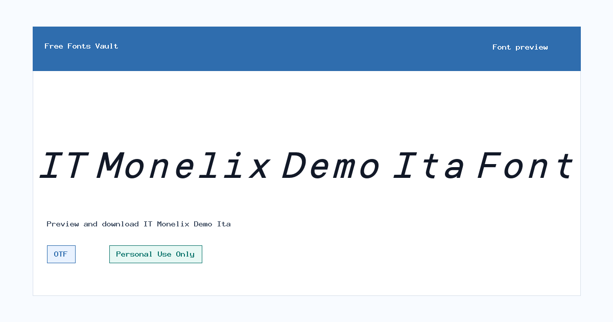
IT Monelix Demo Ita
IT Monelix Demo Ita includes 1 downloadable variant for live preview and testing.
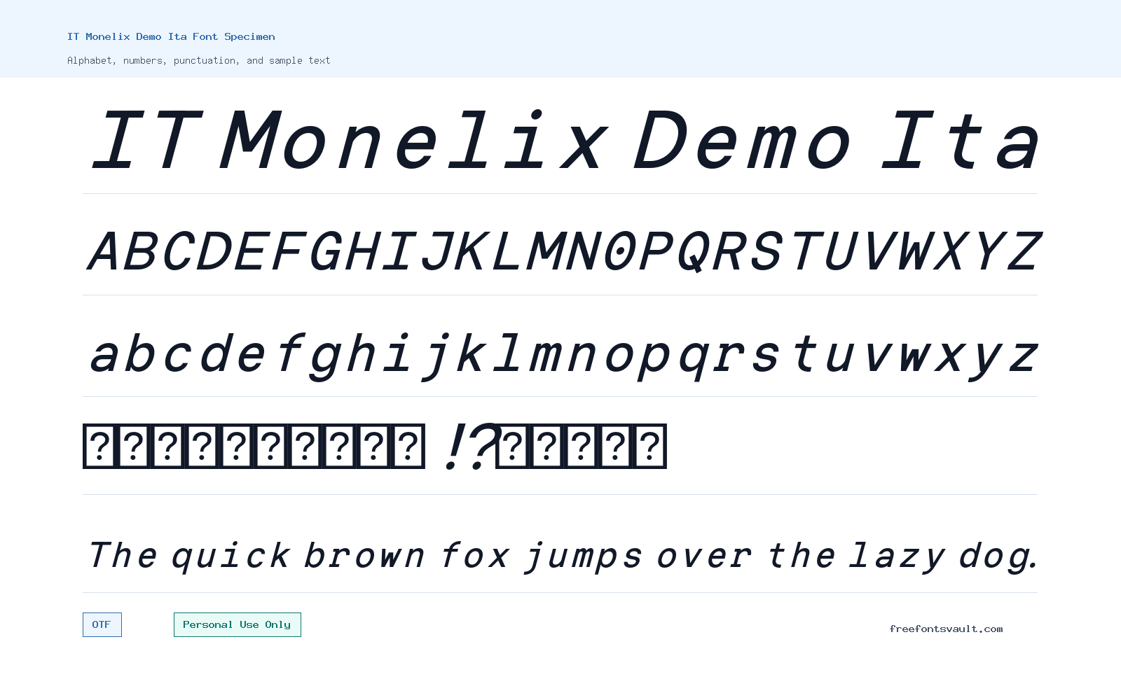
Font Specimen
Details
- Designer Indotype
- Foundry Indotype Foundry
- License Personal use only
- Format OTF
- Variants 1 file available
IT Monelix Demo Ita font.
IT Monelix Demo Ita is an italic sans serif demo font from Indotype. It is a practical choice when you want a slanted, clean-looking type style for personal design tests, preview layouts, and short pieces of display text.
About IT Monelix Demo Ita
IT Monelix Demo Ita uses an italic style, so it naturally brings more movement than an upright sans serif. Because the available font file is an OTF and the style is marked as regular weight with italic styling, it is best approached as a single-style display or accent font rather than a complete text family. Try it first in the font preview with the exact words you plan to use, especially if the design depends on strong readability at a small size.
This font can work well for poster headings, social graphics, logo drafts, web mockups, quote cards, product labels, and other short-text layouts where a clean italic voice is useful. For longer paragraphs, use it carefully. Italic sans serif fonts can become harder to read when used for dense body copy, so pair it with a simpler upright font for descriptions, navigation, captions, or article text. If you are testing a brand concept, use IT Monelix Demo Ita for the expressive wordmark or headline, then choose a neutral sans serif for the supporting information.
Features
- Italic sans serif style suited to short display text, mockups, and accent typography
- OTF font file in a regular weight style, useful for desktop design testing and personal projects
Best Uses
- Logo drafts, poster titles, quote graphics, social media images, and personal branding experiments
- Web layout mockups, headline previews, product label concepts, and other short-text design tests
License Information
The license information states Personal Use Only. Use IT Monelix Demo Ita for personal projects, previews, and non-commercial design testing unless you confirm separate commercial licensing from the rights holder or foundry.
Designer and Foundry
IT Monelix Demo Ita is credited to Indotype, with Indotype Foundry listed as the foundry.
Usage Tips
Use the preview box to test uppercase, lowercase, numbers, punctuation, and the exact phrase you want to design with. Since this is a single italic OTF style, plan pairings around contrast: use IT Monelix Demo Ita for the visual emphasis, then pair it with a plain upright sans serif for readable supporting text. For logo work, check spacing carefully between letters and test the mark at small sizes before relying on it in a final design. For posters and web mockups, give the italic forms enough room so the slant does not feel cramped near image edges, buttons, or tight columns.
FAQ
Is IT Monelix Demo Ita free for commercial use?
No. The license information states Personal Use Only, so do not use it in client work, paid products, business branding, ads, or commercial projects unless you obtain the correct commercial license.
What kind of font is IT Monelix Demo Ita?
It is an italic sans serif demo font. The available style is regular weight with italic styling, making it more suitable for headings, accents, and design previews than long reading text.
What file format does the download use?
The font file is in OTF format, which is commonly used in desktop design software and font managers.
Can I use IT Monelix Demo Ita for a logo?
You can test it in personal logo drafts and concept work, but the Personal Use Only license means commercial logo use needs separate permission or a commercial license.
What should I pair with IT Monelix Demo Ita?
Pair it with a simple upright sans serif for body text, menus, captions, or supporting details. Keeping the companion font plain helps the italic style stand out without making the layout hard to read.
Is IT Monelix Demo Ita good for body text?
It is better for short text. Italic styles can reduce readability in long paragraphs, so use it for emphasis, titles, or short phrases and choose a more neutral font for extended reading.
Similar Fonts
Want to browse beyond this family? Return to All Fonts for the main directory.



