Font Directory
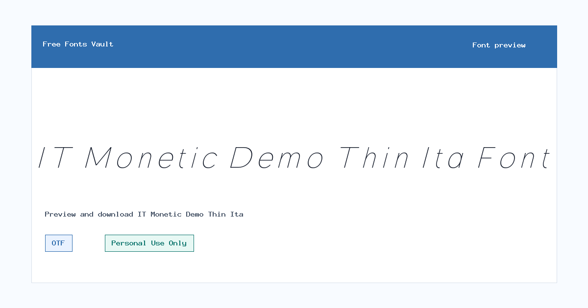
IT Monetic Demo Thin Ita
IT Monetic Demo Thin Ita includes 1 downloadable variant for live preview and testing.
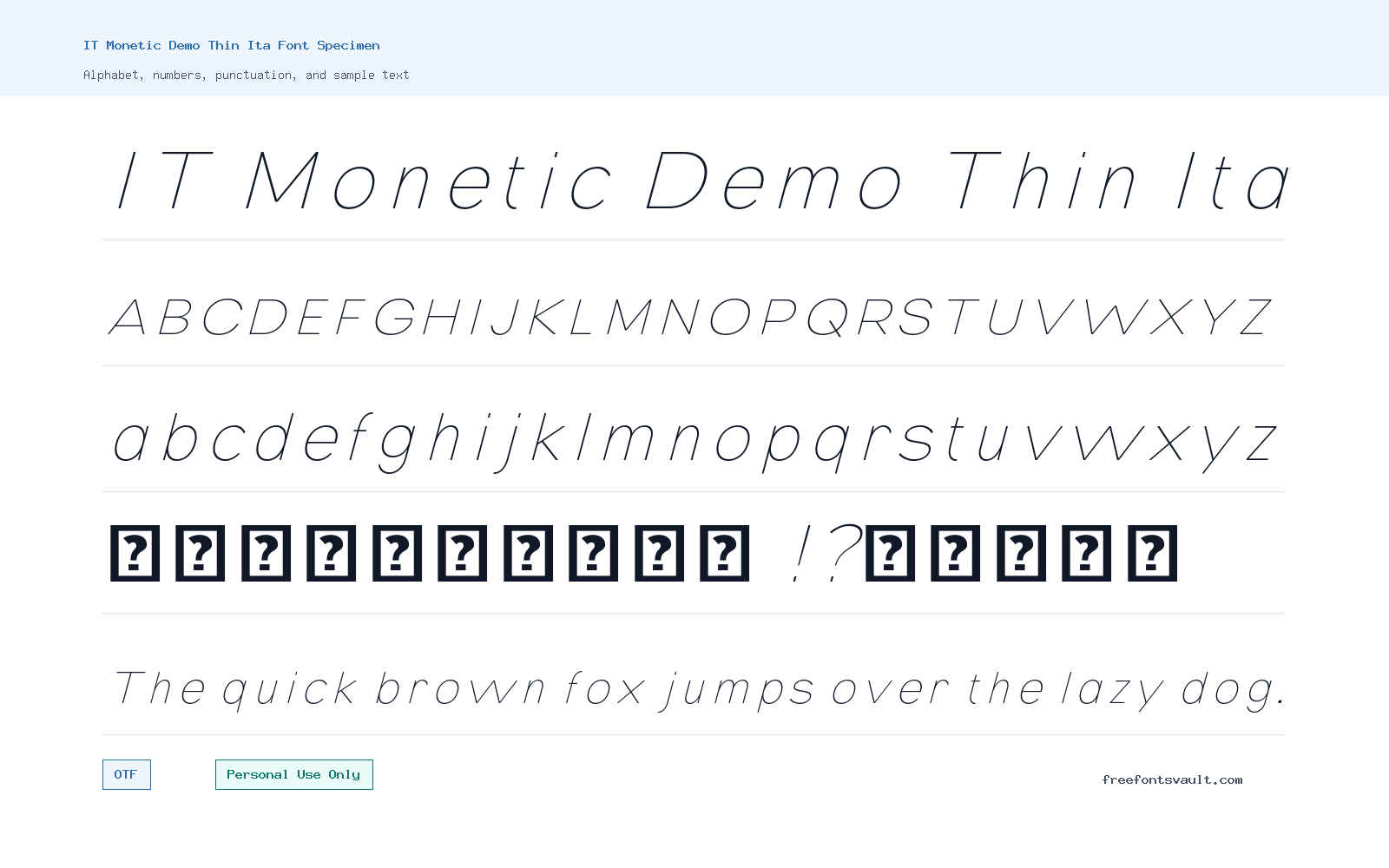
Font Specimen
Details
- Designer Indotype
- Foundry Indotype Foundry
- License Personal use only
- Format OTF
- Variants 1 file available
IT Monetic Demo Thin Ita font.
IT Monetic Demo Thin Ita is a light, italic display style from Indotype Foundry. It is best approached as a personal-use demo font for testing slim, angled lettering in layouts, previews, and concept work.
About IT Monetic Demo Thin Ita
IT Monetic Demo Thin Ita has a very thin weight and an italic posture, which gives the lettering a clean, slanted, and delicate feel. Because the font weight is marked as 100, it will usually work better in larger sizes than in dense body text. Thin italic fonts can look elegant in short headlines, name treatments, quote graphics, fashion-style layouts, portfolio mockups, and refined poster concepts, but they need enough space around the letters to stay readable.
Use the preview tool to test the exact words you plan to design with, especially if the text includes small punctuation, numbers, or long phrases. A thin italic cut can lose impact when it is too small, placed over a busy image, or used in low-contrast colors. For logo work and branding mockups, try it first in a large size with generous spacing, then compare it against a stronger companion font. It can be useful for early logo exploration, poster titles, web hero mockups, social graphics, stationery concepts, and editorial-style headings, but the personal-use license means it should not be used in client, product, advertising, or commercial work unless the proper license is confirmed separately.
For pairing, keep the second typeface simple. A neutral sans serif, a readable grotesque, or a plain text face will usually support the thin italic style without competing with it. Avoid pairing it with another decorative italic or an ultra-thin script unless the design is intentionally delicate and minimal. If you are building a poster or landing page mockup, let IT Monetic Demo Thin Ita handle the short expressive line, then use a sturdier font for descriptions, buttons, dates, prices, or navigation. This keeps the design balanced and helps visitors read the important details quickly.
The downloadable font file is in OTF format, which is commonly used in desktop design software and many typography projects. If you plan to test it in a web mockup, check how your design tool or development setup handles OTF files and confirm licensing before any live use. For screen designs, test the font at several sizes and weights against both light and dark backgrounds. Very thin strokes can look crisp in one preview and too faint in another, depending on rendering, screen resolution, and contrast.
Because this is a demo thin italic style, treat it as a way to explore the look of the family rather than as a full production decision. Test uppercase and lowercase words, short brand names, numerals, and common punctuation before committing to a layout. If the font is used for a poster, keep the main text brief. If it is used for a logo mockup, check that the mark still reads clearly when scaled down. If it is used for social graphics, avoid placing it over textured backgrounds unless there is a soft overlay or a clean color block behind the text.
Features
- Thin 100-weight lettering with an italic style for light, angled display typography
- OTF font format suitable for desktop previewing and design software testing
- Works best in short, spacious text settings rather than long paragraphs
- Useful for concept work where a refined, minimal, slanted title style is needed
Best Uses
- Personal poster concepts and title treatments
- Logo and wordmark mockups for testing a thin italic direction
- Fashion, editorial, portfolio, and moodboard-style layouts
- Web hero mockups, social graphics, and quote designs with short text
- Pairing with a stronger sans serif for balanced hierarchy
License Information
The license information identifies IT Monetic Demo Thin Ita as Personal Use Only. Use it for personal projects, private previews, and non-commercial testing unless you confirm and obtain the proper commercial license from the rights holder.
Designer and Foundry
The designer is listed as Indotype, with Indotype Foundry named as the foundry.
Usage Tips
Set this font large, keep the wording short, and use strong contrast. Thin italic strokes can become hard to read in small sizes, over photos, or in low-contrast color combinations. For commercial design, client work, products, ads, logos, or public brand assets, check the license with Indotype before use.
FAQ
Is IT Monetic Demo Thin Ita free for commercial use?
No. The license information says Personal Use Only. Do not use it for commercial projects unless you get the correct license from the rights holder.
What kind of font is IT Monetic Demo Thin Ita?
It is a thin italic OTF font. The file information lists the style as italic and the weight as 100, so it is best suited to light display use rather than long reading text.
Can I use this font for a logo?
You can test it in personal logo concepts and mockups, but commercial logo use needs proper licensing. Also check the design at small sizes, because very thin italic strokes may lose clarity when scaled down.
What should I pair with IT Monetic Demo Thin Ita?
Pair it with a clean, readable sans serif or a simple text font. Let IT Monetic Demo Thin Ita handle the short headline or accent line, and use the sturdier font for body copy and practical details.
Is the font good for body text?
It is not the best choice for long paragraphs. A thin italic weight is usually easier to read in short headlines, quotes, names, and display settings.
What file format does the download use?
The listed font file is an OTF file, a common font format used by many desktop design applications.
Similar Fonts
Want to browse beyond this family? Return to All Fonts for the main directory.



