Font Directory
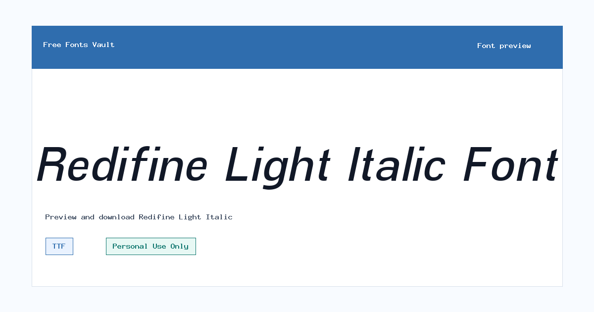
Redifine Light Italic
Redifine Light Italic includes 1 downloadable variant for live preview and testing.
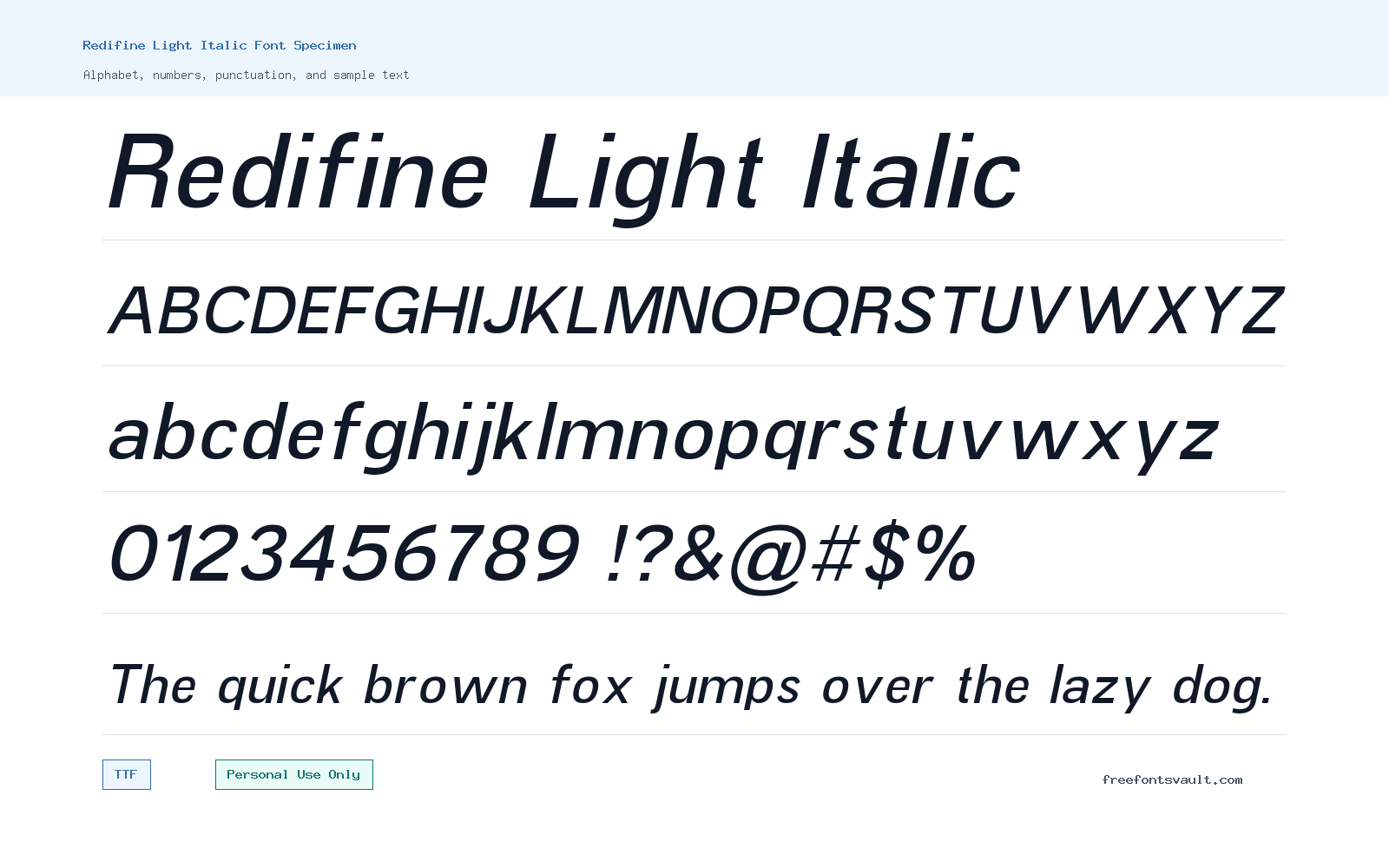
Font Specimen
Details
- Designer Muhamad Fikry Nuralif
- Foundry Fikryal Studio
- License Personal use only
- License URL www.fikryalstudio.com
- Format TTF
- Variants 1 file available
Redifine Light Italic font.
Redifine Light Italic is a light-weight italic sans serif font from Muhamad Fikry Nuralif of Fikryal Studio. It is best approached as a graceful display face for personal projects, mockups, headings, and short pieces of styled text.
About Redifine Light Italic
Redifine Light Italic has a slanted, lightweight structure that gives words a softer and more refined look than a standard upright sans serif. The 300 weight keeps the letters slim, while the italic style adds movement across the line. That combination works well when you want text to feel clean but not plain. It can be useful for fashion-style headings, invitation drafts, editorial mockups, quote graphics, poster accents, packaging concepts, and personal branding experiments where a lighter visual tone is needed.
Because this is a light italic font, it is strongest in short text rather than dense reading. Try it for names, taglines, section titles, captions, social post text, and display phrases. In a font preview tool, test it at larger sizes first, then check smaller sizes carefully before using it in a layout. Thin italic letters can lose clarity on low-resolution screens, busy backgrounds, or small mobile placements. If you use it on an image, give the text enough contrast and spacing so the shape of each letter remains clear.
For logo work and brand mockups, Redifine Light Italic can help explore a clean, angled wordmark direction, especially for personal concept boards or early design drafts. Keep the license limit in mind before using it for a client, business, product, monetized channel, or public commercial identity. If you like the style, build your mockup first, then confirm the correct commercial licensing option with the designer or foundry before final delivery.
Pairing this font is easiest when the supporting typeface stays simple. A neutral sans serif in a regular or medium weight can balance the slant and thin strokes. For example, use Redifine Light Italic for a headline or accent line, then use a plain readable sans serif for body copy, buttons, descriptions, or navigation labels. Avoid pairing it with another decorative italic face unless you want a very stylized result, because competing angles can make a design feel busy. It also helps to use generous spacing and clean layouts so the font’s slim form has room to breathe.
Features
- Light 300 weight with an italic sans serif style
- TTF font file format for common desktop design tools
- Best suited to short display text, headings, names, and accent lines
- Clean slanted appearance that can add motion without heavy decoration
- Works best at medium to large sizes where thin letterforms stay readable
Best Uses
- Personal poster titles and quote graphics
- Fashion, beauty, lifestyle, or editorial-style mockups
- Invitation drafts, mood boards, and social media visuals
- Logo concept exploration and personal branding studies
- Website hero text, web mockups, and elegant section headings
License Information
The listed license is Personal Use Only. Use Redifine Light Italic for personal previews, learning, mockups, and non-commercial design tests unless you obtain the proper commercial license from Fikryal Studio or the designer. Do not treat it as free for business, client, product, advertising, monetized, or trademark/logo use without permission.
Designer and Foundry
Redifine Light Italic is credited to Muhamad Fikry Nuralif and Fikryal Studio. The designer website is listed as fikryalstudio.com.
Usage Tips
Use Redifine Light Italic where a thin, angled sans serif can act as the visual accent. Keep it away from long paragraphs, tiny labels, and low-contrast backgrounds. For web or app mockups, test the font in the exact size and background color you plan to use. For posters and images, increase letter spacing only if it improves readability; too much spacing can make italic text feel disconnected. For logo concepts, use it as a starting point, then check licensing before moving beyond personal or internal mockup use.
FAQ
Is Redifine Light Italic free for commercial use?
No. The listed license says Personal Use Only. You should contact Fikryal Studio or the designer for commercial-use permission.
What type of font is Redifine Light Italic?
It is a light italic sans serif font with a 300 weight. It is better for display text and accents than for long reading.
What file format is available?
The font file is in TTF format, which is widely supported by desktop design software and many font managers.
Can I use Redifine Light Italic for a logo?
You can test it in personal logo concepts or private mockups, but commercial logo, brand, client, or trademark use requires the correct license from the rights holder.
Where does Redifine Light Italic work best?
It works best in short, visible text such as headings, names, posters, social graphics, invitation drafts, and web mockup hero text.
Is it good for body text?
It is not the best choice for long body text. The light italic style is easier to use as a headline, accent, or short caption.
What should I pair with Redifine Light Italic?
Pair it with a simple upright sans serif in a regular or medium weight. That keeps the layout readable while letting the italic font stand out.
Family Styles
Want to browse beyond this family? Return to All Fonts for the main directory.



