Font Directory
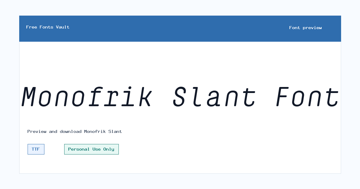
Monofrik Slant
Monofrik Slant includes 1 downloadable variant for live preview and testing.
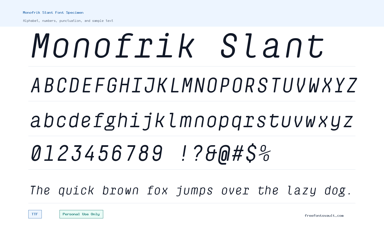
Font Specimen
Details
- Designer Glyphminds Studio (Graphicted.Co)
- License Personal use only
- Format TTF
- Variants 1 file available
Monofrik Slant font.
Monofrik Slant is a slanted sans serif demo font with a forward-leaning look that works best when you want short text to feel active, modern, and clean.
About Monofrik Slant
Monofrik Slant has the straightforward structure of a sans serif font, with an angled stance that gives words more movement than a standard upright style. The demo file comes in TTF format and is listed as a regular 400-weight style, so it is easy to test in common design apps, document tools, and many font preview tools. Because the design leans forward, it can help headings, short labels, and graphic text feel more energetic without relying on heavy ornament or complex decoration.
This is the kind of font to try when a project needs a clean display voice rather than long-form reading text. Use the preview box with brand names, poster titles, short quotes, product labels, channel graphics, social posts, and web hero mockups. The slant can make all-caps words feel sharper, while mixed-case text may give a softer editorial rhythm. For logos and identity sketches, test the exact wordmark at several sizes before committing, especially if the name contains narrow letters or repeated vertical strokes. Slanted fonts can look stylish, but they can also lose clarity if the spacing is too tight or the text is reduced too far.
For poster and web mockup work, Monofrik Slant is most useful as a headline or accent face. Pair it with a quieter text font for descriptions, body copy, menus, and small interface labels. A neutral sans serif can keep the layout readable, while Monofrik Slant handles the visual emphasis. If you are building a high-contrast design, leave enough space around the headline so the angled forms do not feel crowded. Try slightly increased letter spacing for uppercase settings, then compare it against the default spacing in the preview.
The file name identifies this as a demo version, and the license information marks it for personal use only. That makes it suitable for personal graphics, private mockups, school work, and non-commercial testing, but not for client work, paid products, advertising, commercial branding, merchandise, app interfaces, or business websites unless you obtain the proper commercial license from the rights holder. If you are preparing a logo, packaging concept, or public campaign, treat the download as a trial for evaluating the look rather than as final production permission.
Features
- Slanted sans serif appearance suited to short, display-focused text
- Regular 400-weight TTF demo font file for easy previewing and testing
- Clean letter structure that can support logos, posters, titles, and web mockups
- Best used for emphasis rather than long paragraphs or dense reading layouts
- Personal-use-only license, so commercial projects require separate permission
Best Uses
- Logo drafts and wordmark experiments
- Poster titles and event graphics
- Website hero headings and landing page mockups
- Social media banners, thumbnails, and short promotional text
- Product label concepts and personal branding studies
- Typography testing before buying or requesting a commercial license
License Information
Monofrik Slant is marked as Personal Use Only. Use it for personal and non-commercial testing, but do not use it in commercial branding, client work, merchandise, advertising, paid products, or business projects unless you secure the correct commercial license from the font owner.
Designer and Foundry
Monofrik Slant is credited to Glyphminds Studio, with Graphicted.Co listed as the designer URL.
Usage Tips
Use Monofrik Slant where a slanted headline or short wordmark needs motion and clarity. Keep it large enough to read, avoid cramped spacing, and pair it with a simpler upright font for body text, captions, navigation, and longer descriptions.
FAQ
Is Monofrik Slant free for commercial use?
No. The license information marks Monofrik Slant as Personal Use Only. For any commercial project, contact the rights holder or get the correct commercial license before using it.
What kind of font is Monofrik Slant?
Monofrik Slant is a slanted sans serif demo font. It is best suited to short display text such as logos, headings, posters, and mockups.
What file format is included?
The font file is in TTF format, which is widely supported by many desktop design and preview applications.
Can I use Monofrik Slant for a logo?
You can test it in personal logo concepts and mockups, but a real business logo or client identity would count as commercial use. Check the license and obtain commercial permission first.
Is Monofrik Slant good for body text?
It is better for headings and short text. The slanted style can become tiring or less readable in long paragraphs, so use a simpler companion font for body copy.
What should I pair with Monofrik Slant?
Pair it with a neutral upright sans serif for body text and interface labels. This keeps the layout readable while letting Monofrik Slant stand out in headlines.
Similar Fonts
Want to browse beyond this family? Return to All Fonts for the main directory.



