Font Directory
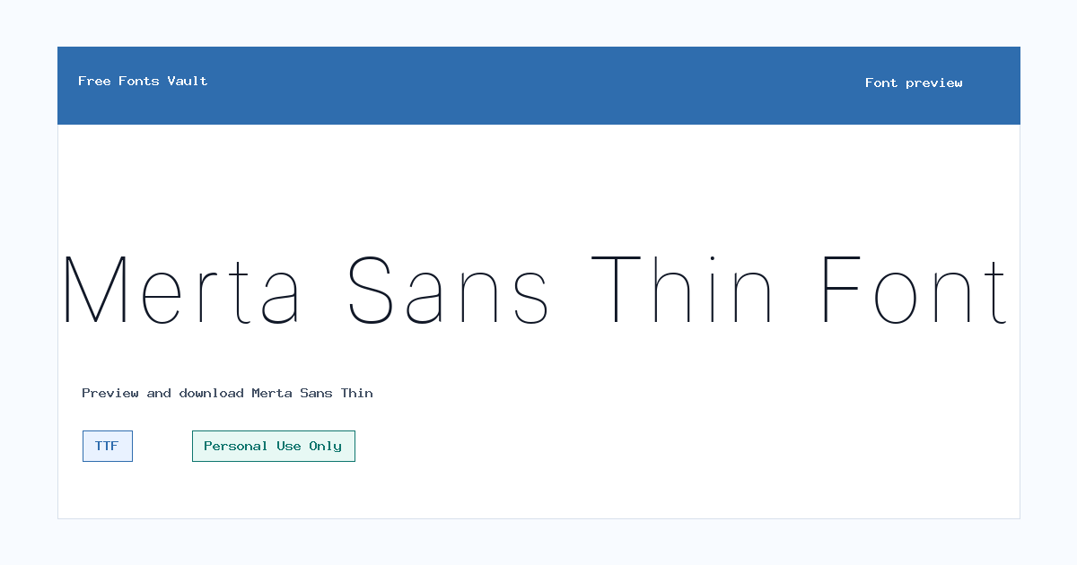
Merta Sans Thin
Merta Sans Thin includes 1 downloadable variant for live preview and testing.
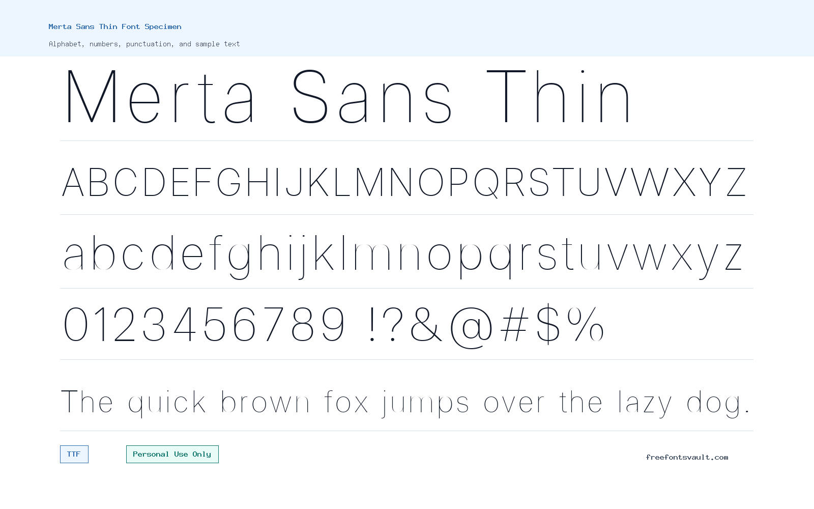
Font Specimen
Details
- Designer Diki Pradipta Tri Atmojo
- Foundry Lettertype Studio Co.
- License Personal use only
- Format TTF
- Variants 1 file available
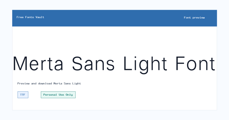
Merta Sans Thin font.
Merta Sans Thin is a light-weight sans serif font with a clean, simple look suited to projects where you want the type to feel airy rather than heavy.
About Merta Sans Thin
Merta Sans Thin uses a very slim weight, which gives words a calm and modern appearance. Because the available file is the Thin style, it is best treated as a display or accent font rather than a workhorse text face. It can look elegant in large headlines, nameplates, minimal poster layouts, quote graphics, packaging mockups, and clean social media designs. At small sizes, thin strokes can lose clarity, especially on busy backgrounds or low-resolution screens, so it is worth testing your exact text in the preview before using it in a final layout.
This font is especially useful when you need a quiet sans serif title that does not overpower the rest of the design. Try it for short words, brand concept sketches, hero headings, fashion-style layouts, portfolio covers, digital banners, or presentation titles. Keep the surrounding design simple: thin fonts usually work best with generous spacing, clear contrast, and plenty of breathing room. For longer text, pair Merta Sans Thin with a more readable regular-weight sans serif or a neutral serif, then reserve Merta Sans Thin for headings, labels, or decorative emphasis.
Features
- Thin 100-weight sans serif style with a clean, lightweight appearance
- TTF font file format for common desktop design and preview tools
- Normal upright style suitable for titles, mockups, and display text
- Works best at larger sizes where the fine strokes remain visible
- Good fit for minimal layouts, logo drafts, posters, web mockups, and short text graphics
Best Uses
- Minimal logo concepts and wordmark sketches
- Poster titles, quote graphics, and clean social media images
- Website hero headings and landing-page mockups
- Fashion, portfolio, beauty, lifestyle, and editorial-style layouts
- Presentation covers, packaging drafts, and short display labels
License Information
Merta Sans Thin is marked as Personal Use Only. Use it for personal projects, previews, learning, and non-commercial design experiments unless you confirm separate permission or obtain the proper commercial license from the rights holder. Do not assume it is free for client work, paid products, branding, advertising, merchandise, apps, websites, or any other commercial use.
Designer and Foundry
The designer is listed as Diki Pradipta Tri Atmojo, with Lettertype Studio Co. listed as the foundry. The designer website is Lettertype Studio.
Usage Tips
Use Merta Sans Thin at larger sizes and avoid placing it over detailed images unless there is strong contrast. Increase letter spacing carefully for uppercase titles, but do not over-track lowercase text because thin strokes can start to feel disconnected. For web mockups, test the font on both light and dark backgrounds. For logo work, use it as an early concept font and check the license before using it in any real brand identity.
FAQ
Is Merta Sans Thin free for commercial use?
No. The license information marks it as Personal Use Only. For commercial projects, contact the designer or foundry and confirm the correct license.
What type of font is Merta Sans Thin?
Merta Sans Thin is a thin-weight sans serif font. Its light strokes make it better for display use than for long paragraphs.
What file format is available?
The available font file is in TTF format, which is commonly used in desktop design software and font preview tools.
Can I use Merta Sans Thin for a logo?
You can test it in personal logo concepts or mockups, but commercial logo use requires the correct permission or license. Thin fonts also need careful testing at small sizes.
What should I pair with Merta Sans Thin?
Pair it with a regular or medium-weight sans serif for body text. A simple serif can also work if you want a more editorial contrast.
Family Styles
Want to browse beyond this family? Return to All Fonts for the main directory.



