Font Directory
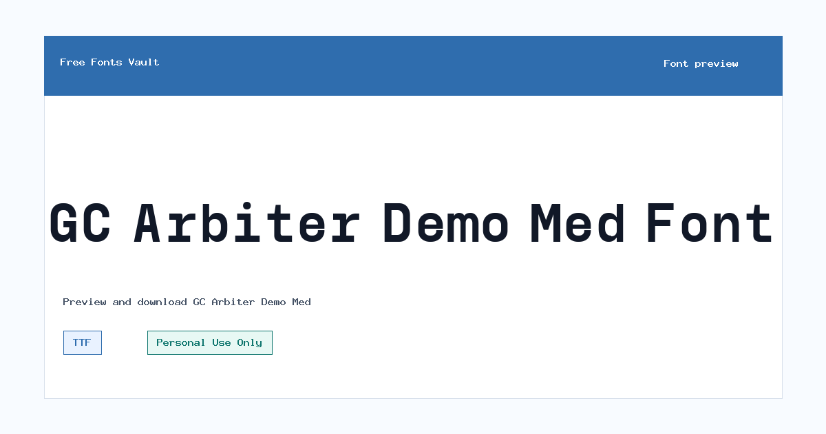
GC Arbiter Demo Med
GC Arbiter Demo Med includes 1 downloadable variant for live preview and testing.
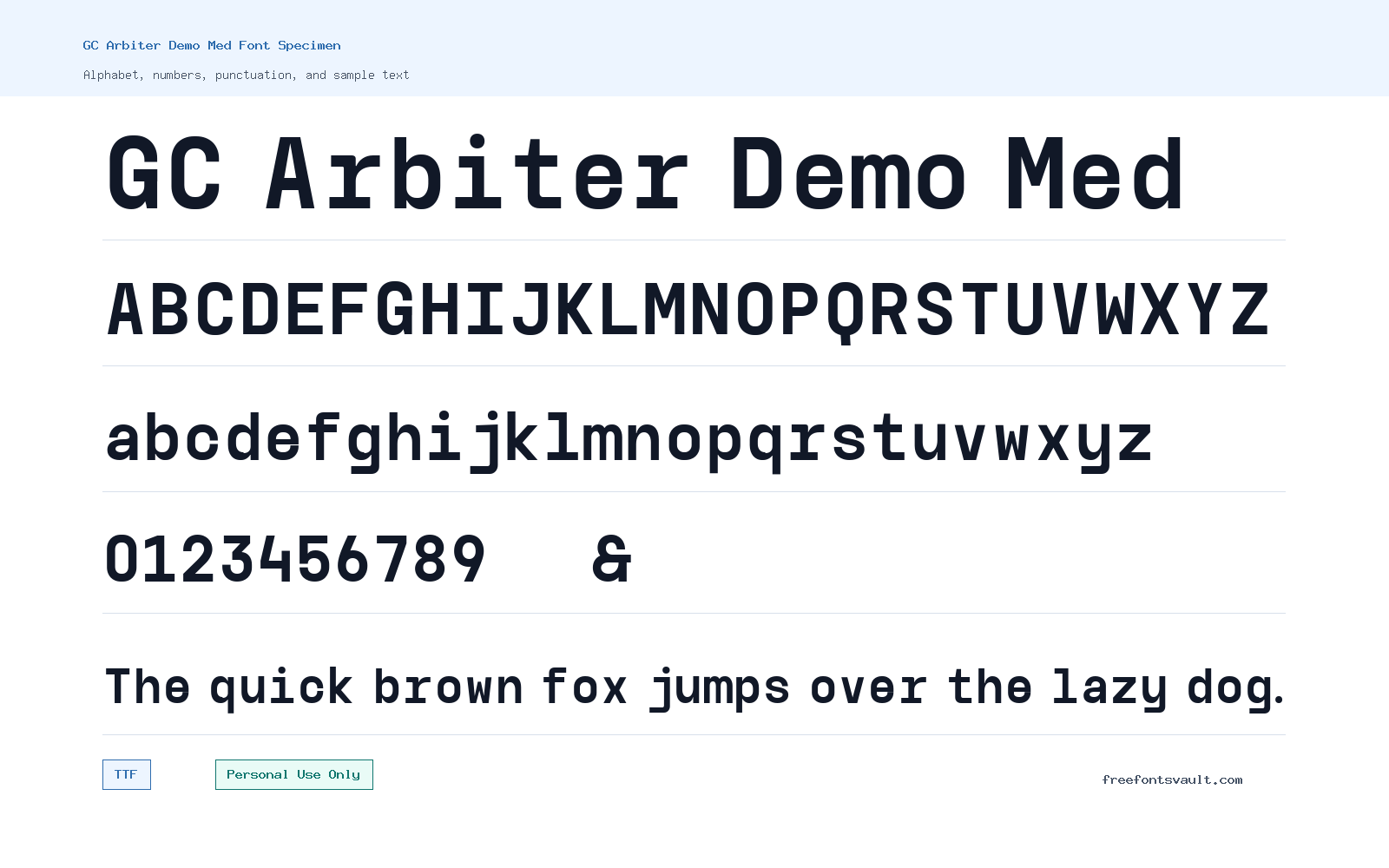
Font Specimen
Details
- Designer Achmad Akbar Afiansyah of Glyphonic
- Foundry Glyphonic
- License Personal use only
- Downloads 1
- Format TTF
- Variants 1 file available
GC Arbiter Demo Med font.
GC Arbiter Demo Med is a medium-weight sans serif font from Glyphonic, designed by Achmad Akbar Afiansyah. It is a practical choice for personal design previews where you want clean letterforms, steady weight, and a straightforward typographic tone.
About GC Arbiter Demo Med Font
GC Arbiter Demo Med sits in the sans serif category and uses a medium weight, making it useful when regular text feels too light but bold text would feel too strong. The name points to a demo medium style, so it is best approached as a test font for personal projects, drafts, layout experiments, and early visual exploration. Because the style information is limited, the safest way to judge it is through the preview tool: type a brand name, a short headline, a menu label, and a few mixed-case words to see how the spacing, rhythm, and punctuation behave. Medium sans serif fonts often work well when a design needs clear structure without heavy visual pressure, but each font has its own details, so test the exact words you plan to use.
For designers, GC Arbiter Demo Med can be useful in logo drafts, poster headings, web mockups, social graphics, presentation covers, and simple title treatments. Try it first in short text, where the medium weight can give names and headings enough presence without turning the page too dark. For logo work, test uppercase, lowercase, and mixed-case versions before choosing a direction. Check difficult letter pairs such as AV, WA, To, Ta, and ry, then adjust spacing in your design software if needed. For posters and web mockups, pair it with a quieter body font rather than another font with a similar voice. If both typefaces are too close in weight and structure, the design can look accidental instead of intentional. A lighter sans serif, a readable serif, or a neutral text face can help GC Arbiter Demo Med stand out in headings while keeping longer copy comfortable to read.
Features
- Medium-weight sans serif style suited to short headings, names, labels, and layout tests.
- TTF font file format, which is widely supported by common desktop design tools.
- Normal style with a 500 weight value, useful between regular and bold in mockups.
- Single regular variant, keeping the download simple for quick personal-use previews.
- Clean category placement for personal-use projects where licensing limits must stay clear.
Best Uses
- Logo concept drafts and wordmark exploration for personal projects
- Poster titles, event mockups, and short display text
- Website hero headings, navigation labels, and interface mockups
- Social media graphics, quote cards, and presentation covers
- Typography tests where a medium sans serif weight is needed
- Pairing studies with lighter sans serifs, readable serifs, or neutral body fonts
License Information
The license is Personal Use Only. Use GC Arbiter Demo Med for personal previews, practice designs, mockups, and non-commercial experiments unless you obtain the proper permission or commercial license from the rights holder. Do not use it in client work, paid branding, merchandise, advertising, apps, websites for a business, or any project connected to revenue without confirming commercial-use rights.
Designer and Foundry
GC Arbiter Demo Med is credited to Achmad Akbar Afiansyah of Glyphonic. The foundry name associated with the font is Glyphonic.
Usage Tips
Use the preview field before downloading to test the exact words you need. Start with short text: a logo name, headline, button label, or poster title. Check how the font handles numbers, punctuation, accented characters, and close letter pairs. Since only one medium regular variant is listed, build contrast through size, spacing, color, and pairing rather than relying on multiple weights. For web mockups, test headings at several sizes and compare them with your body font. If the font feels too dense in paragraphs, keep it for display use and choose a more comfortable typeface for longer reading.
FAQ
Is GC Arbiter Demo Med free for commercial use?
No. The listed license is Personal Use Only, so commercial use requires separate permission or a proper commercial license.
Who designed GC Arbiter Demo Med?
The font is credited to Achmad Akbar Afiansyah of Glyphonic.
What kind of font is GC Arbiter Demo Med?
It is a sans serif font in a medium weight, with a normal style and a regular variant listed.
What file format does the font use?
The listed font file is in TTF format, a common format supported by many design, office, and font-management apps.
Can I use GC Arbiter Demo Med for a logo?
You can test it in personal logo drafts and concept work, but a logo for a business, client, product, or paid project needs commercial-use clearance first.
Is this font good for body text?
Test it before using it for long reading. With only a medium regular style listed, it may be better for headings, labels, and short display text than dense paragraphs.
What should I pair with GC Arbiter Demo Med?
Try a lighter sans serif, a readable serif, or a neutral body typeface. Avoid pairing it with another font that looks too similar in weight and structure.
Similar Fonts
Want to browse beyond this family? Return to All Fonts for the main directory.



