Font Directory
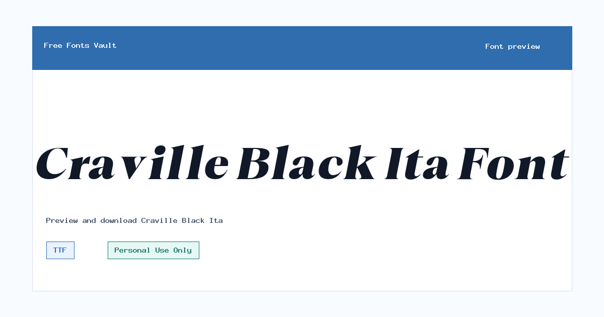
Craville Black Ita
Craville Black Ita includes 1 downloadable variant for live preview and testing.
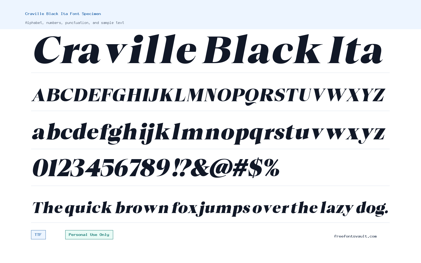
Font Specimen
Details
- Designer Glyphminds Studio (Graphicted.Co)
- License Personal use only
- Format TTF
- Variants 1 file available
Craville Black Ita font.
Craville Black Ita is a heavy italic serif font with a bold, slanted display style. It is best suited for short text where you want a strong typographic voice, such as titles, logo drafts, poster headings, and brand mockups.
About Craville Black Ita
Craville Black Ita uses a black weight and italic style, giving it a firm presence with a forward-leaning shape. That combination makes it more useful as a display font than as a long-reading text face. In a headline, the weight can feel confident and polished; in small paragraphs, the heavy strokes and italic angle may become harder to read. Use it where the words are short, the spacing has room to breathe, and the type can be treated as a main visual element rather than background text.
For design work, Craville Black Ita can fit personal projects that need a dramatic serif headline without moving into overly decorative lettering. Try it for poster titles, fashion-style graphics, quote cards, packaging concepts, editorial headers, invitation mockups, or logo exploration. Because the font is both heavy and italic, test it carefully in all caps, title case, and lowercase before finalizing a layout. It may need extra tracking in uppercase settings, while mixed-case text can help keep the rhythm more readable. For web mockups, use it as a hero heading or accent type, then pair it with a calmer sans serif or readable text serif for body copy.
The download format is TTF, which is widely supported by common design tools and desktop operating systems. After installing it, preview the font at the actual size you plan to use. A wordmark that looks sharp at large scale may feel crowded when reduced for a social profile image, favicon-style mark, or small button. If you are using it for logo concepts, check the letters that matter most in the brand name, especially tight pairs, descenders, and endings. Heavy italic fonts can create strong movement, but they also need balanced spacing so the word does not look squeezed.
Craville Black Ita is also worth testing in contrast-heavy layouts. Pair it with simple backgrounds, restrained colors, and generous margins so the letterforms can carry the attention. If you combine it with another font, avoid pairing it with a second loud display face unless the design is intentionally experimental. A neutral grotesque, humanist sans serif, or classic readable serif will usually make the layout easier to control. Use Craville Black Ita for emphasis, not for every layer of text. That keeps the design clear and helps the font feel intentional.
Features
- Black-weight italic serif styling for strong display headlines and short text
- TTF font file format for use in many desktop design and preview tools
- Best suited to large-size typography rather than long body copy
- Forward-leaning letterforms that can add motion and emphasis to titles
- Useful for personal-use mockups, posters, logo studies, and editorial-style graphics
Best Uses
- Poster headlines and event-style title designs
- Logo drafts, wordmark exploration, and branding mockups
- Fashion, editorial, and portfolio-style hero typography
- Social media quote graphics and bold text overlays
- Packaging concepts, invitation headings, and display layouts
- Website hero sections where the font is used sparingly
License Information
Craville Black Ita is marked as Personal Use Only. Use it for personal projects, testing, previews, and non-commercial mockups unless you confirm and obtain the proper commercial license from the rights holder. Do not use it in paid client work, products, advertising, business branding, or other commercial projects without checking the license terms first.
Designer and Foundry
The designer information lists Glyphminds Studio, associated with Graphicted.Co. No additional foundry details are confirmed here.
Usage Tips
Use Craville Black Ita at larger sizes and keep the wording short. Test spacing before exporting logos or poster artwork, especially in all caps. For balanced layouts, pair it with a simple sans serif or readable text font and let Craville Black Ita handle the main title or accent line.
FAQ
What kind of font is Craville Black Ita?
Craville Black Ita is a heavy italic serif display font. Its black weight and slanted style make it better for headings, logos, posters, and short design text than for long paragraphs.
Can I use Craville Black Ita for commercial projects?
The license information marks it as Personal Use Only. For commercial use, you should get permission or a commercial license from the font owner before using it in client work, branding, products, ads, or monetized designs.
Is Craville Black Ita good for logos?
It can work well for personal logo concepts and wordmark drafts because the style is bold and distinctive. For real business branding, confirm the commercial license first and test the spacing carefully at small and large sizes.
What file format is included for Craville Black Ita?
The listed font file is in TTF format, a common desktop font format supported by many design apps and operating systems.
What fonts pair well with Craville Black Ita?
Pair it with a quiet sans serif or a readable text serif. Since Craville Black Ita is already heavy and italic, a simpler companion font will keep menus, paragraphs, captions, and supporting text easier to read.
Should I use Craville Black Ita for body text?
It is not the best choice for body text. The black weight and italic angle are stronger at display sizes, so use it for titles or short accent lines and choose another font for paragraphs.
Similar Fonts
Want to browse beyond this family? Return to All Fonts for the main directory.



