Font Directory
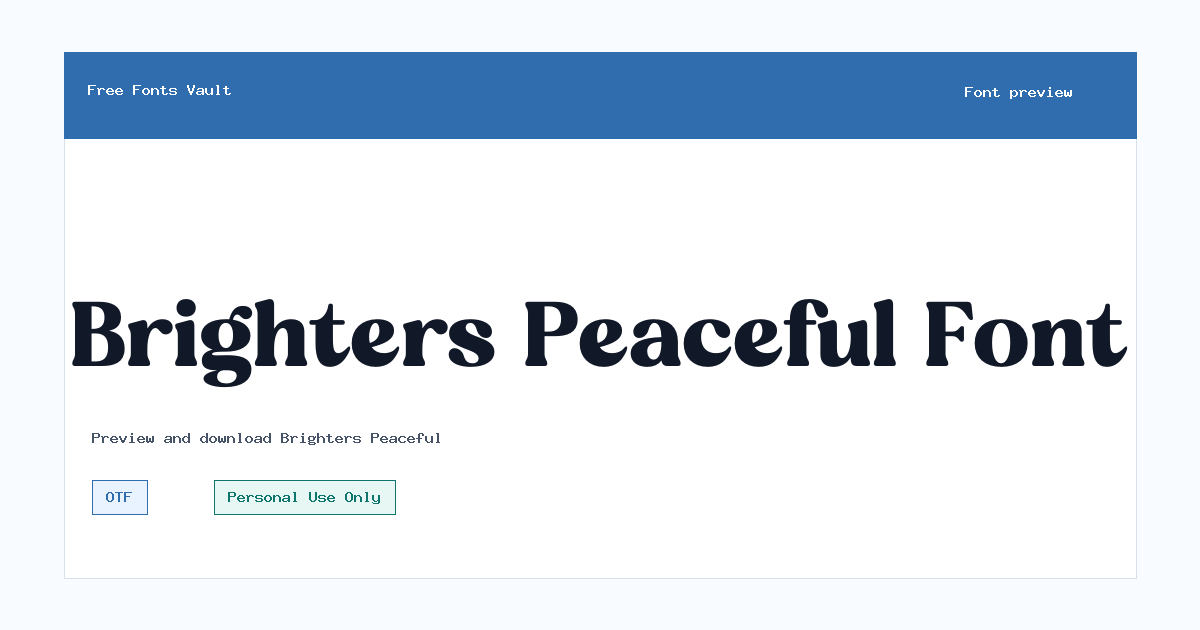
Brighters Peaceful
Brighters Peaceful includes 1 downloadable variant for live preview and testing.
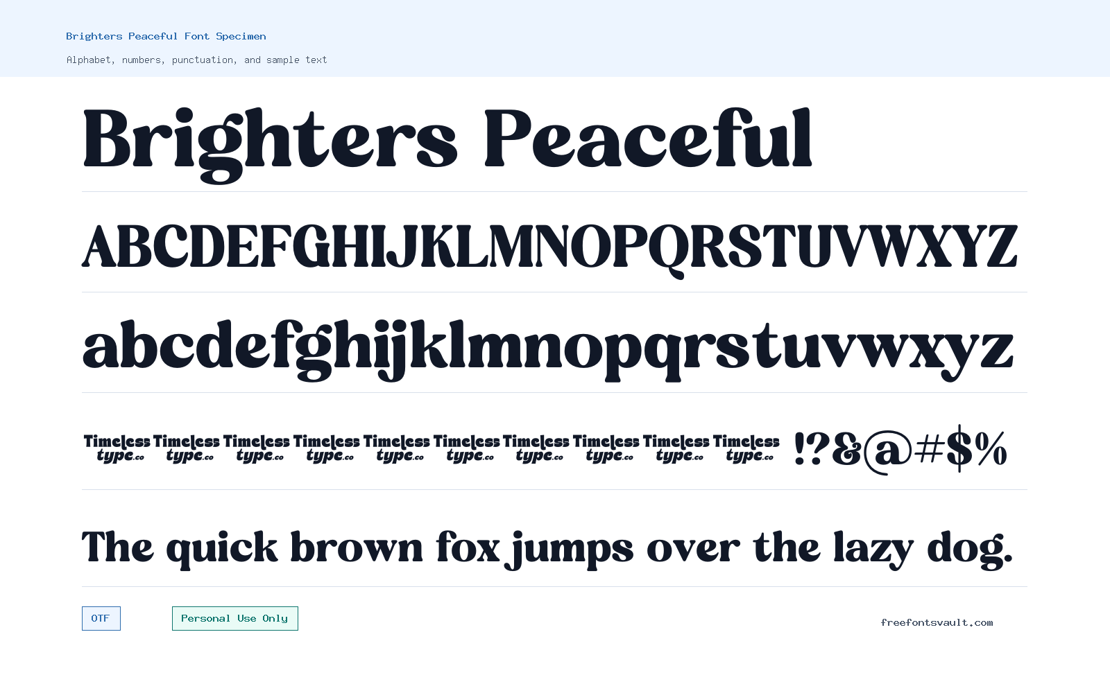
Font Specimen
Details
- Designer Heru Utama Putra
- Foundry TimelessType
- License Personal use only
- License URL TimelessType.co/
- Format OTF
- Variants 1 file available
Brighters Peaceful font.
Brighters Peaceful is a serif font with a calm display feel, made for visitors who want to test elegant text before downloading. It is best approached as a personal-use font, so check the license carefully before using it in client work, products, ads, or any project that earns money.
About Brighters Peaceful
Brighters Peaceful works well when you need a refined serif voice for short text. The regular OTF file gives you a clean starting point for previewing names, titles, invitation lines, boutique-style wording, mood boards, and social graphics. Because only one regular style is listed, it is better suited to focused display use than to a full editorial system with many weights. Try it at larger sizes first, where the serif shapes can be seen clearly, then test smaller captions only if your layout needs them.
Use the preview box to check the exact words you plan to design with. Serif display fonts can look graceful in a headline but may lose clarity when set too small, squeezed tightly, or used in long paragraphs. Test uppercase, lowercase, punctuation, and any accented characters you need before committing to a design. For pairing, keep the supporting font simple: a neutral sans serif or plain text serif can help Brighters Peaceful stay as the main accent without making the page feel too busy.
Features
- Regular OTF font file for simple installation and design-app testing.
- Serif display style suited to short titles, names, quotes, and decorative text rather than dense body copy.
- Single-weight family, which makes previewing straightforward but limits advanced hierarchy options.
- Works best when given enough size and spacing to show the letter details clearly.
Best Uses
- Personal invitation drafts, greeting cards, name previews, and quote graphics.
- Logo mockups, packaging concepts, boutique headings, and mood-board typography for non-commercial testing.
- Pinterest pins, social post titles, and website hero text where only a few words need emphasis.
- Font comparison sessions where you want to test a calm serif against cleaner supporting typefaces.
License Information
The license information for Brighters Peaceful says Personal Use Only. That means you should not treat it as free for commercial use. If you want to use it for a business, client project, product, monetized content, branding, merchandise, advertising, or any other commercial purpose, contact TimelessType or review the official license terms first.
Designer and Foundry
Brighters Peaceful is credited to Heru Utama Putra, with TimelessType listed as the foundry. The designer URL points to TimelessType.co.
Usage Tips
Download and install the OTF file, then test your real wording before using it in a layout. Start with larger headings, add a little breathing room, and avoid long paragraphs until you have checked readability. If your design needs bold, italic, or multiple weights, plan to pair it with another font family because only a regular style is listed for this font.
FAQ
Is Brighters Peaceful free for commercial use?
No commercial-use permission is shown in the license details. The listed license says Personal Use Only, so use it for personal testing unless you obtain the right commercial license.
What file format is included?
The listed font file is an OTF file. OTF fonts are commonly supported by major design apps and most desktop operating systems.
What kind of projects is Brighters Peaceful good for?
It is a good fit for short, decorative text such as names, headings, invitation wording, quote graphics, and personal design mockups.
Can I use Brighters Peaceful for body text?
It is better to test it carefully before using it for body text. The single regular style and display feel make it more practical for short titles than for long reading.
Similar Fonts
Want to browse beyond this family? Return to All Fonts for the main directory.



