Font Directory
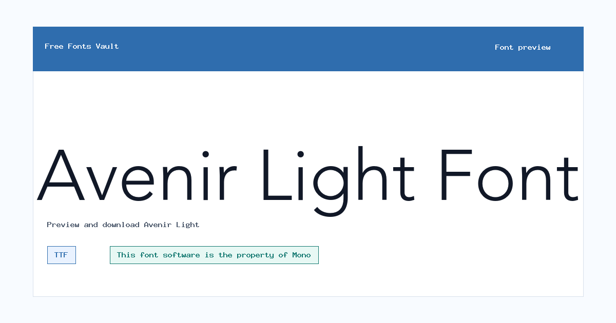
Avenir Light
Avenir Light includes 1 downloadable variant for live preview and testing.
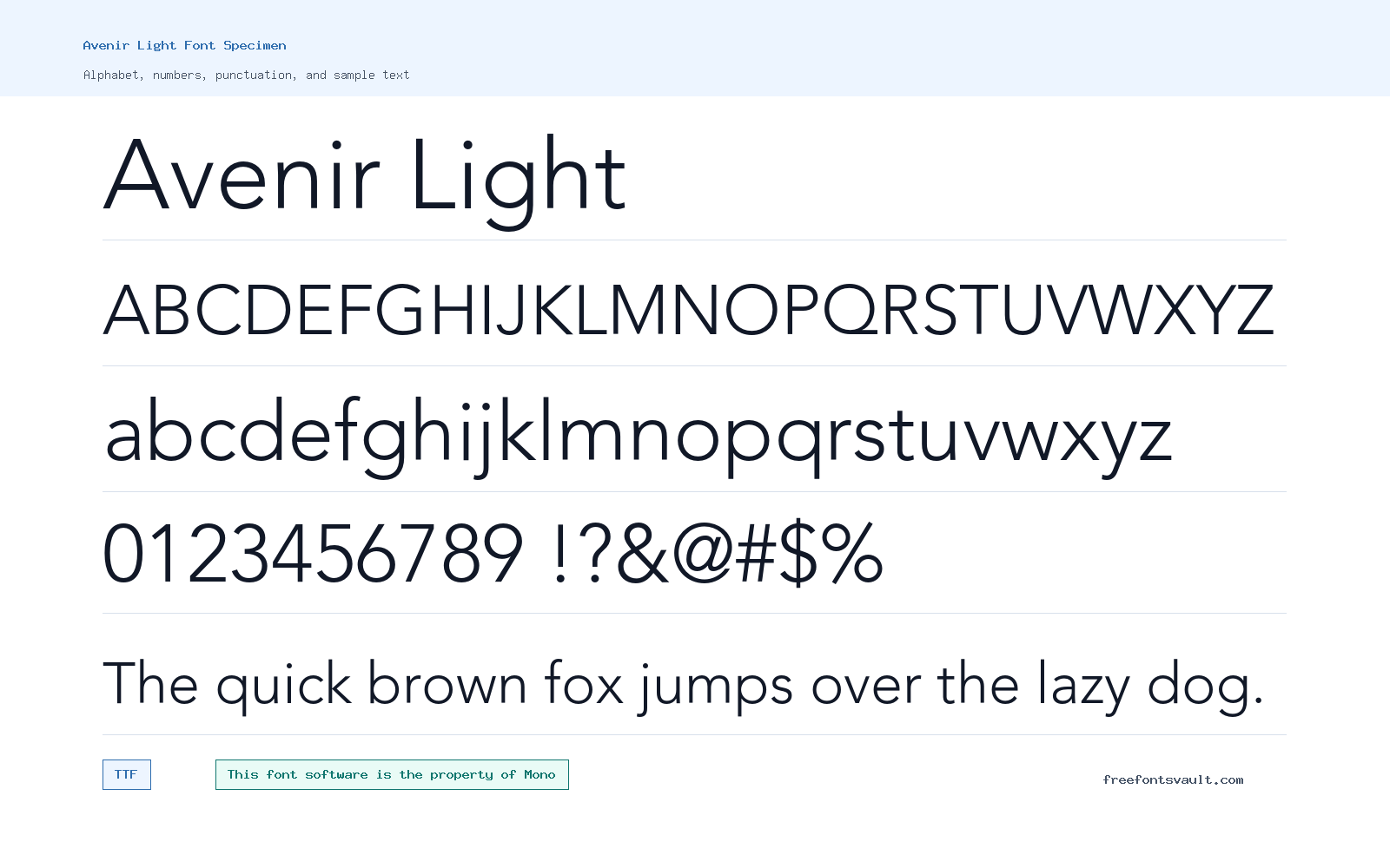
Font Specimen
Details
- Designer Nadine Chahine and Adrian Frutiger
- Foundry Monotype GmbH
- License Restricted use
- License URL www.monotype.com
- Downloads 2
- Format TTF
- Variants 1 file available
Avenir Light font.
Avenir Light is a light-weight sans serif with a clean, calm look. Its thin structure works best when you want a modern tone without making the text feel heavy.
About Avenir Light
Avenir Light uses a 300-weight normal style in TrueType format. The design direction is suited to people looking for a geometric-humanist sans: simple shapes, open spacing, and a lighter voice than regular or bold sans serif fonts. It can make headings, labels, short descriptions, and interface text feel more refined, but it needs enough size and contrast to stay readable.
Use the preview box to test the exact words you plan to set. Light fonts can look elegant in large display sizes, but they may become faint in small body text, low-contrast colors, or thin print output. Try uppercase headings, mixed-case titles, numerals, and punctuation before choosing it for a real layout.
Features
- Light 300 weight with a normal upright style
- TrueType font file: Avenir-Light.ttf
Best Uses
- Minimal headings, product labels, menus, and short interface text
- Clean editorial layouts, presentation titles, and simple branding drafts
License Information
The license text identifies the font software as property of Monotype GmbH or an affiliated Monotype entity and says use is covered by a license agreement. It also says you may not copy or distribute the software unless your specific license gives you those rights. Check your license before using it for desktop work, webfonts, apps, embedding, logos, client delivery, or redistribution.
Designer and Foundry
The font credits name Nadine Chahine and Adrian Frutiger as designers, with Monotype GmbH as the foundry. Monotype’s own Avenir Next World page also connects Nadine Chahine with the broader Avenir Next World family, while Microsoft’s typography page documents Avenir Next LT Pro as a Monotype-related family designed by Adrian Frutiger with Akira Kobayashi.
Usage Tips
For best results, use Avenir Light in larger sizes or high-contrast settings. Pair it with a sturdier sans serif weight for body copy, captions, forms, or long paragraphs. If you plan to send the font file to a client, package it with a project, embed it in software, or serve it on the web, confirm that your license allows that specific use.
FAQ
Is Avenir Light free for commercial use?
Do not assume that. The license text points to Monotype licensing and says use is limited by the license agreement you received.
Can I use Avenir Light for a logo?
Only if your license allows logo or trademark-style use. The design may work visually for a clean wordmark, but the legal permission depends on your Monotype license terms.
What format is the font file?
The listed file is Avenir-Light.ttf, a TrueType font file.
What weight is Avenir Light?
The listed style is normal with a 300 font weight, which is commonly treated as a light weight.
Is Avenir Light good for body text?
It can work for short text at comfortable sizes, but a light weight may be too thin for long reading, small captions, or low-contrast layouts.
Family Styles
Want to browse beyond this family? Return to All Fonts for the main directory.



