Font Directory
Konnect Medium
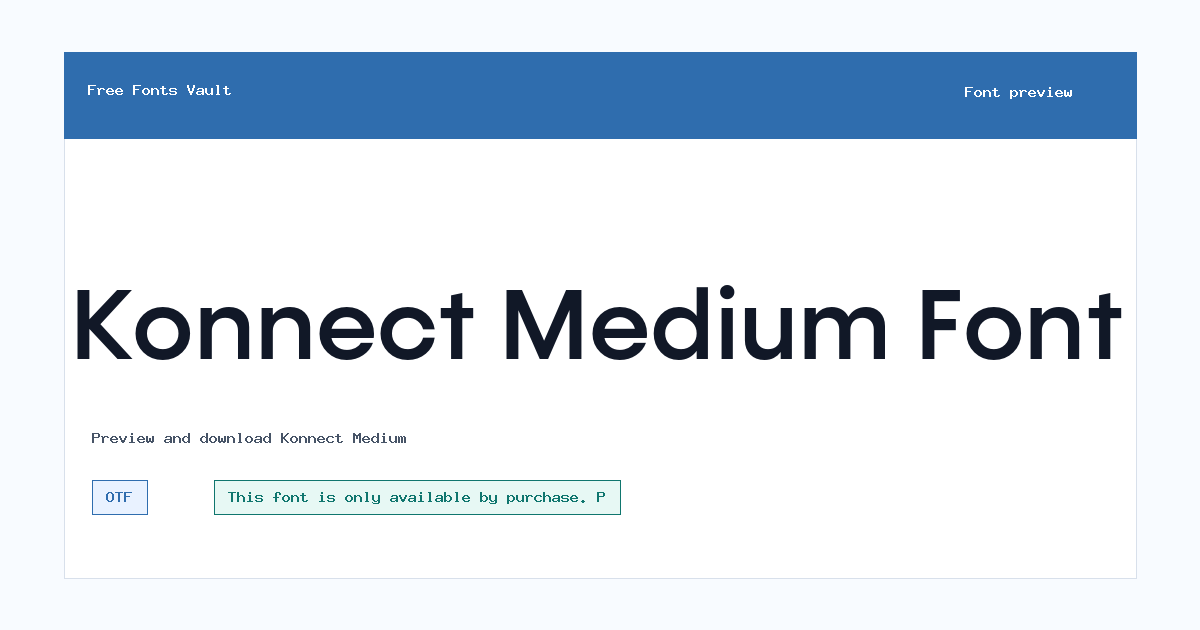
Konnect Medium includes 1 downloadable variant for live preview and testing.
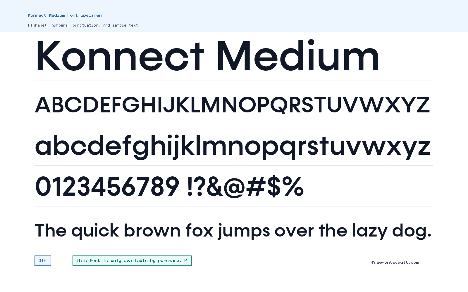
Font Specimen
Details
- Designer Adam Ladd
- Foundry Adam Ladd
- License License terms
- Format OTF
- Variants 1 file available
Konnect Medium font.
Konnect Medium is a 500-weight OTF font style from Adam Ladd. It is suited to visitors who want a balanced weight for headings, interface text, labels, and short display settings.
About Konnect Medium
Konnect Medium sits in the middle of the weight range, giving text more presence than a light or regular style without the heavy impact of a bold cut. That makes it useful when you want words to feel clear and steady, especially in titles, section headers, navigation labels, and short blocks of copy.
Use the preview tool to test the exact words you plan to set. Medium-weight fonts can work well for headlines and compact text, but spacing, letter shapes, and readability should always be checked at the size you need. Try uppercase, lowercase, numbers, and punctuation before downloading so you can see how the OTF file handles real layout text.
Features
- OTF font file format
- Normal style with 500 medium font weight
Best Uses
- Headings, subheadings, and short text blocks
- UI labels, menu text, and brand-style mockups
License Information
Konnect Medium is only available by purchase. Review the vendor license agreement before using it, and contact Adam Ladd for custom licensing questions.
Designer and Foundry
Konnect Medium is credited to Adam Ladd, with Adam Ladd also listed as the foundry.
Usage Tips
Test the font at the same size and line length you plan to use. For long paragraphs, check comfort and spacing carefully; for short text, compare it against lighter or bolder styles if your design needs stronger contrast. Konnect Medium should be tested as both a headline and a practical text weight. It can work well for section titles, menus, buttons, card labels, and short descriptions where a regular weight feels too light but bold feels too loud. Try it with real product names, mixed-case labels, numerals, and punctuation before using it in a live layout. If you are building a complete identity or website, pair Medium with lighter and bolder Konnect styles only after confirming the licensed family package covers the formats you need. Konnect Medium can feel polished in simple layouts, but it still needs enough spacing around each line. Avoid placing it over detailed photos unless you add contrast behind the text. For UI-style work, preview button labels and menu words at real size, because medium weights can shift from balanced to heavy when space is tight.
FAQ
Is Konnect Medium free for commercial use?
No. The license information says this font is only available by purchase. Check the vendor license agreement before commercial or client use.
Who designed Konnect Medium?
Konnect Medium is credited to Adam Ladd.
What format is the Konnect Medium font file?
The listed font file is in OTF format.
What weight is Konnect Medium?
It is listed as a 500 weight, which is commonly treated as a medium weight.
What should I test in the preview?
Preview your exact headline, brand name, or UI label. Include numbers and punctuation if your design will use them.
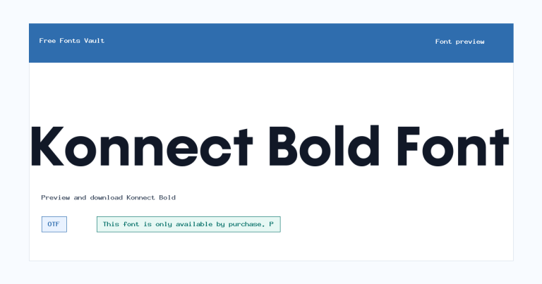
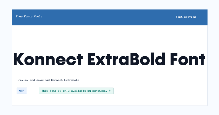
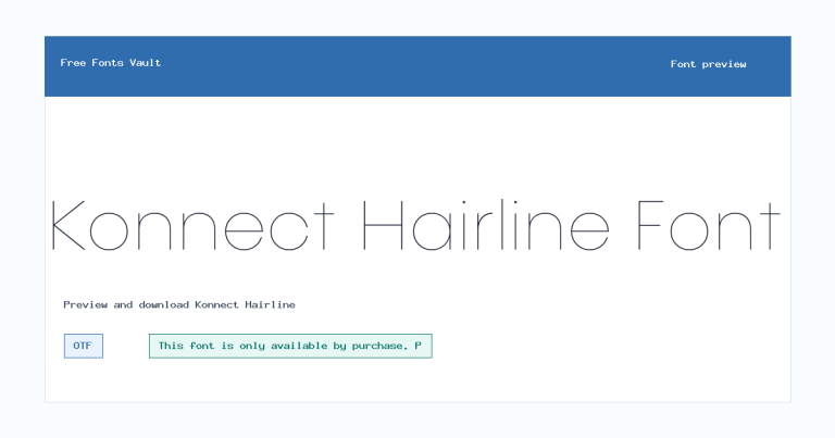
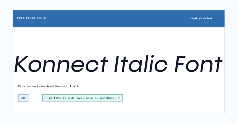
Family Styles
Want to browse beyond this family? Return to All Fonts for the main directory.



