Font Directory
Still Time
Still Time includes 1 downloadable variant for live preview and testing.
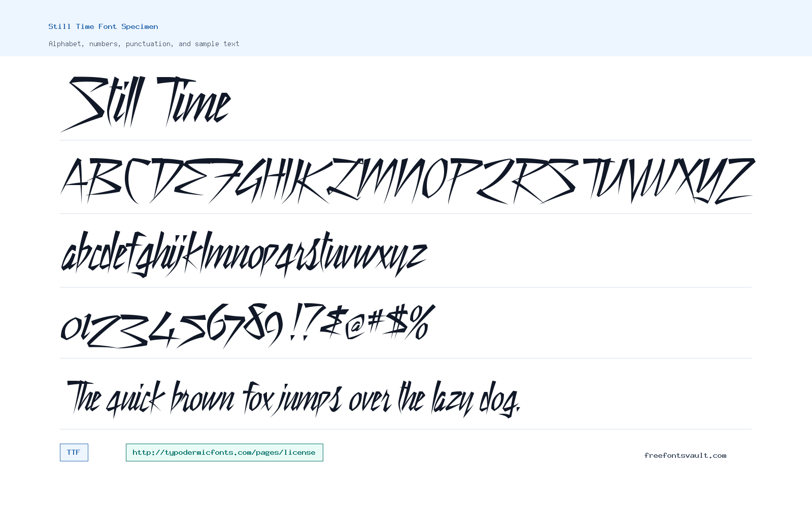
Font Specimen
Details
- Designer Ray Larabie
- Foundry Ray Larabie
- License License details
- License URL typodermicfonts.com/pages/license
- Format TTF
- Variants 1 file available
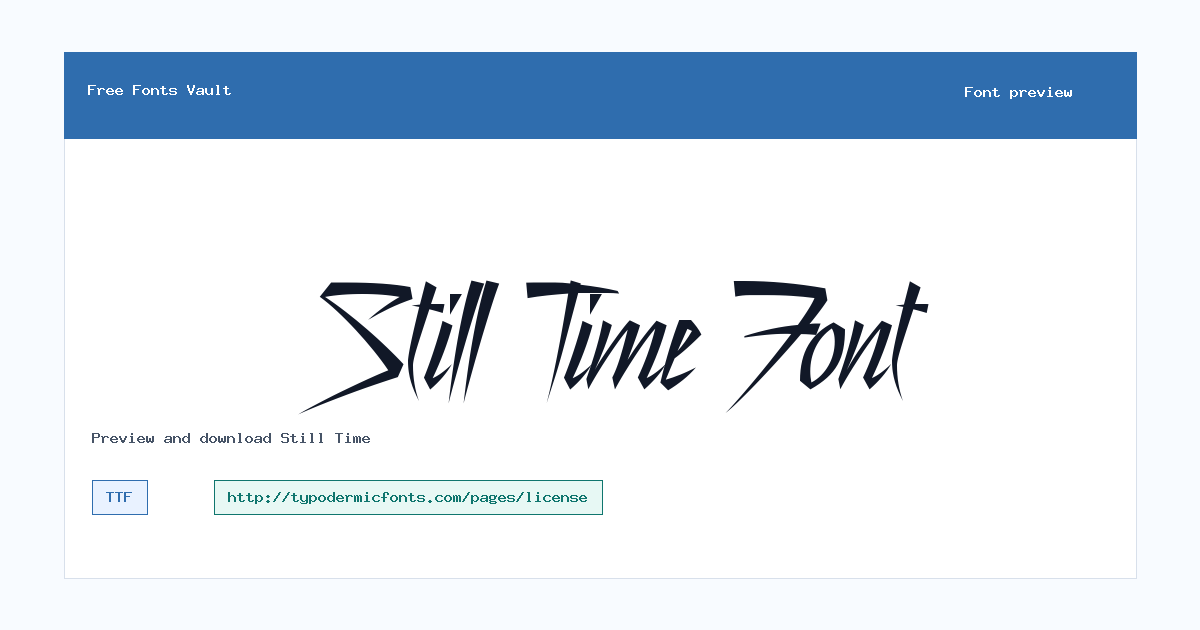
Still Time font.
Still Time is a sharp, slanted display font with a fast handwritten look. It works best when you need a title or short line to feel rough, energetic, and a little aggressive.
About Still Time
Still Time uses narrow, angular letterforms with pointed strokes and uneven edges. The uppercase letters have a scratchy marker feel, while the lowercase set is tighter and more compressed. It is not a quiet reading font. Its strength is in short words, names, logos, poster lines, and other places where the shape of the text matters as much as the words.
Use the preview tool before downloading to test your exact phrase. Some letters have dramatic cuts and sharp angles, so spacing can feel tight in all caps or in long words. It is better for display text than paragraphs. Try it at a large size, add extra letter spacing if needed, and avoid using it for small UI labels or body copy where quick reading matters.
For best results, compare a few versions of the same line before settling on one. Still Time can look stronger when the words are kept short and the layout gives the letters room to breathe. If a phrase starts to feel crowded, try title case, wider spacing, or a line break instead of shrinking the font.
Features
- Regular TTF font file with a normal 400 style
- Sharp handwritten display style with slanted, pointed strokes
- Uppercase, lowercase, numbers, and common punctuation visible in the font file
- Best suited to large text where the rough shape can be seen clearly
Best Uses
- Poster titles and event graphics
- Music, movie, or entertainment-style headings
- Short logo-style text
- Social media images and thumbnail lettering
- Decorative titles that need a sharp handwritten edge
License Information
The font points to the Typodermic Fonts license page. Check that license for your project before using Still Time, especially for client work, products, ads, or other commercial uses. Do not assume commercial rights from the download alone.
Designer and Foundry
Still Time is credited to Ray Larabie, with Typodermic Fonts listed as the related designer site.
Usage Tips
Keep Still Time large and brief. Test your wording in the preview, then adjust tracking or line breaks if the sharp strokes overlap or make a word harder to read. It is a good candidate for dramatic accent text, but it should sit beside a cleaner companion font when the design also needs paragraphs, navigation, or small supporting copy.
FAQ
What kind of font is Still Time?
Still Time is a display font with sharp, slanted handwritten shapes. It is better for titles and short phrases than for long reading text.
Is Still Time good for body text?
No. The pointed strokes and compressed shapes can become hard to read in paragraphs or small sizes. Use it for headings, posters, and short decorative text.
What file format is included?
The listed variant is a TTF file in Regular style with normal 400 weight.
Who designed Still Time?
Still Time is credited to Ray Larabie.
Can I use Still Time for commercial work?
Check the Typodermic Fonts license page linked with the font before using it commercially. The download information alone is not enough to confirm commercial permission.
How should I pair Still Time?
Pair it with a plain sans serif or readable serif. Let Still Time handle the headline or name, then use the simpler font for descriptions, dates, buttons, and other details.
Similar Fonts
Want to browse beyond this family? Return to All Fonts for the main directory.



