Font Directory
Priamos-Serial-Heavy
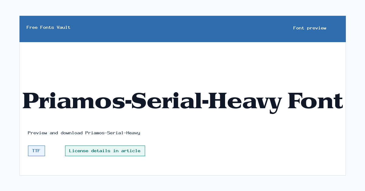
Priamos-Serial-Heavy includes 1 downloadable variant for live preview and testing.
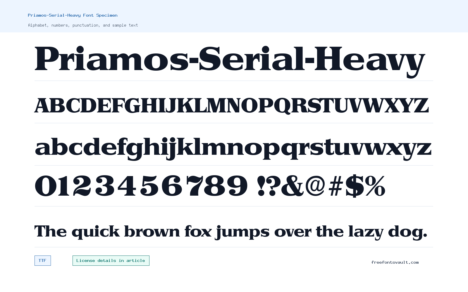
Font Specimen
Details
- Designer (c) 1996 SoftMaker Software GmbH
- Format TTF
- Variants 1 file available
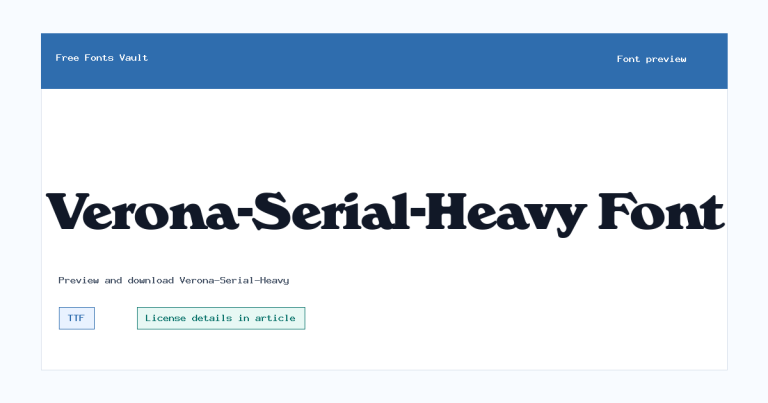
Priamos-Serial-Heavy font.
Priamos-Serial-Heavy is a heavy TrueType font made for bold, attention-grabbing text. Use the preview tool to test your own words before downloading.
About Priamos-Serial-Heavy
Priamos-Serial-Heavy has a strong, weighty appearance that works best when the text needs to stand out quickly. Because the file is a regular TTF style with a heavy display name, it is better suited to titles, labels, posters, and short headings than long reading sections.
Try it with uppercase words, short phrases, and tight headline layouts in the preview. Heavy fonts can lose clarity at small sizes, so check spacing, punctuation, and numbers if you plan to use it in menus, badges, thumbnails, or social graphics.
In a finished layout, give Priamos-Serial-Heavy enough space around the letters. Dense type can feel powerful, but it can also become heavy if every line uses the same treatment. Use it for the main word or phrase, then let a simpler supporting font handle descriptions, dates, prices, captions, and longer explanations.
Features
- Heavy display style for strong headings and short text
- TrueType font file in regular style
- Strong display weight that needs room at small sizes
Best Uses
- Posters, banners, and title graphics
- Logos drafts, labels, badges, and short promotional text
- Short words that need weight without a long paragraph setting
License Information
The license is not stated here. Do not assume commercial use is allowed. Check the font file, download package, or original rights holder information before using Priamos-Serial-Heavy in client work, branding, products, ads, or any paid project.
Designer and Foundry
The available font information names “(c) 1996 SoftMaker Software GmbH.” Treat this as a rights or copyright notice rather than a full designer biography.
Usage Tips
Use Priamos-Serial-Heavy for short, high-impact text. Test it at the exact size you need, especially if the design will be viewed on small screens or printed at low resolution. If the counters or inner spaces start to close up, increase size, add tracking, or switch supporting text to a lighter companion font. When in doubt, compare it against a lighter option at the same size and choose the version that stays readable fastest.
FAQ
What kind of font is Priamos-Serial-Heavy?
It is a heavy TrueType display-style font, best tested for headings, titles, labels, and other short text uses.
Is Priamos-Serial-Heavy free for commercial use?
The license is not stated here, so commercial use should not be assumed. Check the original license terms before using it in paid or public-facing work.
What file format is included?
The available font file is a TTF file.
Can I use Priamos-Serial-Heavy for body text?
It is better for short display text. For paragraphs, pair it with a simpler, more readable text font.
How can I make Priamos-Serial-Heavy easier to read?
Keep the text short, use generous size, and avoid crowding the letters. For small supporting text, use a simpler companion font instead of forcing the heavy style into every part of the layout.
Similar Fonts
Want to browse beyond this family? Return to All Fonts for the main directory.



