Font Directory
Cami Rae
Cami Rae includes 1 downloadable variant for live preview and testing.
Font Specimen
Details
- Designer Russ McMullin
- Foundry Russ McMullin
- License Personal use only
- Format OTF
- Variants 1 file available
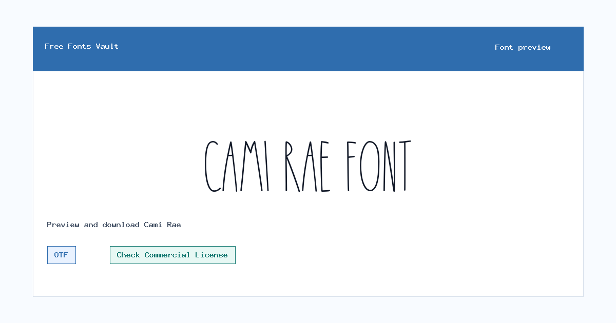
Cami Rae font.
Cami Rae is a slim, hand-drawn display font with tall letterforms and a light, casual feel. It works best when you want text to look personal without becoming heavy or overly decorative.
About Cami Rae
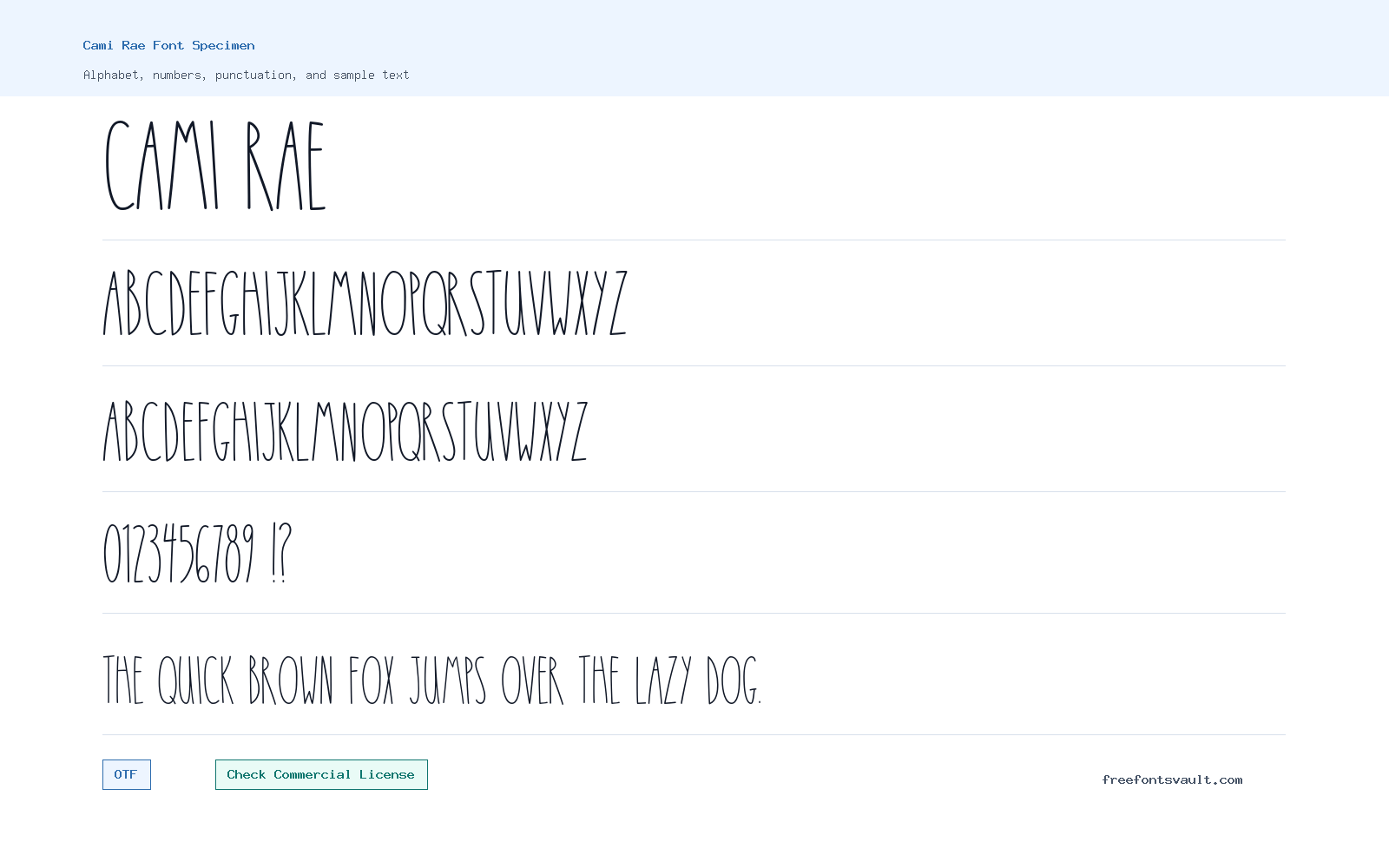
Cami Rae uses narrow strokes, uneven handmade shapes, and a mostly upright rhythm. The sample text reads like neat marker or pen lettering, with a friendly look that suits short messages, names, labels, and simple display text. Its thin lines give it an airy style, so it feels better for headings and accents than for dense paragraphs.
Use the preview box to test your own wording before downloading, especially if your design includes small sizes, long phrases, or busy backgrounds. The font is supplied as a Regular OTF file, so it should be tested in the app or website where you plan to use it. Keep contrast high, give the letters enough spacing, and avoid using it for body copy where fast reading matters.
Features
- Regular OTF font file with normal style and 400 weight metadata
- Tall, narrow hand-drawn display lettering suited to short text
Best Uses
- Invitations, name cards, greeting graphics, and personal stationery
- Short quotes, labels, blog graphics, mood boards, and handmade-style headings
License Information
Private use is permitted. For commercial use, contact the designer before using Cami Rae in client work, products, advertising, branding, or anything sold or monetized.
Designer and Foundry
Cami Rae is credited to Russ McMullin, with McMullin Creative listed as the designer website.
Usage Tips
For the cleanest result, use Cami Rae at display sizes with simple backgrounds. Pair it with a plain sans serif or serif for longer supporting text, and let Cami Rae handle the title, name, or short phrase. Cami Rae is best treated as a display or accent face rather than a long reading font. Use the preview to test casual headings, name treatments, stationery ideas, and short social graphics, then check whether the spacing still feels natural after you change size or color. Since private use is allowed and commercial use requires contact with the designer, keep the license note attached to any draft you send to a client or teammate. If the design uses a long name or quote, break it into shorter lines and compare the result with a neutral supporting face. That keeps the handwritten character visible without making the whole composition difficult to scan.
FAQ
Is Cami Rae free for commercial use?
No commercial-use permission is stated. Private use is permitted, and commercial use requires contacting the designer.
What file format is included?
The font file is an OTF file named Cami-Rae-Regular.otf.
What style of font is Cami Rae?
It is a thin, narrow, hand-drawn display font with a casual handwritten look.
Is Cami Rae good for body text?
It is better for short display text. For paragraphs or small text, use a more readable companion font.
Who designed Cami Rae?
The font is credited to Russ McMullin.
Browse More Fonts
Want to browse beyond this family? Return to All Fonts for the main directory.



