Font Directory
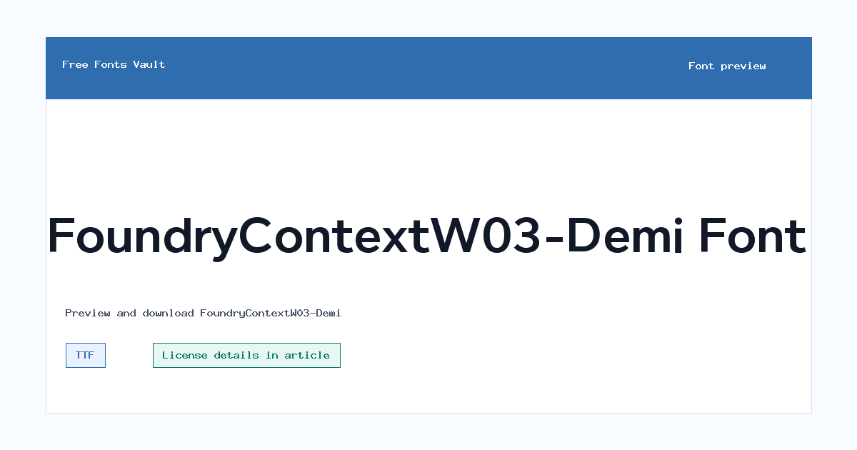
FoundryContextW03-Demi
FoundryContextW03-Demi includes 1 downloadable variant for live preview and testing.
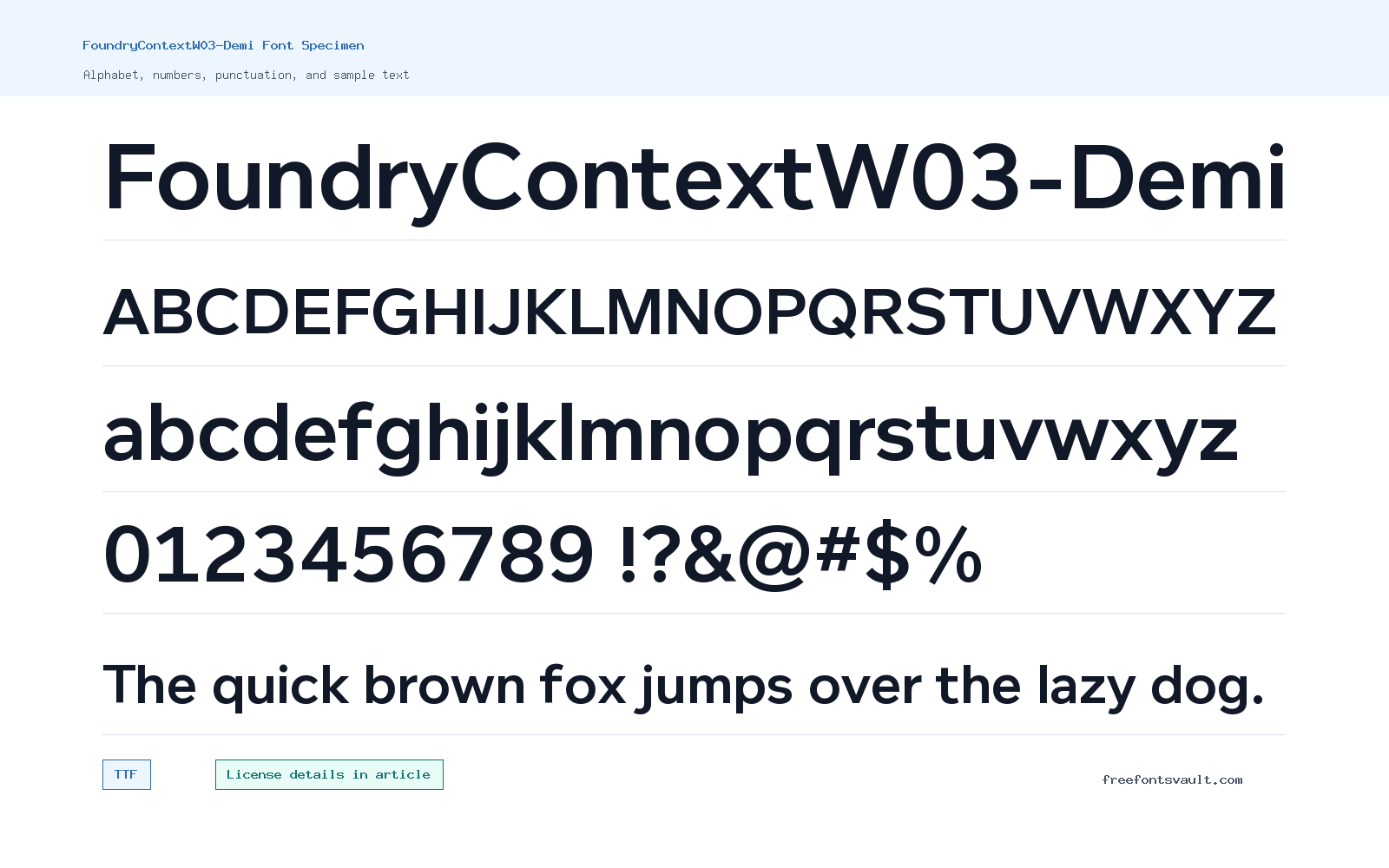
Font Specimen
Details
- Designer David Quay and Freda Sack
- Foundry The Foundry, London
- Format TTF
- Variants 1 file available
FoundryContextW03-Demi font.
FoundryContextW03-Demi is a TrueType font connected to the Foundry Context name, with David Quay and Freda Sack listed as designers. It is useful for testing a demi-weight text or display voice before deciding how it fits a layout.
About FoundryContextW03-Demi
The listed file is Foundry-Context-Demi.ttf. The style data is regular and normal, while the family name signals a Demi cut, so the safest approach is to preview it in the exact context where you plan to use it. Demi weights often sit between regular and bold: strong enough for headings and labels, but not always as heavy as a full bold face.
Use the preview to compare short headings, menu labels, numerals, punctuation, and a few lines of reading text. If the font keeps its rhythm at paragraph size, it may work for more than titles. If it feels too firm or tight, reserve it for headings, cards, callouts, and editorial display moments.
The foundry data references The Foundry, London, and the designer field names David Quay and Freda Sack. Because no license text is present, rights should be checked before any client, commercial, web, app, product, or brand use.
Features
- TTF file named Foundry-Context-Demi.ttf.
- Demi-weight family name with regular style metadata.
- Credited to David Quay and Freda Sack.
- Foundry attribution normalized as The Foundry, London.
- Useful for testing headings, labels, and controlled reading text.
Best Uses
- Headings, labels, and editorial title treatments.
- Short text blocks where regular weight feels too light.
- Navigation, cards, and interface mockups after readability testing.
- Print or screen layouts where a steady demi tone is needed.
- Typography comparisons before choosing a final licensed family.
License Information
The license is not stated for this entry. Do not assume commercial permission. Check The Foundry or the rights holder terms before using FoundryContextW03-Demi in client work, branding, apps, websites, products, merchandise, templates, or font embedding.
Designer and Foundry
David Quay and Freda Sack are listed as designers, and The Foundry, London is listed as the foundry. The foundry value was normalized from a copyright-prefixed metadata string for cleaner public display.
Usage Tips
Preview real headings and a few reading-size lines. Pay attention to spacing, numerals, punctuation, and how the demi weight behaves on both light and dark backgrounds.
FAQ
What format is FoundryContextW03-Demi?
The listed file is Foundry-Context-Demi.ttf, a TrueType font file.
Who designed FoundryContextW03-Demi?
David Quay and Freda Sack are listed as the designers.
Can I use FoundryContextW03-Demi commercially?
Do not assume commercial rights. Check The Foundry or the rights holder license before paid, client, web, app, or product use.
What is a demi font useful for?
A demi weight often works for headings, labels, and short text that needs more presence than regular without becoming fully bold.
What should I preview first?
Preview headings, numbers, punctuation, and a few lines at reading size to decide whether it fits display text, body text, or both.
Browse More Fonts
Want to browse beyond this family? Return to All Fonts for the main directory.



