Font Directory
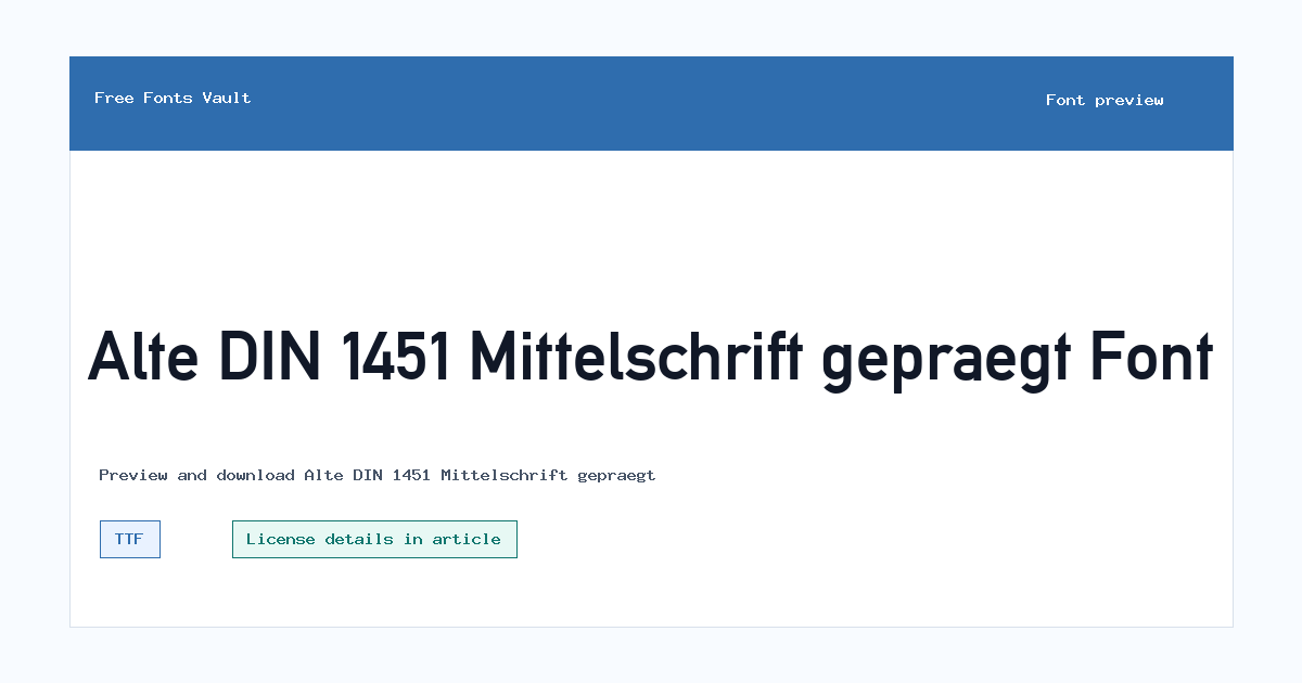
Alte DIN 1451 Mittelschrift gepraegt
Alte DIN 1451 Mittelschrift gepraegt includes 1 downloadable variant for live preview and testing.
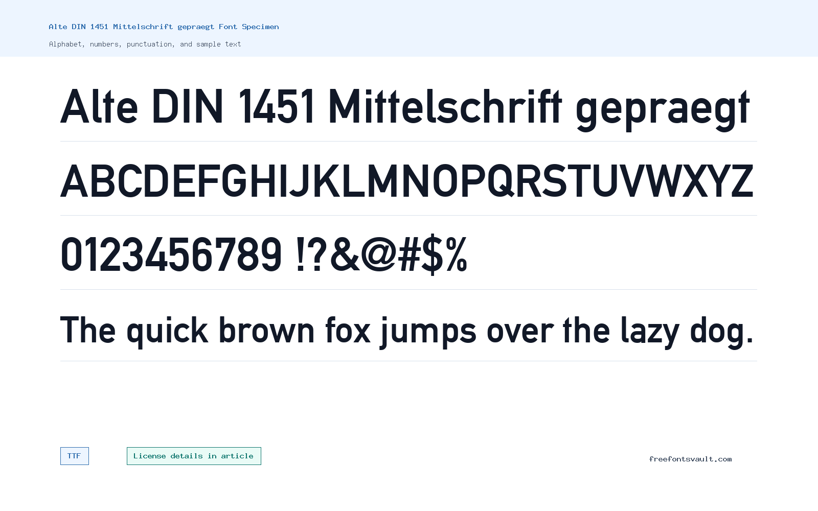
Font Specimen
Details
- Designer Ludwig Goller
- Foundry Ludwig Goller
- Downloads 1
- Format TTF
- Variants 1 file available
Alte DIN 1451 Mittelschrift gepraegt font.
Alte DIN 1451 Mittelschrift gepraegt is a DIN-inspired TrueType font with a structured, technical feel for signs, labels, posters, badges, and title blocks.
About Alte DIN 1451 Mittelschrift gepraegt
The name points to DIN 1451 Mittelschrift, a lettering tradition associated with clear engineered forms. The word gepraegt suggests a pressed or embossed treatment, so this cut is most useful when you want a practical industrial tone with a little physical texture.
Use it where short text needs to feel precise: signage-style headings, product labels, stamp-like badges, utility posters, interface mockups, catalog titles, or number-heavy layouts. It can work well for uppercase words and codes, but you should check spacing carefully because technical fonts can look crowded when the tracking is too tight.
For readable pages, pair it with a plain sans serif for paragraphs and keep this font for the moments that need the DIN character. If the embossed effect is strong at small sizes, move it up in size or use it only for titles and labels.
This font is also worth testing with numerals, because DIN-style faces are often chosen for practical information. Try dates, measurements, model names, and short navigation labels before using it in a finished design. If the pressed character is the main visual feature, keep the surrounding layout simple so the texture feels intentional rather than noisy.
Features
- Regular-weight TTF font for broad desktop app compatibility
- DIN-style structure with a practical mechanical tone
- Embossed or pressed character suggested by the gepraegt name
- Useful for uppercase text, numbers, short labels, and compact headings
- Best used with careful spacing and strong contrast
Best Uses
- Technical posters, signage concepts, and title blocks
- Labels, badges, product mockups, and wayfinding-style graphics
- Short uppercase headings, numeric details, and code-like text
- Editorial accents that need a precise engineered mood
- Design previews where a DIN-style face is needed quickly
License Information
A clear license statement is not shown for this font. Preview and test it freely in your layout, but confirm the author or package license before using it commercially, sharing it with a client, embedding it on a website, or placing it in a product.
Designer and Foundry
Ludwig Goller is named for both designer and foundry. Keep that credit intact when organizing the font, and check any package notes if you need exact license terms.
Usage Tips
Start with short words, labels, numbers, and title lines. Increase tracking for all-caps text, avoid cramped paragraphs, and compare it against your final background color before committing to a design. For website use, preview it in the browser at real sizes, because a treatment that looks strong in a large image can soften on small screens.
FAQ
What format is Alte DIN 1451 Mittelschrift gepraegt?
It is listed as a TTF font.
What does this font look best on?
It suits short technical text, signage-inspired headings, labels, badges, posters, and title blocks.
Can I use it commercially?
Commercial use is not confirmed. Check the license in the font package or with the author before using it in paid work.
Is it comfortable for paragraphs?
It is better as a display or labeling font. Use a simpler companion face for long reading text.
Who is credited for the font?
Ludwig Goller is listed as the designer and foundry.
Similar Fonts
Want to browse beyond this family? Return to All Fonts for the main directory.



