Font Directory
Radnika SemiBold Italic
Radnika SemiBold Italic includes 1 downloadable variant for live preview and testing.
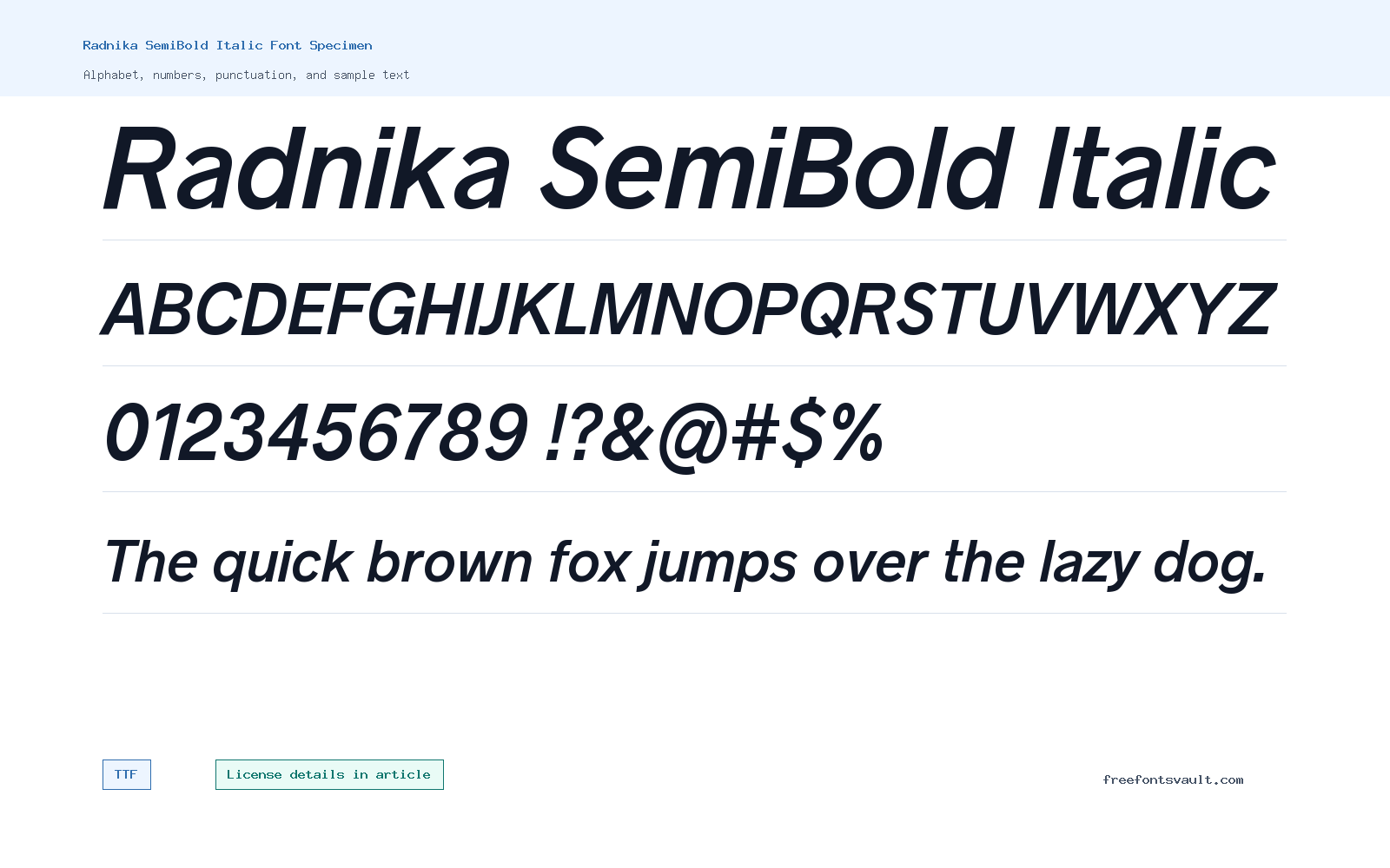
Font Specimen
Details
- Designer Alfredo Marco Pradil
- Foundry Hanken Design Co.
- License URL hanken.co/eula
- Format TTF
- Variants 1 file available
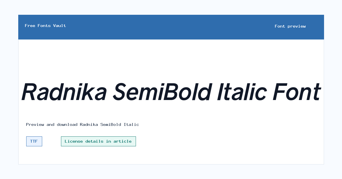
Radnika SemiBold Italic font.
Radnika SemiBold Italic is a slanted, heavier-weight style made for text that needs emphasis without becoming too loud.
About Radnika SemiBold Italic
Radnika SemiBold Italic has the angled movement of an italic style with the added strength of a semibold weight. That combination makes it useful when regular italic text feels too light, especially in headings, pull quotes, labels, and short highlighted phrases. The font file is supplied in TTF format, which is widely supported across desktop design apps and many web or document tools.
Use the preview box to test the exact words you plan to set before downloading. SemiBold Italic styles can look clear and confident in short lines, but long paragraphs may feel too active because the slant keeps the eye moving. Try it for names, section titles, captions, editorial accents, button text, or small branding details, then pair it with a calmer upright typeface for longer reading.
Radnika SemiBold Italic is most useful when a layout needs a confident secondary voice. It can make a quote, product detail, author line, tab label, or short callout feel intentional without switching to a decorative font. Keep the line length modest and let the italic angle do the emphasis.
When pairing it, use an upright sans serif or serif for the main reading text. The contrast between upright body copy and this slanted semibold style makes hierarchy clearer, especially in editorial pages, landing sections, captions, and compact UI blocks.
Features
- SemiBold italic style with a 700 weight value
- TTF font file format for broad app compatibility
- Useful for emphasis when regular italic feels too light
- Works best with generous spacing and short line lengths
Best Uses
- Headlines, subheads, pull quotes, and short editorial accents
- Emphasis text, labels, buttons, and compact display use
- Editorial cards, author names, short quotes, product labels, and interface accents
License Information
The license field is not specified here, but the font is linked to the Hanken Design Co. EULA. Read that EULA before using Radnika SemiBold Italic in personal, client, commercial, app, logo, or webfont projects.
Designer and Foundry
Radnika SemiBold Italic is credited to Alfredo Marco Pradil, with Hanken Design Co. listed as the foundry.
Usage Tips
For best results, use Radnika SemiBold Italic in short text where the slant and weight can add emphasis. Avoid setting large blocks of body copy in this style unless the preview remains comfortable to read at your chosen size.
FAQ
What format is Radnika SemiBold Italic?
The downloadable font file is a TTF file.
Is Radnika SemiBold Italic good for body text?
It is better for short emphasis, headings, labels, and pull quotes. For long reading, pair it with an upright regular style if one is available in your design system.
Can I use Radnika SemiBold Italic for commercial work?
The commercial-use terms are not stated in the font details. Check the linked Hanken Design Co. EULA before using it in commercial, client, logo, app, or web projects.
Who designed Radnika SemiBold Italic?
The font is credited to Alfredo Marco Pradil, and Hanken Design Co. is listed as the foundry.
How should I pair Radnika SemiBold Italic?
Use it beside a calmer upright font. Let Radnika SemiBold Italic handle emphasis, then keep paragraphs, descriptions, and longer instructions in a regular text style.
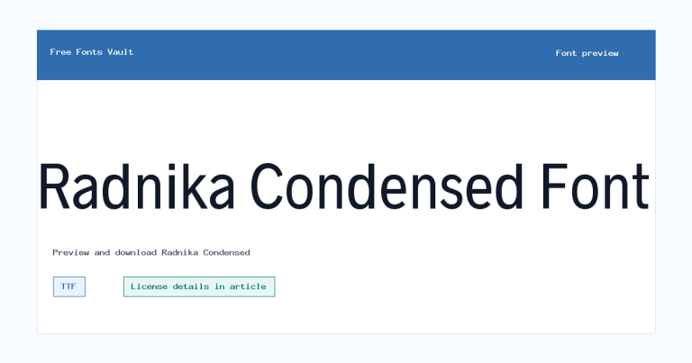
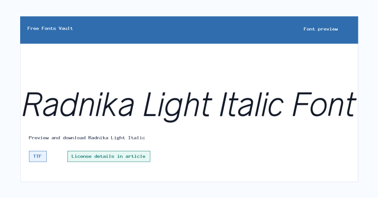
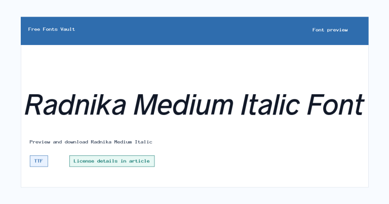
Family Styles
Want to browse beyond this family? Return to All Fonts for the main directory.



