Font Directory
ParmaPetit
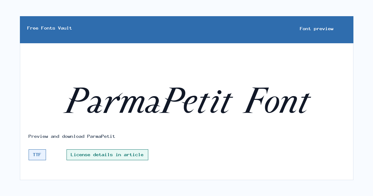
ParmaPetit includes 1 downloadable variant for live preview and testing.
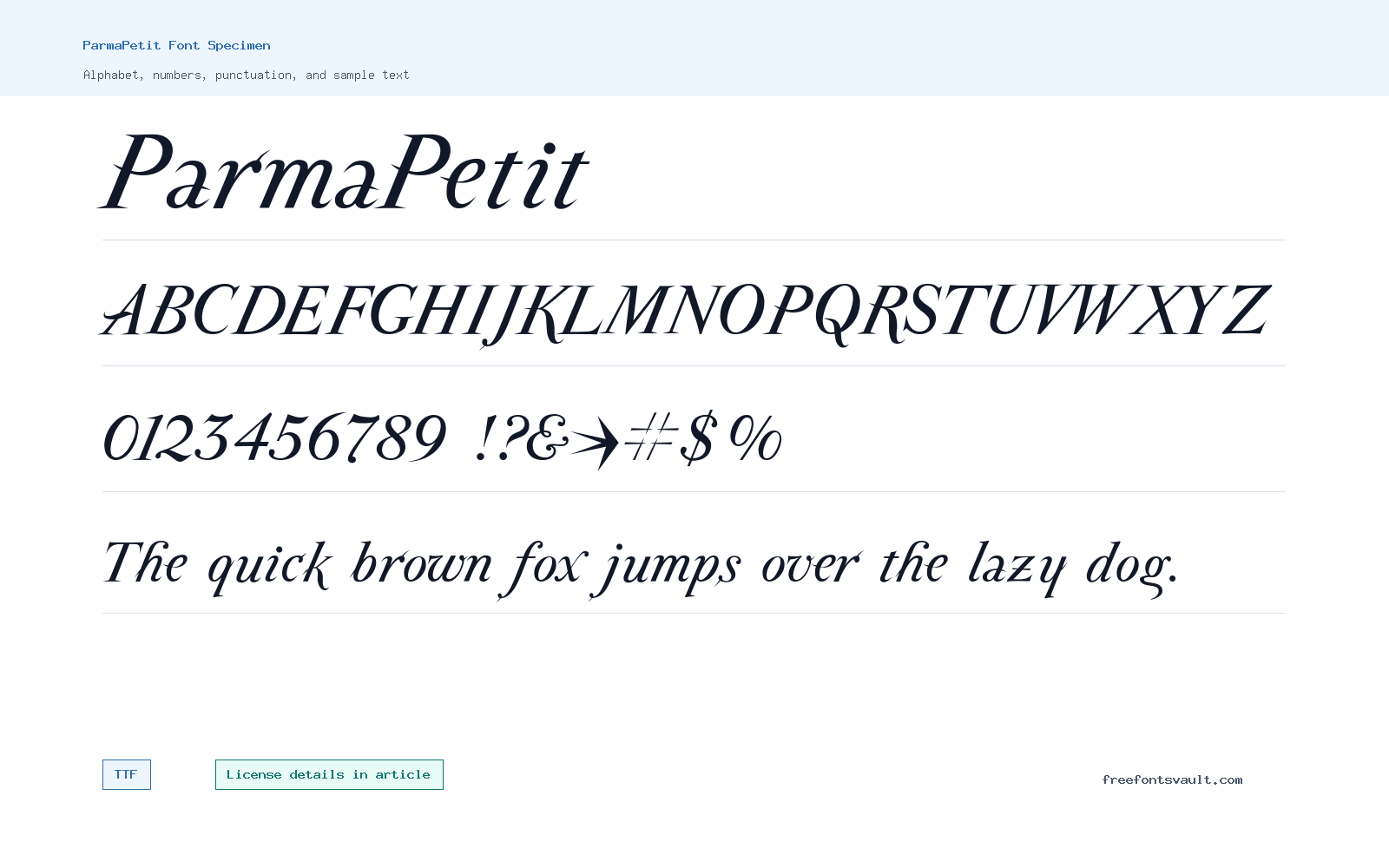
Font Specimen
Details
- Designer First edited 1994 @ Alphabets, Inc. / \251 Manfred Klein New vs 4.
- Format TTF
- Variants 1 file available
ParmaPetit font.
ParmaPetit is an italic TrueType font with a narrow, slanted display feel. It is best used when a short line needs personality, movement, and a lighter decorative touch.
About ParmaPetit Font
ParmaPetit works better as an accent face than as an everyday reading font. The listed file is ParmaPetit-Italic.ttf, and the style data marks it as an italic 400-weight TTF. That makes it easy to try in common desktop design apps, but the real value is in short text: names, headings, invitations, quote cards, small labels, and title graphics where the angled shapes can be seen clearly.
Use the live preview with the exact wording you plan to design. Italic display fonts can change character quickly when the phrase includes tall letters, punctuation, numbers, or repeated strokes. A word that looks elegant at poster size may feel cramped as a small caption, so test more than one size before deciding.
For layouts, ParmaPetit usually pairs best with a quiet support font. Let ParmaPetit carry one decorative line, then use a plain sans serif or readable serif for descriptions, dates, addresses, or body copy. That keeps the style visible without making the whole design difficult to scan.
Features
- Italic TrueType font file listed as ParmaPetit-Italic.ttf
- Regular 400 weight for simple installation and previewing
- Most useful for short display text, names, labels, and title lines
- Slanted letterforms that add movement without needing extra effects
- Better as an accent font than a paragraph font
- Pairs well with simple serif or sans serif support type
Best Uses
- Invitation names, greeting cards, and personal stationery
- Short quotes, captions, labels, and decorative headings
- Social graphics, mood boards, and small print accents
- Logo-style experiments where an italic display tone is needed
- Testing elegant or vintage-flavored typography before final design
License Information
The license terms are not stated with the downloadable font data. Treat ParmaPetit as permission-unconfirmed for commercial work until you review the license file in the package or get clear permission from the rights holder. That matters for client designs, logos, merchandise, paid ads, apps, templates, and any redistribution of the font file.
Designer and Foundry
The credit line reads: First edited 1994 @ Alphabets, Inc. / 251 Manfred Klein New vs 4. Because that line mixes editing, organization, and version wording, it should be treated as a credit note rather than a complete designer biography.
Usage Tips
Start by previewing your real phrase in uppercase, lowercase, numbers, and punctuation. If the letters feel too tight, increase the size or tracking, or use ParmaPetit only for the first word and set the rest in a cleaner companion typeface. Keep backgrounds simple so the italic details do not disappear.
FAQ
What kind of font is ParmaPetit?
ParmaPetit is listed as an italic TrueType display font. It is most practical for short decorative text rather than long paragraphs.
Can I use ParmaPetit for commercial projects?
Commercial permission is not confirmed by the font data. Check the license file or rights holder terms before using it in paid, client, logo, product, or business work.
What file is included?
The listed font file is ParmaPetit-Italic.ttf, a TrueType font file.
Is ParmaPetit good for body text?
It is better for short accents such as names, titles, labels, and quote lines. Use a simpler companion font for paragraphs.
What should I test before using it?
Test your exact words, punctuation, numbers, accented characters, and final size. This helps catch spacing and readability issues early.
Browse More Fonts
Want to browse beyond this family? Return to All Fonts for the main directory.



