Font Directory
Verona-Serial-Heavy
Verona-Serial-Heavy includes 1 downloadable variant for live preview and testing.
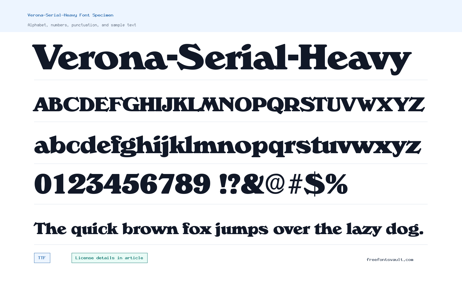
Font Specimen
Details
- Designer (c) 1996 SoftMaker Software GmbH
- Format TTF
- Variants 1 file available
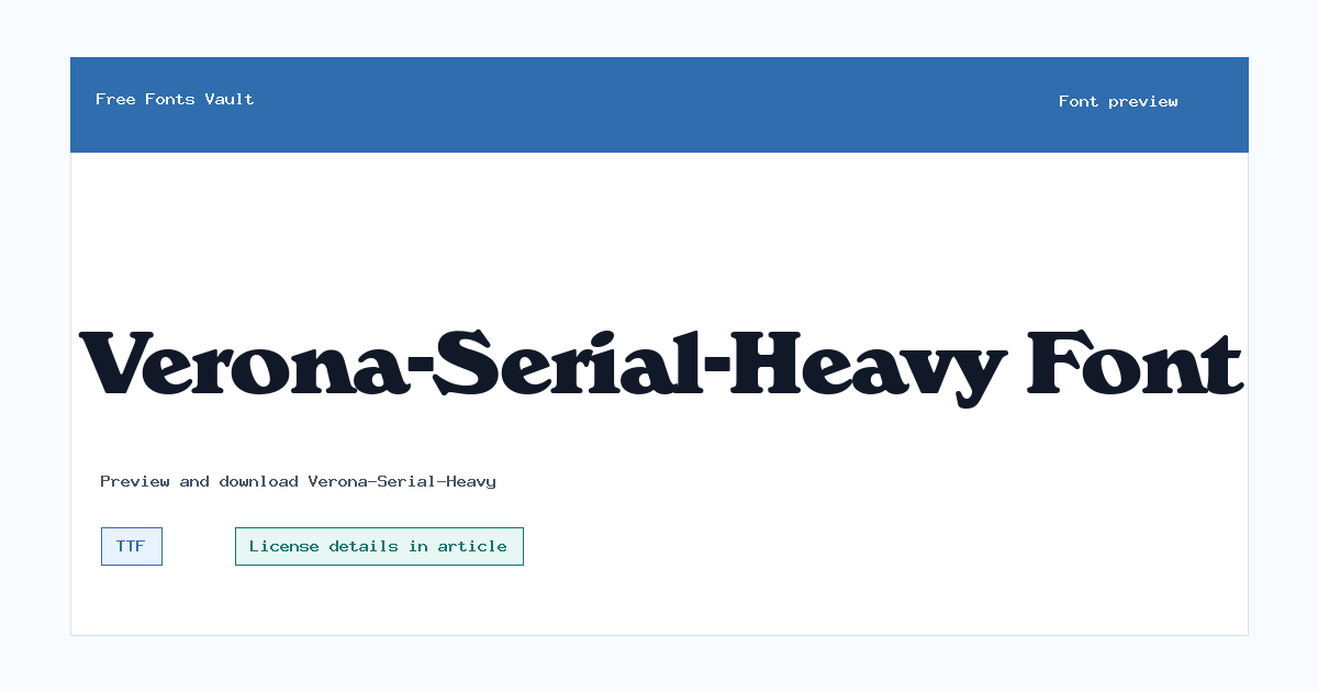
Verona-Serial-Heavy font.
Verona-Serial-Heavy is a bold TTF font with an 800 weight, built for text that needs a firm, heavy presence. Use the preview tool to test your own words before downloading, especially if you plan to use it for headings, labels, posters, or other short display settings.
About Verona-Serial-Heavy
Verona-Serial-Heavy is best approached as a strong display option rather than a long-reading text face. Its weight is marked as 800, so it is meant to look dense and prominent on the page. That makes it useful when a design needs a clear title, a compact wordmark-style line, a poster heading, a bold website hero phrase, or a short label that should not fade into the background. Because only one regular TTF variant is listed, there is no separate italic, light, condensed, or extended companion shown here. If your layout needs a full type system with several weights, you may need to pair this font with another family for body copy, captions, and interface text.
For the best result, preview Verona-Serial-Heavy with the exact words you want to use. Heavy fonts can change character depending on the text: short names may look solid and balanced, while longer sentences can feel crowded. Test uppercase and lowercase forms, check spacing between tight letter pairs, and try the font at the size you actually plan to use. If you are designing for screens, compare it at desktop and mobile sizes before committing. For print work, leave enough margin and line spacing so the heavy strokes have room to breathe. A simple sans serif or readable serif can work well beside it when you need supporting text that stays quieter.
Features
- Single regular TTF variant with a listed 800 font weight for heavy display use.
- Practical for short, bold text where impact matters more than extended reading comfort.
Best Uses
- Headlines, poster titles, cover text, banners, and bold website hero lines.
- Short labels, display names, logo mockups, and typographic experiments where a heavy style is needed.
License Information
The license terms are not stated here. Do not assume commercial-use permission from the download alone. If you want to use Verona-Serial-Heavy in client work, products, ads, apps, merch, or any revenue-generating project, confirm the license from a reliable source or obtain permission from the rights holder first.
Designer and Foundry
The font file information lists “(c) 1996 SoftMaker Software GmbH.” Treat that as a copyright notice, not a full designer biography or a complete licensing statement.
Usage Tips
Use Verona-Serial-Heavy for short text first. Set body copy, long descriptions, and small UI text in a more readable companion font. When testing, watch for tight spacing, heavy word shapes, and reduced readability at small sizes. Since the downloadable file is TTF, it should work in many desktop design apps, but web use may require conversion or proper font embedding rights.
FAQ
Is Verona-Serial-Heavy free for commercial use?
Commercial-use permission is not confirmed here. Check the license from the rights holder or another reliable licensing source before using it in paid, client, product, advertising, app, or merchandise work.
What file format is included?
The listed download is a TTF font file. TTF files are commonly used in desktop design software and can often be installed on major operating systems.
What style is Verona-Serial-Heavy?
The listed variant is regular style with an 800 weight, so it should be treated as a heavy display font for bold visual emphasis.
Can I use it for body text?
It is better suited to headings and short display text. For paragraphs, pair it with a simpler, more readable font and keep Verona-Serial-Heavy for emphasis.
What should I test in the preview?
Try your actual title, brand name, or phrase. Check spacing, readability at your target size, uppercase versus lowercase, and how the heavy weight works beside your other fonts.
Similar Fonts
Want to browse beyond this family? Return to All Fonts for the main directory.



