Font Directory
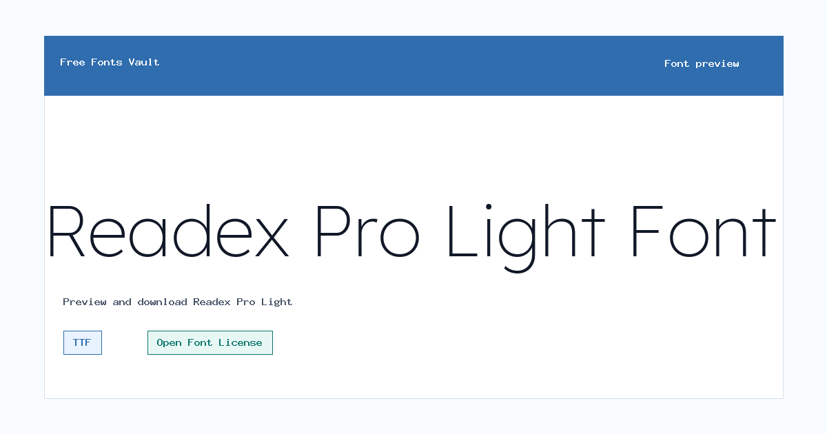
Readex Pro Light
Readex Pro Light includes 1 downloadable variant for live preview and testing.
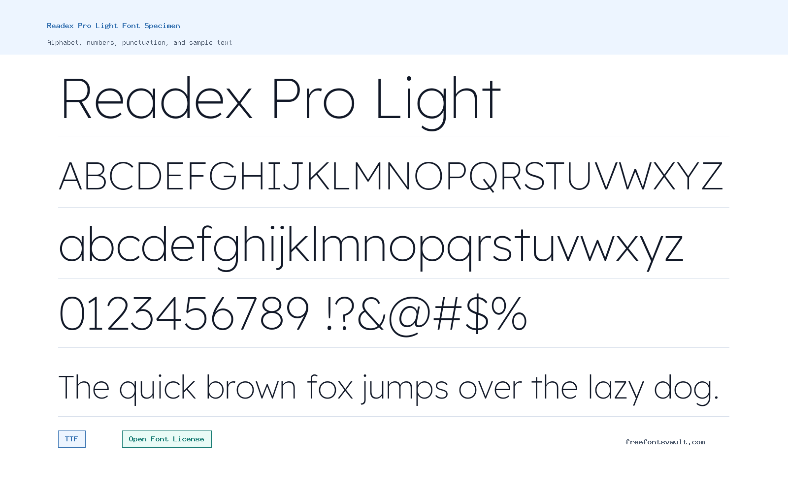
Font Specimen
Details
- Designer Bonnie Shaver-Troup, Thomas Jockin
- Foundry Lexend
- License Open Font License
- License URL scripts.sil.org/OFL
- Format TTF
- Variants 1 file available
Readex Pro Light font.
Readex Pro Light is a light 300-weight font from the Readex Pro family, designed for clean text with a calm, open look.
About Readex Pro Light
Readex Pro Light uses a normal upright style and a thin, lighter stroke weight. That makes it a good choice when you want text to feel clear without looking heavy. It can work well for headings, interface labels, captions, menus, and short blocks of copy where a softer weight fits the design.
Because this is the Light weight, test it carefully at small sizes and on low-contrast backgrounds. Thin strokes can lose clarity if the text is too small or the color contrast is weak. For best results, use the preview tool with your own words, check both uppercase and lowercase text, and try it at the size you plan to use before downloading.
Readex Pro Light has a restrained, low-weight look that suits clean interface text, quiet headings, and editorial layouts. The lighter stroke can make a page feel open and modern, but it needs enough contrast to remain readable. It is a good choice when you want a softer voice than a regular or bold sans serif style.
Features
- Light 300 weight with normal upright styling
- TTF font file format for broad desktop and web design compatibility
Best Uses
- Clean website headings, labels, and navigation text
- Minimal branding, editorial layouts, captions, and short display copy
License Information
Readex Pro Light is licensed under the SIL Open Font License, Version 1.1. That license generally allows use, sharing, and modification under its terms, but you should read the OFL text and FAQ if you plan to redistribute, modify, or bundle the font.
Designer and Foundry
Designer credit is listed as Bonnie Shaver-Troup and Thomas Jockin, with Lexend named as the foundry.
Usage Tips
Use Readex Pro Light when you need a lighter text style. Keep strong contrast between text and background, and avoid relying on this weight for very small body text unless your preview test remains easy to read. Avoid using very pale colors with this Light style, especially on mobile screens. Increase size or weight for small labels, and reserve this cut for text that has enough room to stay clear.
FAQ
Is Readex Pro Light free to use?
The font is licensed under the SIL Open Font License 1.1. Review the license terms for details, especially if you plan to modify, redistribute, or bundle the font.
What file format is included?
The available font file is a TTF file named ReadexPro-Light.ttf.
What weight is Readex Pro Light?
Readex Pro Light is listed with a 300 font weight, which is commonly used for light text styles.
Is this a good font for body text?
It can be used for text, but the Light weight should be tested at the intended size. For long paragraphs or small text, make sure the contrast and readability are strong.
When should I use Readex Pro Light instead of regular?
Use the Light style when you want a softer heading or interface tone, and use regular or medium weights when small text needs more strength.
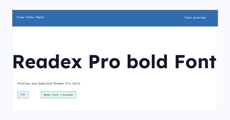
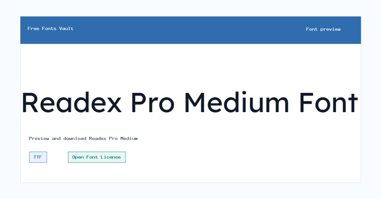
Family Styles
Want to browse beyond this family? Return to All Fonts for the main directory.



