Font Directory
Anton
Anton includes 1 downloadable variant for live preview and testing.
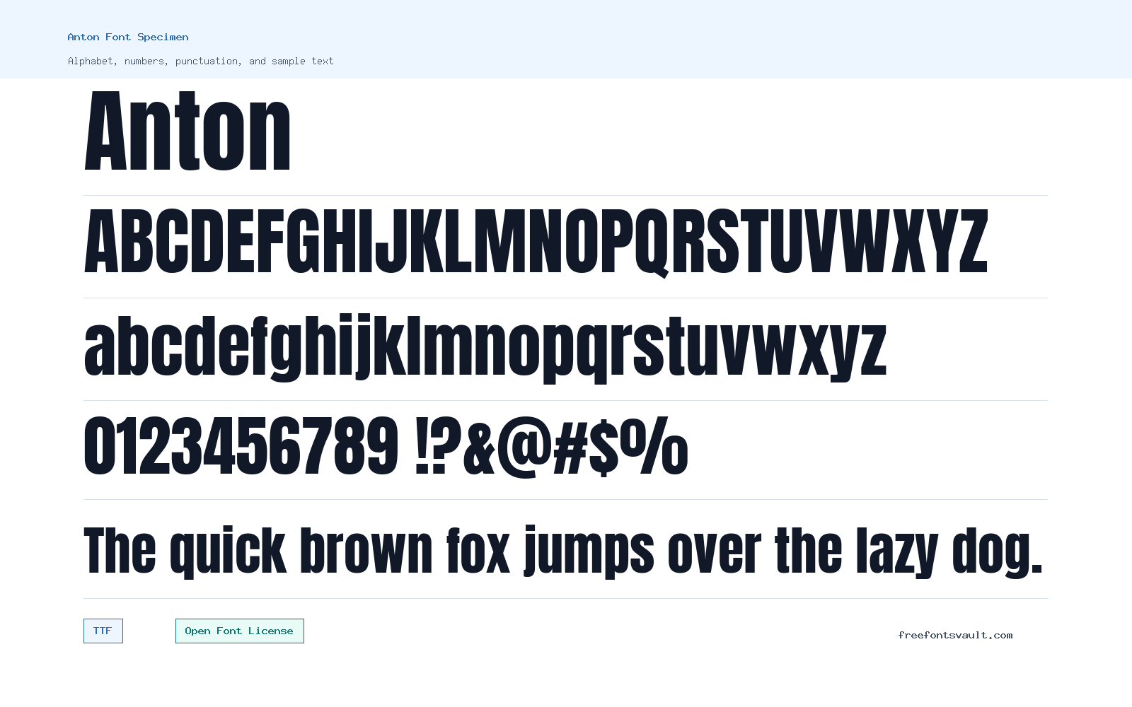
Font Specimen
Details
- Designer Vernon Adams
- Foundry Vernon Adams
- License Open Font License
- License URL scripts.sil.org/OFL
- Format TTF
- Variants 1 file available
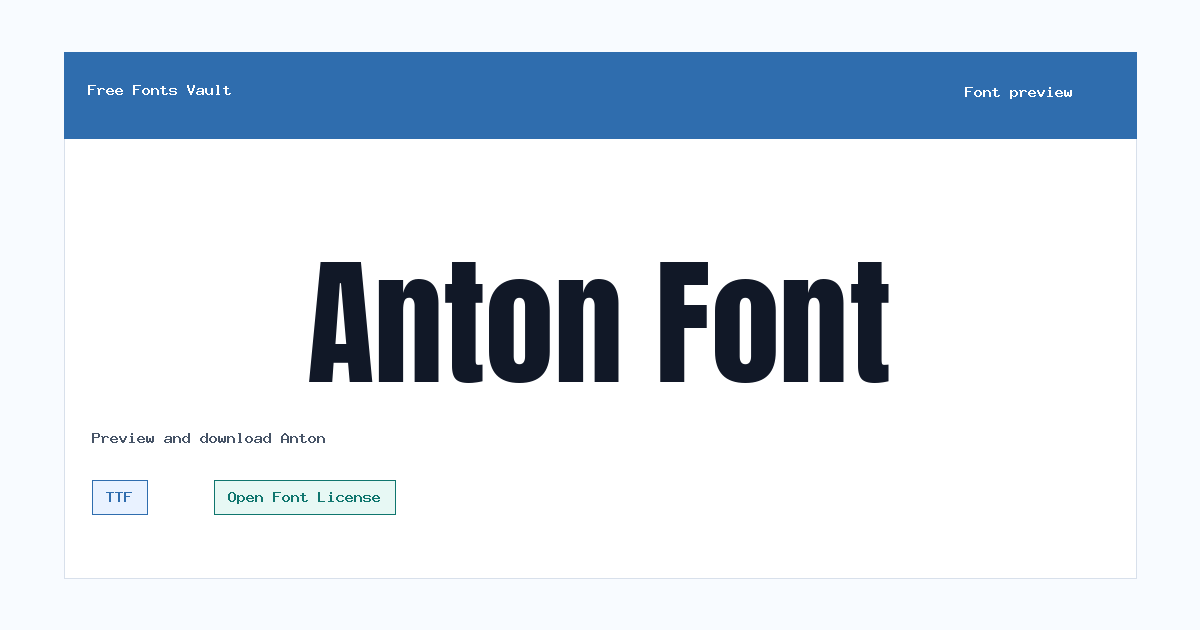
Anton font.
Anton is a strong sans serif display font by Vernon Adams. It has a compact, bold look that works best when the text needs to stand out quickly.
About Anton Font
Anton is built for display use rather than quiet reading. Its regular style carries a heavy, condensed feel, giving headlines and short labels a firm presence without needing extra effects. Google Fonts classifies Anton as a sans serif and lists it with Neo Grotesque and Grotesque style categories, which fits its clean, direct letterforms.
Use Anton for short text where impact matters: posters, website hero headings, banners, thumbnails, product labels, and bold navigation accents. Because it is dense and assertive, test it in the preview with your exact words before using it for longer lines. It usually works best with a simpler body font that gives the layout more breathing room.
Anton has a strong vertical rhythm, so it can make even short words feel loud and confident. That is useful for posters and thumbnails, but it also means spacing matters. If a headline feels cramped, try fewer words, a little more tracking, or a larger canvas instead of forcing the font into a narrow area.
Features
- Single Regular 400 style supplied as a TTF file
- Bold, condensed sans serif look suited to display typography
Best Uses
- Headlines, posters, banners, and hero text
- Short branding accents, labels, thumbnails, and callouts
License Information
Anton is licensed under the SIL Open Font License, Version 1.1. Review the OFL terms if you plan to redistribute, modify, bundle, or use the font inside a product.
Designer and Foundry
Anton is credited to Vernon Adams, with Vernon Adams also listed as the foundry.
Usage Tips
Keep Anton for short, high-impact text. For paragraphs or small captions, pair it with a more open sans serif or serif font so the page stays easy to read. Use sentence case or short uppercase words first, then check whether counters and tight spaces stay readable after export.
FAQ
Is Anton a good font for body text?
Anton is better for headings and short display text. Its bold, condensed shape can feel crowded in long paragraphs.
What file format is included for Anton?
The downloadable style is Anton Regular in TTF format.
Who designed Anton?
Anton is credited to Vernon Adams.
What license does Anton use?
Anton uses the SIL Open Font License, Version 1.1. Check the license text for the rules around redistribution, modification, and bundling.
What should I pair Anton with?
Pair Anton with a calmer text font. A neutral sans serif or readable serif can balance Anton’s strong headline style.
Can Anton work for logos?
It can work for logo drafts and bold wordmarks, but test uniqueness and licensing needs carefully before using any font in final brand work.
Why does Anton look better in short text?
Its compact, heavy letters are designed for display impact. Long lines can feel dense, especially on small screens.
Similar Fonts
Want to browse beyond this family? Return to All Fonts for the main directory.



