Font Directory
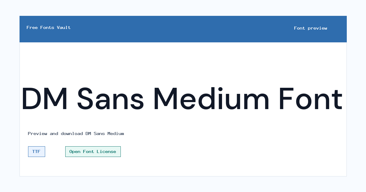
DM Sans Medium
DM Sans Medium includes 1 downloadable variant for live preview and testing.
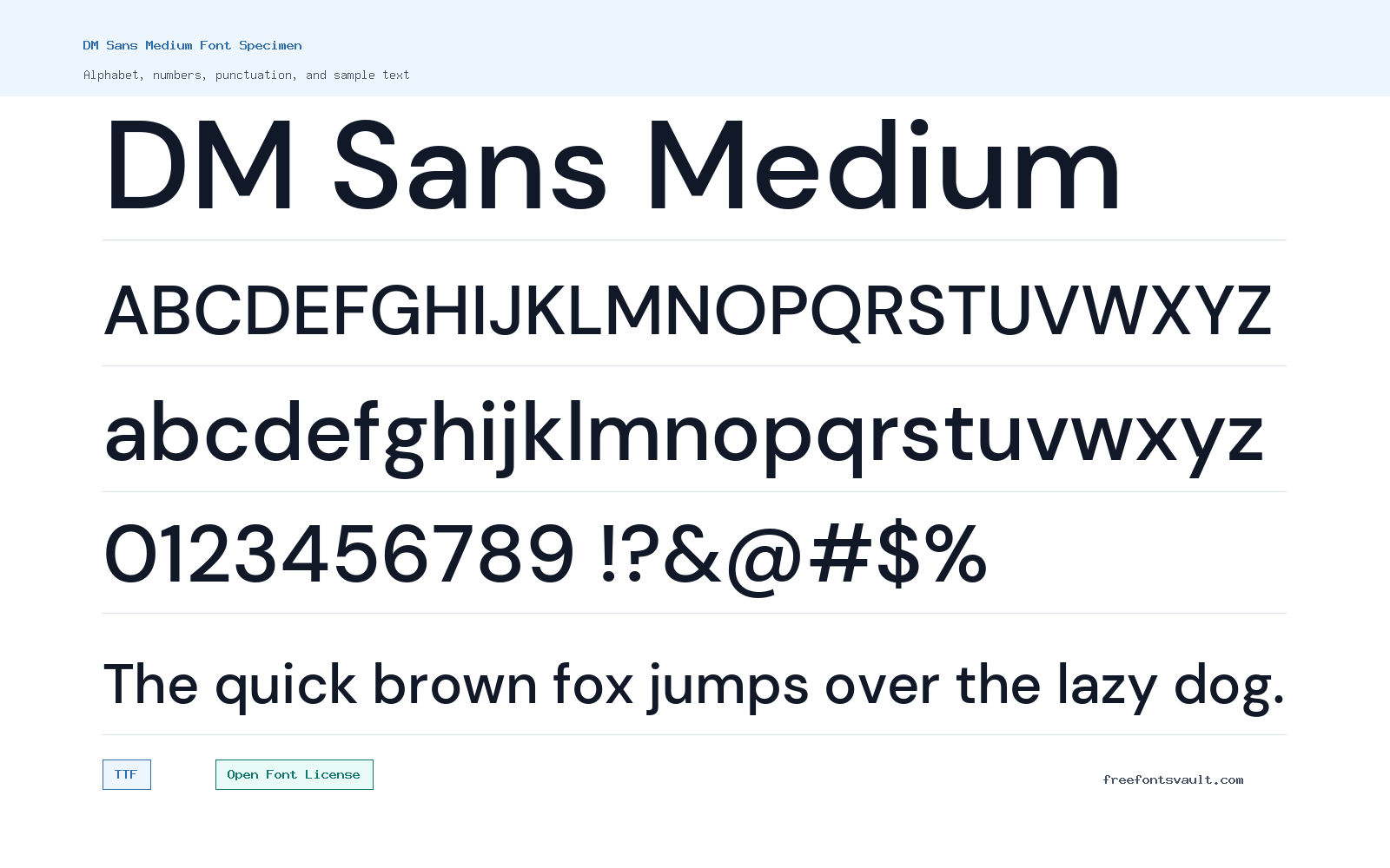
Font Specimen
Details
- Designer Colophon Foundry, Jonny Pinhorn
- Foundry Colophon Foundry
- License Open Font License
- License URL scripts.sil.org/OFL
- Format TTF
- Variants 1 file available
DM Sans Medium font.
DM Sans Medium is a clean 500-weight sans serif font for clear headings, interface text, labels, and short blocks of copy.
About DM Sans Medium
DM Sans Medium sits between regular text weight and heavier headline styles. The medium weight gives words a firmer presence without making the letters feel too heavy, which makes it useful when you want emphasis while keeping a simple sans serif look.
Use the preview tool to test your exact text before downloading. This weight can work well for section titles, buttons, navigation, product cards, captions, and short paragraphs. For long reading sections, compare it with a lighter or regular weight if one is available in your project, because medium weights can feel dense in large bodies of text.
DM Sans Medium is a useful middle weight when regular text feels too light but bold feels too loud. Test it in buttons, short headings, navigation labels, and small interface text where a steady 500-weight style can improve hierarchy without changing the whole tone of the design.
Features
- Medium 500 weight for stronger emphasis than regular text
- TTF font file in normal style
Best Uses
- Website headings, menus, buttons, and UI labels
- Posters, social graphics, cards, and short display text
License Information
DM Sans Medium is licensed under the SIL Open Font License, Version 1.1. The OFL allows broad use, modification, and redistribution under its terms, but you should read the license text and FAQ if you plan to bundle, modify, or redistribute the font.
Designer and Foundry
The font credits list Colophon Foundry and Jonny Pinhorn, with Colophon Foundry named as the foundry.
Usage Tips
Try DM Sans Medium at the size you plan to use. It is a good choice when regular text feels too light, but it may be less comfortable for long paragraphs if used too small or with tight line spacing. Preview numbers, menu labels, and a full sentence at the final size. Medium weights can look balanced in UI text, but they still need enough spacing when used in dense layouts. If the page has many controls, use it selectively so the medium weight still feels like emphasis. Keep that role clear. Use it consistently in controls.
FAQ
What file format is included for DM Sans Medium?
The listed font file is a TTF file named DMSans-Medium.ttf.
What weight is DM Sans Medium?
DM Sans Medium is listed with font weight 500.
Can I use DM Sans Medium for commercial projects?
The font is licensed under the SIL Open Font License 1.1, which generally permits commercial use under its terms. Review the OFL text if you are modifying, packaging, or redistributing the font.
Is DM Sans Medium good for body text?
It can work for short paragraphs, but medium-weight fonts are often better for headings, labels, and emphasis. Test your text size and spacing in the preview first.
Who designed DM Sans Medium?
The listed credits are Colophon Foundry and Jonny Pinhorn.
Family Styles
Want to browse beyond this family? Return to All Fonts for the main directory.



