Font Directory
Architects Daughter
Architects Daughter includes 1 downloadable variant for live preview and testing.
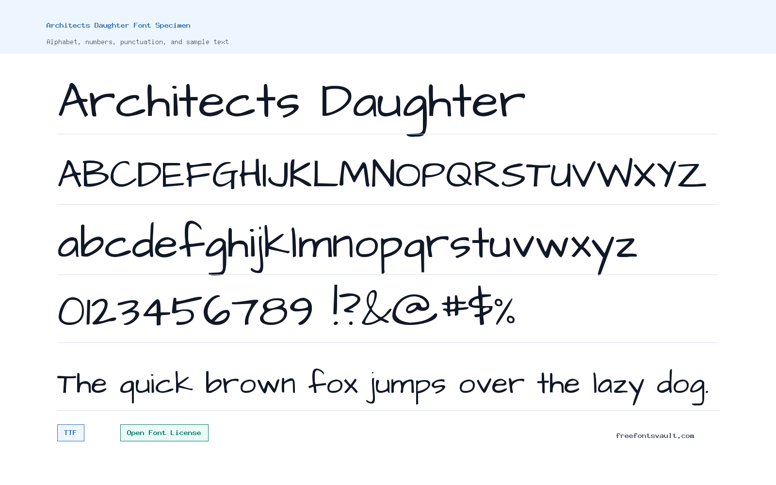
Font Specimen
Details
- Designer Kimberly Geswein
- Foundry Kimberly Geswein
- License Open Font License
- License URL scripts.sil.org/OFL
- Downloads 1
- Format TTF
- Variants 1 file available
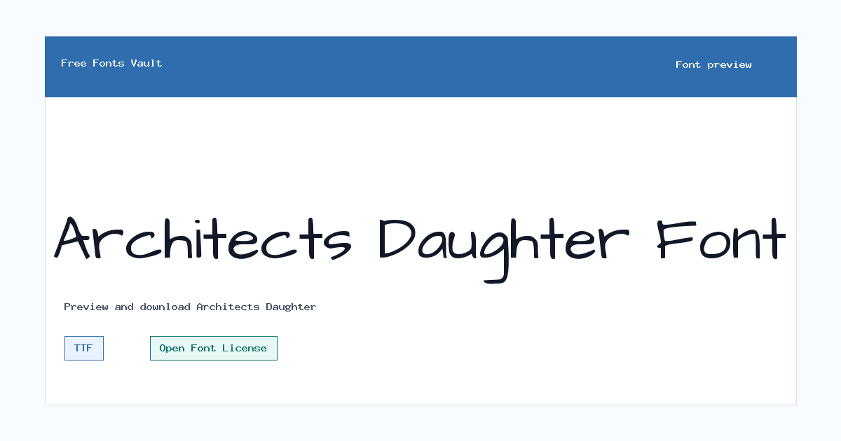
Architects Daughter font.
Architects Daughter is a casual handwritten font with a neat, personal feel. Its regular style works well when you want text to look friendly without becoming too messy or hard to read.
About Architects Daughter
Architects Daughter has the look of tidy hand lettering: informal, upright, and easy to scan in short blocks. The letters feel relaxed rather than decorative, which makes the font useful for designs that need a human touch while still keeping the words clear.
Use it for headings, notes, labels, classroom materials, blog graphics, social posts, cards, and other short text. Because it is a handwritten style, test longer paragraphs in the preview before using it for body copy. It is usually strongest at medium to large sizes, where the hand-drawn character is visible and the spacing has room to breathe.
It also works well when a page needs warmth without looking childish. Keep it for visible moments such as recipe cards, teacher resources, casual brand notes, printable signs, and friendly callouts. If the surrounding design is busy, give the letters extra line height and pair them with a plain companion font.
Features
- Regular 400 weight in TrueType format
- Casual handwritten letter style with clear short-text readability
Best Uses
- Friendly headings, labels, and quote graphics
- Classroom resources, personal cards, blog images, and informal branding accents
License Information
Architects Daughter is licensed under the SIL Open Font License Version 1.1. The font may be used, studied, copied, embedded, modified, and redistributed under the OFL terms, but the font software cannot be sold by itself and modified versions must follow the license conditions.
Designer and Foundry
Architects Daughter is credited to Kimberly Geswein, with Kimberly Geswein also listed as the foundry.
Usage Tips
Try the preview with your exact words before downloading. For best results, use Architects Daughter for short phrases, headings, captions, or callout text rather than dense paragraphs. Pair it with a simple sans serif or serif font when you need longer supporting copy. For web pages, avoid all caps and very small sizes. The font feels most natural when it has room to show the handwritten rhythm, especially in short lines with generous spacing.
FAQ
Is Architects Daughter free to use?
Yes, it is released under the SIL Open Font License 1.1, which allows broad use under the license terms. Do not sell the font file by itself, and follow the OFL conditions if you redistribute or modify it.
What file format is included?
The available font file is a TrueType font: ArchitectsDaughter-Regular.ttf.
Who designed Architects Daughter?
The font is credited to Kimberly Geswein.
Is Architects Daughter good for body text?
It can work for short readable text, but it is a handwritten font, so long paragraphs may feel busy. Test your text in the preview and use a simpler companion font for longer reading.
What style is Architects Daughter?
It is a casual handwritten font with a regular 400 weight and normal style.
Similar Fonts
Want to browse beyond this family? Return to All Fonts for the main directory.



